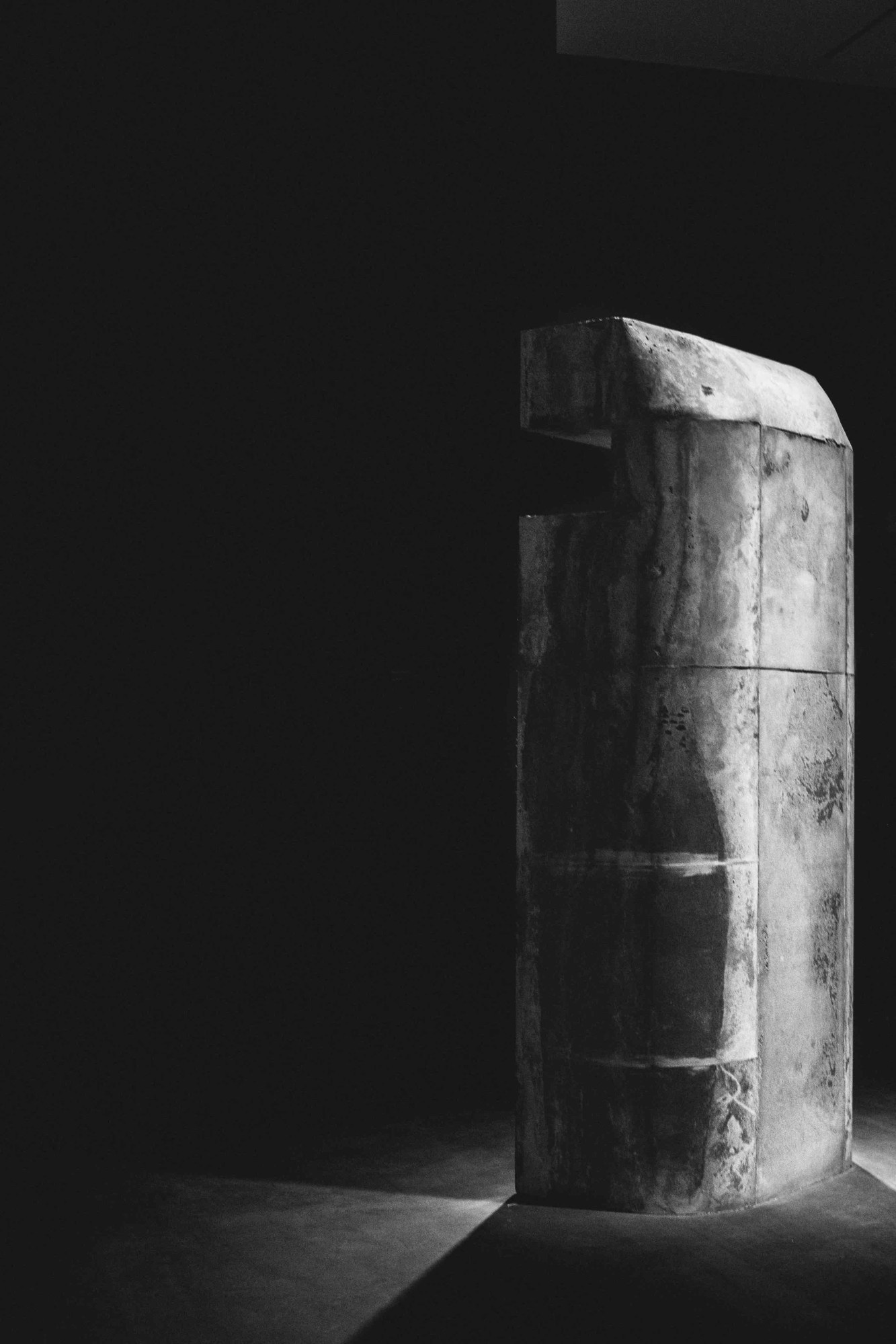
Rick Owens and his wife Michele Lamy began designing furniture in 2007, initially to create pieces for their Paris home and atelier. Their collaborative pieces, which are now enjoying their first museum exhibition on US soil, are everything you would expect Owens and his dark queen to create: they are gargantuan, exotic, and wildly expensive. With materials ranging from foam to alabaster and camel hair, and some pieces weighing in the tons, the furniture, much like Owens’s clothing, is not for the faint of heart.
“This was going to be my US year — coming back home,” says Lamy, who oversaw the installation and direction of Furniture at the MOCA Pacific Design Center in Los Angeles. Lamy had her first taste of success in Los Angeles in the late 90s after opening Les Deux Café, a restaurant and nightlife venue situated in a parking lot. It was here that she met Owens, an Otis College of Art and Design dropout making ends meet as a pattern cutter. From there the two went on to establish a professional and romantic bond, and soon launched Owens’s eponymous brand. After living in LA for decades, Lamy and Owens left the US in 2003 to set up an atelier in Paris, where the couple has resided ever since. When Lamy bumped into MOCA director Philippe Vergne at Art Basel last year, they discussed the idea of an exhibition, and Lamy — the force behind the furniture — quickly established ateliers in New York and Los Angeles. She rented out Jeanne Greenberg’s Freeman Gallery in New York and a garage off Highland in Los Angeles, and within weeks she was fabricating new pieces for the show.

A year and a half in the making, Furniture has completely transformed the Pacific Design Center. “We occupied the space, redid the floor, repainted the walls,” says Lamy. The Design Center building resembles a “high tomb,” she explains, and was perfectly suited to becoming an Owens house. “The floors of the building are pretty small but the height is vertiginous,” she says. The exhibition begins on the first floor, where a nine-foot-long two-pronged alabaster bench faces a video installation. In the clip, Owens is seen working in the studio, draping a mannequin in preparation for his fall/winter 16 menswear show, “Mastadon.” The designer folds and pinches fabric to create a layered silhouette. On the opposite wall hangs a painting by artist Steven Parrino, one of six throughout the exhibit. Following Owens and Lamy’s collaborative work last year at the Musée d’art Moderne de la Ville de Paris — where their furniture was exhibited as part of the Carol Rama show — the duo hoped to once again tackle the relationship between museum furniture and art. However, this time Owens and Lamy’s work takes center stage.
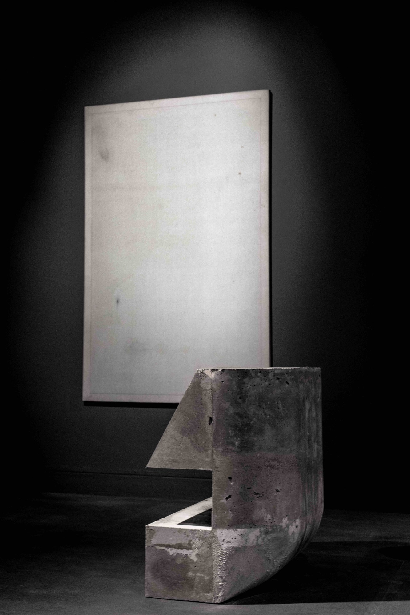
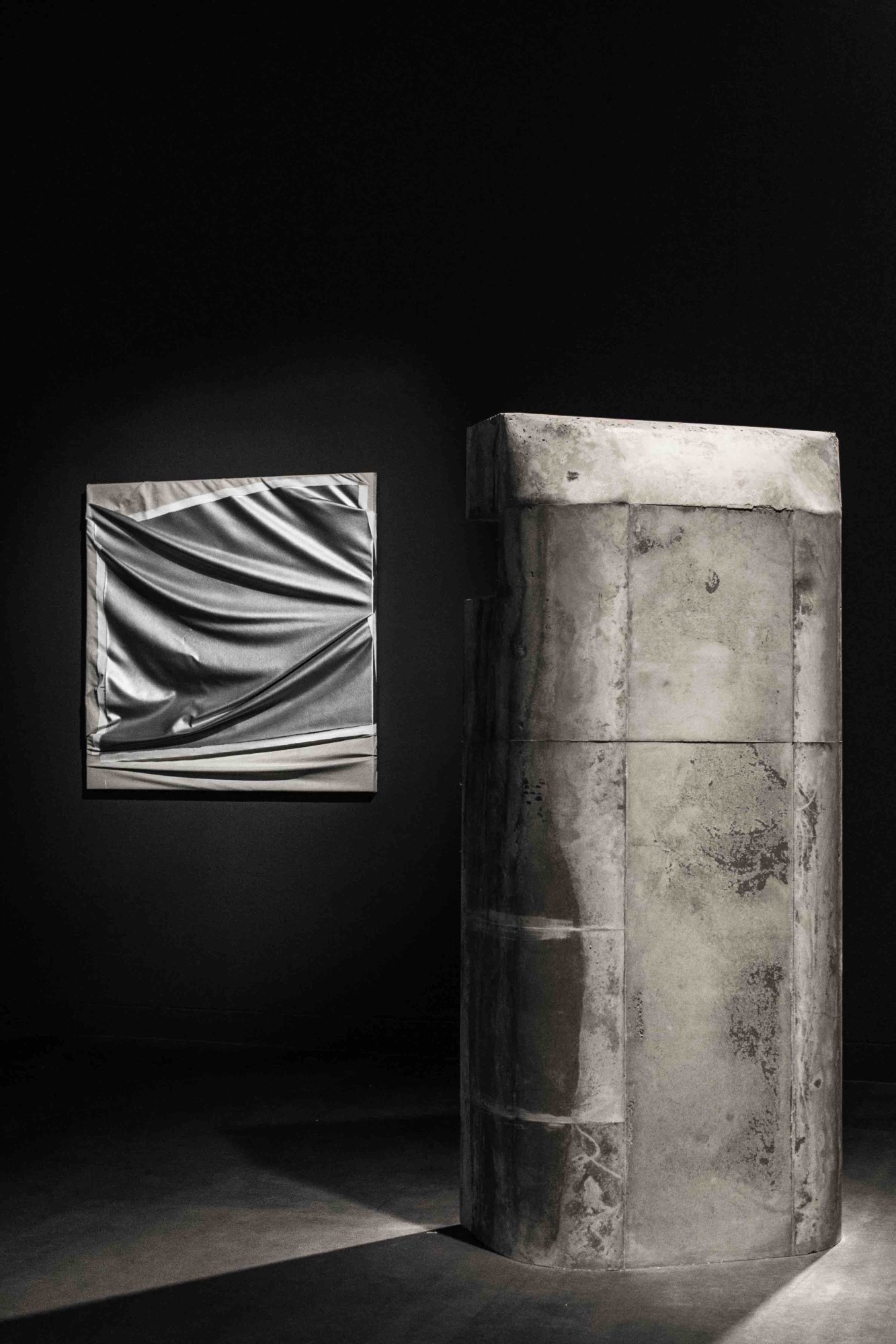
The Parrino painting — a continuous source of inspiration for Owens — features beige fabric manipulated through a similar pinching technique and pressed over canvas. This juxtaposition of art, bench, and video installation is one of the show’s few indicators of the working relationship between furniture and clothing.

Down a staircase, oddly reminiscent of the Lamy-designed marble steps in Owens recently opened New York flagship, is the main room. It’s home to foam and crystal rock “chairs,” a new addition made specifically for the exhibition. The chairs (which double as a table) are in fact prongs, claw-like structures inspired by brutalist architecture and German World War II bunkers. Key to nearly every piece, “this ‘claw’ can hold a six-meter plank in Elm wood floating with no other attachment — [and can be] cast in concrete for a seat or floating in foam,” says Lamy.
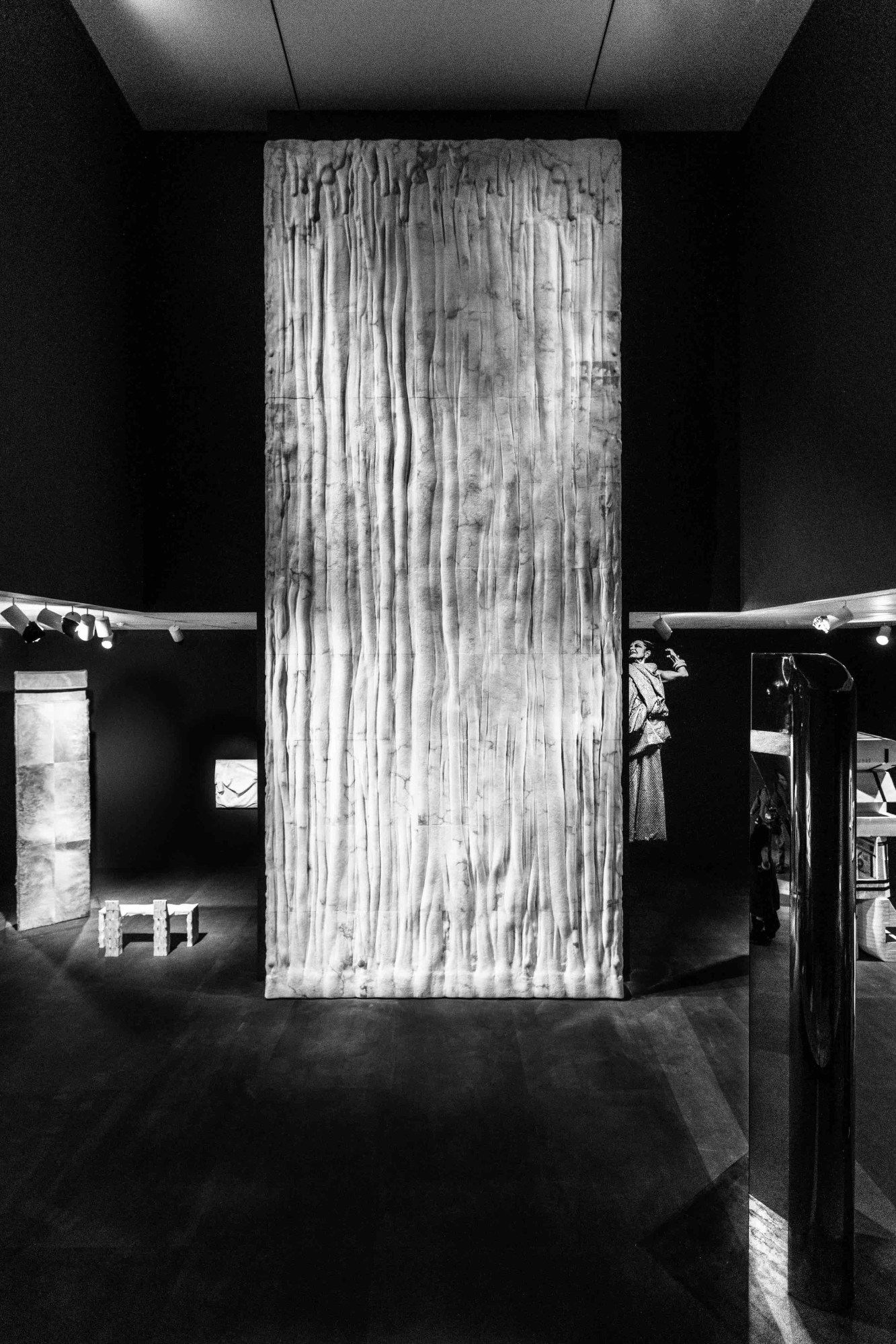
Beyond the crystal rock and foam lies a massive totem covered in camel hair. A docent indicates it’s okay to touch it. In another corner is a small bench made entirely out of ox bone — you can’t sit on that. Central to the exhibit is the “Weeping Wall,” a nearly 20-foot installation made from over two tons of alabaster. The wall, which melds 70 different carved panels into one fluid design, is both daunting and breathtaking. “It created mayhem with a few structural engineers but we did it,” says Lamy. On the far wall there is a large projection of Lamy, dressed in her usual gothic attire with gold teeth shining and jewelry clanking. It is clear who is at the heart of the exhibit. While Owens may draw the initial sketches, it is Lamy who is up at dawn, working alongside craftsman and artisans to source materials and fabricate the furniture and sculptures.

Minimalism is an odd way to describe Rick Owens. In terms of fashion at least, it is not the first word that comes to mind. But Curatorial Assistant Rebecca Matalon, who organized Furniture, repeats it time and time again. This is not Scandinavian minimalism, but the design concept, in the vein of Donald Judd, Frank Stella, and Sol LeWitt. “The juxtaposition of these forms and materials,” says Matalon, creates a paradox between design and appearance. “You have these cold hard surfaces of alabaster or concrete, and the sort of lushness of foam or fur.” While the material choice is bold, from a design perspective, the pared-down elements are firmly in line with the minimalist tradition.
For this exhibition, Owens and Lamy wanted to move beyond functional pieces and explore more structural components, like the “Weeping Wall” and Camel Hair totem. In the sculptures, the juxtaposition of material and design becomes even more apparent. “This ‘and-ness’ is something that happens in the relationship between art and design, between furniture and sculpture,” says Matalon. It is what allows Lamy and Owens to bridge the gap between functional furniture and monolithic structures.
When asked how MOCA felt about hosting the first full-fledged Rick Owens furniture exhibition Matalon said, “Thrilled.” “It definitely feels like a homecoming,” she added.
“Furniture” is on show at the MOCA Pacific Design Center now through April 2, 2017.
moca.org
Credits
Text Asaf Rotman
Photography Owenscorp
