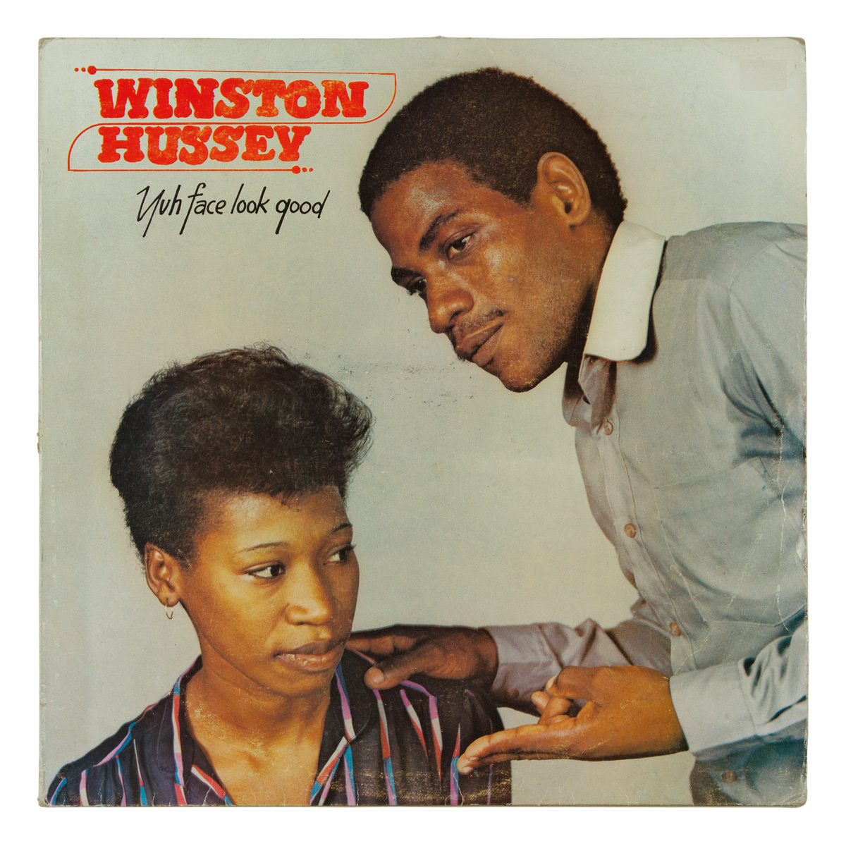
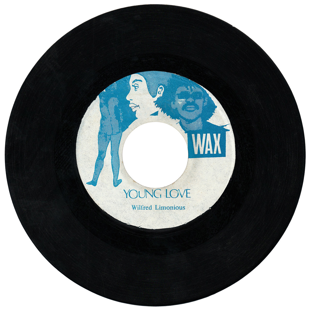
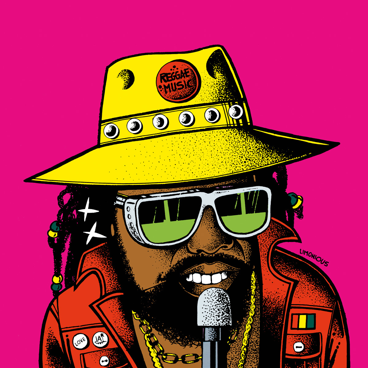
In the foundation days of Jamaican dancehall, Wilfred Limonious was responsible for gifting the music an entire visual language. A newspaper cartoonist who ended up designing thousands of album covers in the 80s and 90s, Limonious’ style – all hot pink and lurid yellow, jumping with sexy women, cheeky yardies, and scribbled patois commentary – has become a benchmark to which the scene constantly returns.
Now author Chris Bateman, and editor Al Newman (who previously worked on Clarks in Jamaica – a history of the island’s obsession with the UK footwear brand) have drawn together the first book compiling Limonious’s work. In Fine Style: The Dancehall Art of Wilfred Limonious gathers together a treasure trove of Limonious imagery, from his bawdy newspaper cartoons, to his iconic cover art. In advance of the book’s release, we asked Bateman and Newman to discuss the history, technique and legacy of dancehall’s greatest artist…

Tell us about Limonious – how much background knowledge do you have on him?
Christopher Bateman: Wilfred Limonious was born in 1949 near Albert Town in the parish of Trelawny. He was the eldest of seven children. From a very early age, he showed an interest in doodling and cartooning – Wilfred’s family is from a very rural part of Jamaica and his family members talk about how he loved to draw people, and that he could see you walking towards the house and present a picture of you by the time you reached him… His parents were very supportive of his creativity and his interest in the arts and I think that played a big part in him pursuing art as a career.
Al Newman: His professional career began in 1970 when his single-frame comic strips were published in the Laugh With Us section of the Jamaican newspaper The Star. He went on to become well known on the island as a newspaper cartoonist, creating strips such as Amos, Chicken, Shane and Shawn, Grass Root and Earth Runnings. From the mid- to the late 1970s he worked for JAMAL which stands or the Jamaican Movement for the Advancement of Literacy, as illustrator for their adult-literacy publications. After returning to Jamaica following a short stint studying in the UK he began illustrating LP jackets, with Shoulder Move by Jah Thomas being his first, as far as we can tell. He was also was a songwriter, singer and guitarist and recorded and released at least two songs of his own.
Was he trained in any orthodox way?
CB: He studied graphic design at the Jamaica School of Art, which is now a part of the Edna Manley College of the Visual and Performing Arts, so I would say that he was trained in a relatively orthodox way.
AN: He also attended the Barking College of Technology in the UK although we don’t know much about his time there as the college seem to have lost or destroyed records from that time.

How did he end up working with so many artists?
CB: He was becoming a relatively well-known newspaper cartoonist around the time that the dancehall sound was breaking in the early 1980s. Given the youthful and playful vibe of the music, having a cartoonist design your album cover would probably be a pretty good fit. As Al mentioned, his cover for Jah Thomas’ Shoulder Move LP was likely his first foray into album cover design.
AN: Yeah, that cover was something different and was really well received, and producers began to request him. At that time he was being commissioned by Neville Lee’s company, Sonic Sounds, and producer Ossie Thomas told us that initially Neville Lee kept Limonious’s identity a secret, so if you wanted a Limonious cover, you had to go through him. Word soon got out though, and he began working with many of Jamaica’s top record producers. Some of the main record labels that he worked closely with include George Phang’s Powerhouse, Winston Riley’s Techniques, Jah Thomas’s Midnight Rock, Prince Jazzbo’s Ujama, Ossie Thomas’s Black Solidarity and Hartnell ‘Sky High’ Henry’s Sky High Records, amongst many others.
Do you know much about his technical process?
CB: We have been fortunate to have met and talked with a number of Limonious’ design colleagues who were able to paint a pretty good picture of his process. For the most part, it seemed like a pretty simple system with outline drawings and colour percentage instructions.
AN: According to Winston ‘Fowly’ Dillon, a younger Jamaican designer who worked alongside Limonious, he used two weights of marker pen. He would produce a keyline drawing, then another colour mockup indicating to the printer which colours went where. He was a big fan of pure colours, particularly yellow, and would often mark up his mockups that way, 100% yellow, 100% magenta, etc. Deadly Dragon Sound in New York have a collection of original Limonious artworks, the original pen-and-ink pieces and colour mockups that would have been submitted to the printer, which were fascinating as they provided an insight into his working methods.
CB: some of his later records incorporate elements of collage, pieces of newsprint, cut-up pieces of paper, etc.

How did the idea of the retrospective come about? and how easy has it been to track down the imagery?
AN: I think both myself and Chris were amazed at how little information there is out there about such a prolific and talented artist and we wanted to showcase Limonious’ work and make it more accessible to people who wouldn’t otherwise come across it. Tracking down the imagery was a long and difficult task. The family for example don’t have an archive of Wilfred’s work. That’s one of the reasons the book took so long!
CB: For myself, the idea of a book retrospective was always the end goal with this project. Limonious’ style is so singular and foundational to the dancehall aesthetic and it was always a little bit of a head-scratcher as to why there had not been a book on his work. I began looking pretty seriously into the idea of putting together this retrospective after speaking to a graphic design contemporary of Limonious’ named Orville ‘Bagga’ Case, who was very supportive.
Obviously the dancehall covers have been influenced by the music – do you think there was a point where Limonious’s artwork ended up influencing the music back again?
AN: Personally I can’t think of an example of that happening.
CB: The closest thing that I can think of is was in the early 1990s, Limonious had a comic strip in a local tabloid called the Weekend Enquirer. Around the time, a seven-inch single came out by a deejay named Scorpion called “Enquirer” which was all about how great the newspaper was. Limonious designed the label art for the seven-inch.
AN: That’s a wicked tune and one of my favourite Limonious seven-inch centre designs. It was a for a label that you don’t see much called Super Chill. I think that Enquirer tune might have been the only tune that came out on the label. But Scorpion didn’t voice the song in response to Limonious’s artwork, he did it because he seems to have loved the Weekend Enquirer newspaper, so in general I’d say the answer is no. Saying that, I’m sure there must be examples out there. If you dig deep enough Jamaican artists have recorded tunes about everything under the sun. Take the Enquirer tune for example – all about how the Weekend Enquirer is better than The Gleaner and The Star. Can you imagine an artist in the UK recording a tune about how The Guardian is better than The Telegraph and The Times?

Has this kind of art – or profession – been lost in the digital age?
AN: To a certain degree I would say so, although there are still people producing illustrated comic-book-style reggae and dancehall album covers. Tony McDermott who did most of the covers for Greensleeves is still active, and there are newer artists such as Ellen G from Israel who has illustrated Limonious-style covers for Tuff Scout, Mungo’s Hifi and Necessary Mayhem. One of the things I love about Limonoius covers is his hand-drawn type, and I think with the advent of computers, that is something that is much less common now.
CB: I just read an interesting interview with Marlon James, the author of A Brief History of Seven Killings, who apparently also designed many of Sean Paul’s early album covers. He was talking about how he hand-drew many of those fonts from scratch. There are definitely different tools being used now to produce flyers and album art, and it may be less hands-on and tactile, but people are still going to be making album artwork that is relevant to their time and place. Much like Limonious was. They are not necessarily for album art, but artists like Robin Clare and Matthew McCarthy are producing some really great stuff right now with paint and paper.
What are your favourite Limonious pieces, and why?
AN: In terms of his LPs covers, I would say some of my favourites are the one-rhythm album Original Stalag 17-18 and 19 as well as Ghost Busters by Early B, Animal Party by Papa San, Shut Up Bway by Frankie Paul and the back cover of Tidal Wave, also by Frankie Paul, but there are so many great ones. I especially like the covers with the scribbled Patois commentary and still find hilarious lines today that I’ve missed even after looking at the covers for years and years. Limonious was a comedic genius.
CB: Ghost Busters and Animal Party for sure are some of my favourites. They are just so playful and creative. Oh, and the back cover for Reggae For the World in Dub featuring Joe Lick Shot has some classic scribbled commentary! So many good ones.
In Fine Style: The Dancehall Art of Wilfred Limonious is available from August 16th via OneLoveBooks.com
Credits
Text Ian McQuaid
