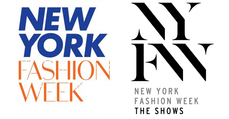
A battle of the logos is taking place this September at New York Fashion Week. Both the CFDA, which manages the official schedule, and WME-IMG, which will manage the official venue, have created their own respective interpretations of the four-letter acronym that will be emblazoned across NYFW-related material. The CFDA gave their logo some local flair with Knicks-colored letters that incorporate sewing stitches while WME-IMG went with a modernist interpretation – understated black and white stacked letters. Which one captures the spirit of fashion week best?
According to Mother, the design firm enlisted by WME-IMG, those simple four black letters required quite a bit of craft, creative thought, and branding strategy. “We wanted to create something that juxtaposed modernity with the classic nature of the letter forms,” said Christian Cervantes, the creative director of Mother in London. Mother has also designed marks for the Sundance Film Festival and CB2, among others.
When describing the particular design choices for their version of the NYFW logo, Cervantes continued: “Not to get too nerdy, but the forms are classic seraph type forms, all handcrafted. The modernity comes from the ligatures: the N and the Y share, the F and the W share. It’s really about connections that are made at NYFW and the collections and the dialogue that’s taking place within that week so we wanted something that had that energy to it.”
Of course, no one knows the power of a logo better than the fashion industry itself. “I think everyone loves the classic YSL logo. It’s such a beautiful mark, it has such presence to it, the intertwined letters,” said Cervantes when asked about his favorite logo in fashion. “I love the Hermès mark too, the signature above the actual typography, the illustration with the little horse. That speaks more to heritage.”
New York Fashion Week used to hold all of its shows at Lincoln Center, sponsored by Mercedes Benz. Then the action moved downtown to the hipper, seemingly more authentic venue, Milk Studios for MADE Fashion Week. Now William Morris Endeavor is in the mix (after it was bought by IMG), there’s a new season of menswear shows – plus new venues in SoHo and Midtown – and Lexus is the replacement big-name automobile sponsor. Conflicting logos are just a symptom of NYFW’s splintered identity.
So what does Cervantes think about the proliferation of logos at fashion week this season? “I think it will be confusing,” said Cervantes. “I don’t know if I’m supposed to be diplomatic about it. I think it’s interesting. People will respond to one or the other and I would imagine that one has more relevance to fashion than the other,” he said. “I’ll let you determine that one.”
Credits
Text Austen Leah Rosenfeld
