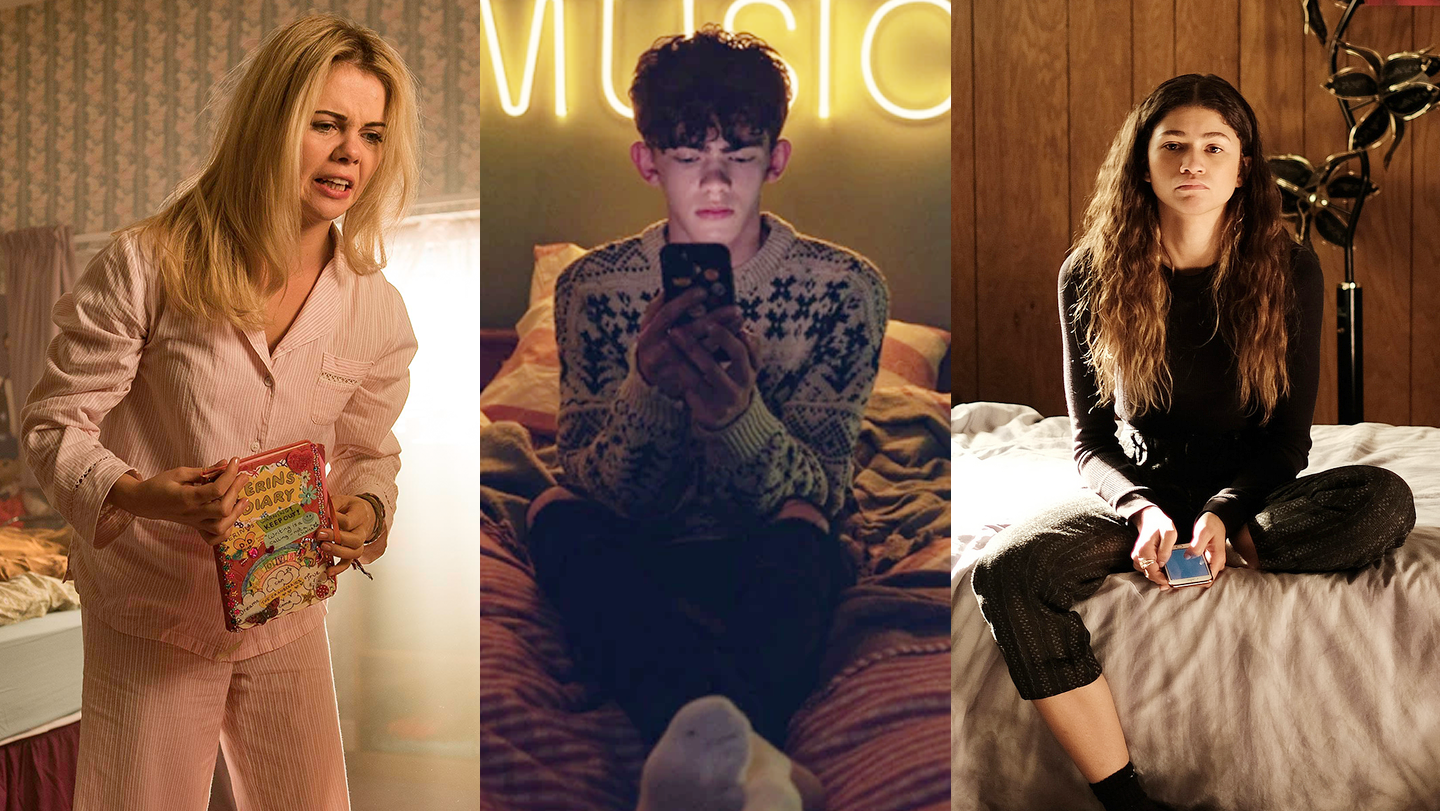
The teenage bedroom, like adolescence, is a uniquely liminal space. Whether it’s a festering melting pot of personalities or a carefully curated expression of self, there will always be remnants of childhood — cuddly toys, window stickers, a fading food stain — that portray the juvenile person you are trying to shed. It can be both a refuge and, when banished to it as punishment, a prison.
Recreating that space for television presents something of a challenge: How do you capture an age that mutates so fiercely? How do you depict an environment that’s supposed to represent who a person is, when they don’t even know who they are themselves? A slew of recent coming-of-age TV shows — including Heartstopper, Euphoria and Derry Girls — and the designers and decorators working on them, have risen to that challenge.
Tim Dickel, the production designer on Netflix’s new queer coming-of-ager Heartstopper, has a track record working on teenage-led projects, with credits on Skins and My Mad Fat Diary. But Heartstopper came with something those previous shows hadn’t: a visual aid in the form of the graphic novels it’s based on. “I knew that we had to reference [them]”, he says of Alice Oseman’s book series. It was important to Tim that people who saw Heartstopper, having read the graphic novels, would recognise the world Alice had drawn. “The idea”, says Tim, was to make the bedrooms themselves feel like they existed in a web-comic world, “so there would be no dirge-y, dark colours. It’s got a lightness of touch.”
As a result, the teenage bedrooms are vibrant and, mood-wise, somewhat idyllic, representative of the feel-good loveliness that fuels the show and the (mostly) sweet teenagers it revolves around. But even while existing in “comic land”, as Tim calls it, “they had to have a sense of real life.” That search for realism begins with him scouring on Pinterest, and then Instagram. Tim also finds that working with younger people on these projects allows him to stay in-tune with current trends. He can ask them questions: Do teenagers use bedside tables anymore? Bunting: is it in or out?
He asks friends of his with kids if they can send pictures of their rooms, which helps him “get a sense of the zeitgeist.” The actors also have a say, with Tim presenting his moodboards to them, and asking which bits they like or are comfortable with.
Production design is just as much about building a playground for the actors to inhabit as it is creating a space that we believe someone actually spends time in. This is particularly true of HBO’s wildly successful teen drama Euphoria. Set decorator Julia Altschul (“Anything that you see inside of a room a set decorator was involved in”, she clarifies), tells me that the set of Euphoria is dressed “in 360”. The entire room, even if the camera doesn’t have a reason to go there, will be furnished. “Not all shows do that”, says Julia. But Euphoria isn’t like most shows, and its teenage characters lead especially messy and dysfunctional lives.
For Julia, this meant adopting a slightly new approach to her work. “I’m a perfectionist, [but] I don’t think that’s always served me,” she says. “Sometimes it’s in the imperfection that you find gold. Kids are not perfectly placing everything on the wall or folding their clothes.” In order to reconstruct a teenage bedroom, Julia had to “let go”. She recalls a moment when dressing Cassie (Sydney Sweeney) and Lexi’s (Maude Apatow) shared, split-level bedroom: “I stood on Lexi’s side and I had clothes in my hand and I threw [them] all the way across the room onto Cassie’s side. I was like, ‘Where this shirt lands is where it lands.’”
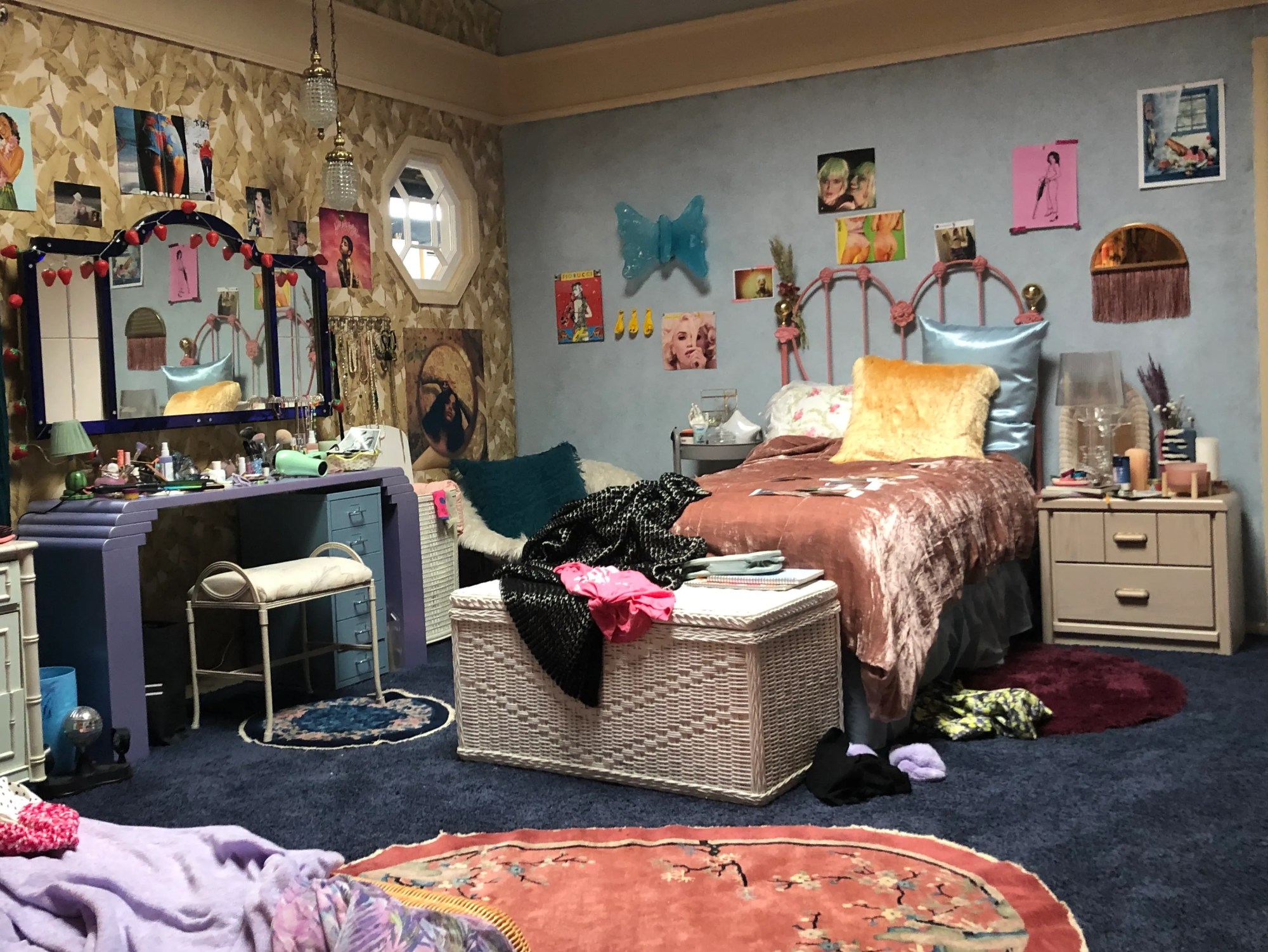
Just like Tim had a dialogue with the cast of Heartstopper, Julia also worked closely with some of Euphoria’s cast members. “When we were creating Jules’ New York apartment”, Julia recalls, “Hunter [Schafer, the actress who plays Jules] actually made art for the bedroom. So the watercolour [paints] and paintbrushes and pastels were used. It’s the little details like that that really matter.” Julia also reaches out to the cast before production gets underway and asks them what they feel like their character might “be into right now. What music are they listening to? What art would they like? Who are they inspired by? That’s where we get a lot of ideas for posters and art on the walls.”
Speaking of details, there are multiple scenes of destruction that take place in Euphoria, most memorably when Rue (Zendaya) has a meltdown in episode five of the second season, or in an earlier episode when, whilst dancing to Bobby Darin’s “Call Me Irresponsible”, she swipes a slew of her belongings off of her dresser, sending them scattering across the room. “We have to be really thoughtful about what we’re putting in their spaces that are okay to destroy”, explains Julia. The key to a successful set build is a delicate dance between authenticity, the needs of the actors and the standards of on-set safety.
In the 90s, American high school TV series, like Saved By The Bell, Sister Sister and Moesha, all featured on-screen teenage bedrooms that felt gigantic compared to the average teenager’s. It turns out, that’s not just because these were middle-class, suburban characters. “Part of my job is to scout locations and find environments that work [within the context of the show]”, says Jason Baldwin Stewart, the production designer on season two of Euphoria. “You offer up an architecture” that works for the story and the filmmakers, he adds. “Sometimes they just need more space to continue shots.” Because Euphoria is such a heightened show, narratively and visually, the environments have to accommodate that, and allow for the dynamic, boundary-pushing cinematography for which the series has become known.
Which sometimes means pulling down walls as well as boundaries. “I don’t think there’s one set we used just as it was,” Jason says. “That’s the cool nature of the show.” In season two, which sought to push the characters and their spaces to darker, more mature places, the spaces they inhabited had to adapt. “I was worried people might take offence to their favourite characters’ rooms changing, with no explanation as to why.” His explanation? “It’s not happenstance. We make choices in the service of visual storytelling.”
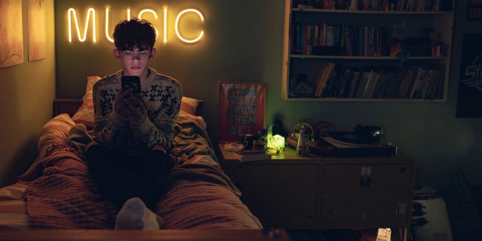
The design of the bedrooms is also an opportunity for us to learn more about a character than they might let on, or know about themselves. One of Heartstopper’s most refreshing traits is how it pokes at stereotypes. Our protagonist Charlie, played by Joe Locke, might be a musically-gifted, shy nerd, but he’s also athletic and openly gay. The typically confident ‘jock’ character, embodied by Charlie’s rugby-playing love interest Nick, played by Kit Connor, is more confused and insecure. Their bedrooms personify this contrast and help us understand what each character brings to the table and why such a partnership might work.
Charlie’s bedroom is adorned with band posters (Daft Punk, Radiohead, Muse, The Strokes), an overflowing bookcase, a Penguin Classics book cover poster of Brideshead Revisited and a framed print that reads “Stand Tall Show Them All”. He has a defined set of tastes and interests and a sense of himself. Nick, on the other hand, has more of a sparsely decorated room; blue walls, a sports car print, a propped up tennis racket and a string of fairy lights. He’s still very much navigating what kind of things — and what kind of people — he likes.
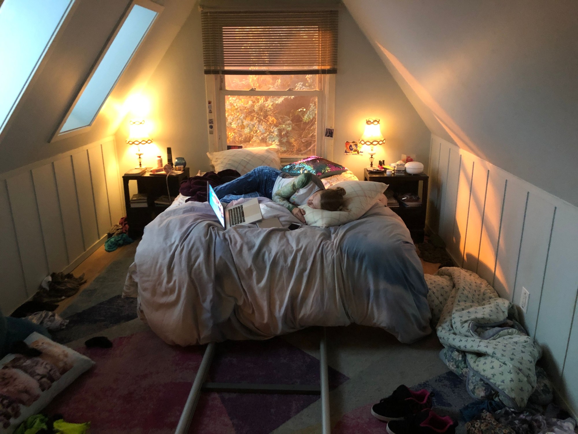
Similarly in Euphoria, Rue and Jules are relative opposites who embark on a turbulent relationship together. Rue’s bedroom has a grungy, pit-like feel to it — fabrics draped over lamps, mismatched furniture and general dishevelment — which entirely corresponds with her need to get her shit together. Julia, Euphoria’s set decorator, describes the colour palette as “earthy with a little bit of acid.” Jules, meanwhile, has a rooftop attic room. Julia says this “shows how Jules is this airier, kind of lighter character. I see her as floating in the clouds”. Jules could be the light at the end of Rue’s tunnel of drug addiction; the person that lifts her out of the darkness.
While Heartstopper and Euphoria both have their finger on the pulse of what teenagers’ bedrooms look like now, they’re slightly too cool to feel representative of most of our own. The bedrooms of the 90s-set sitcom Derry Girls — particularly Erin’s, played by Saoirse-Monica Jackson — captures the slightly cringe side of adolescent expression perfectly.
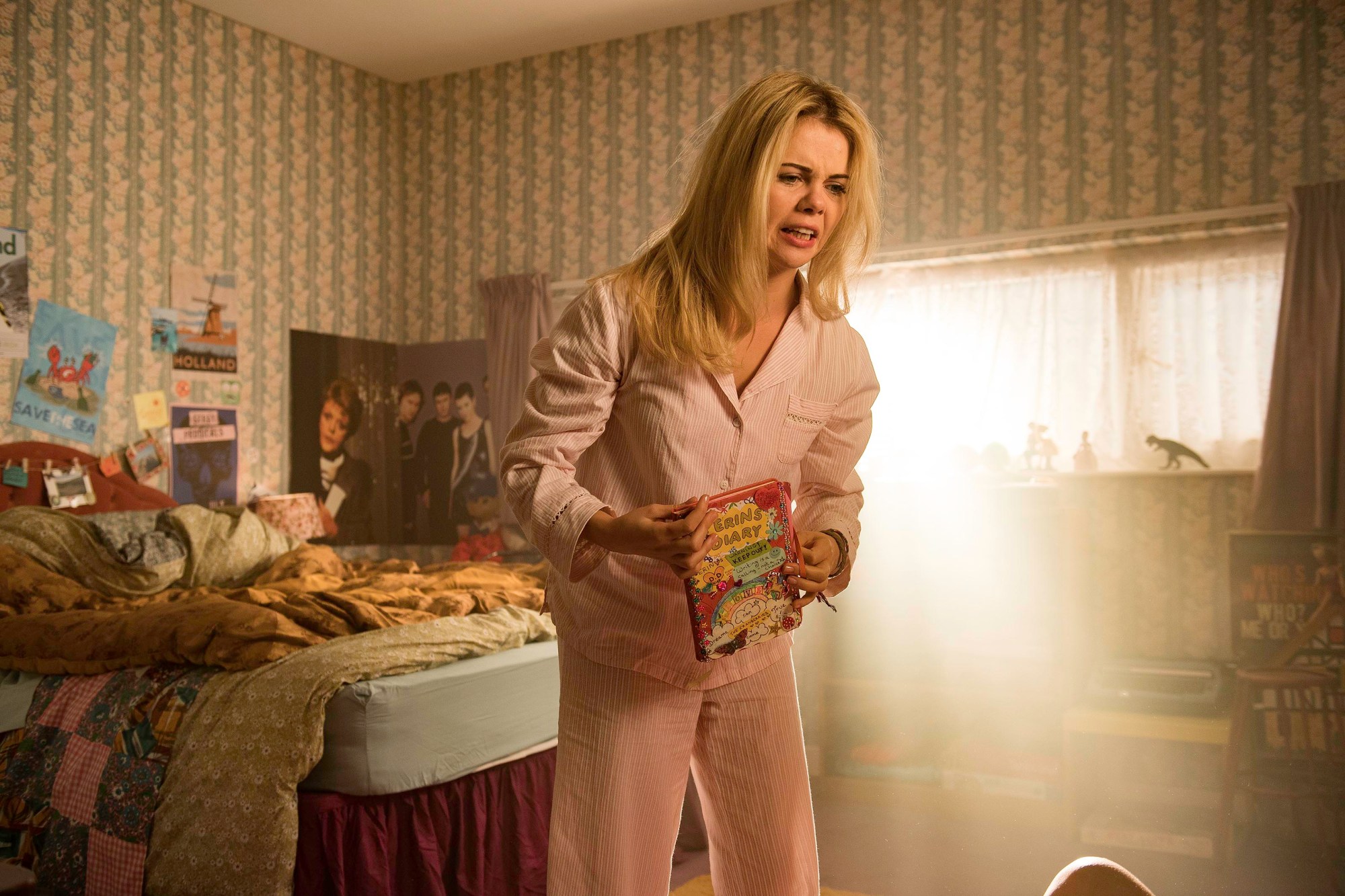
“Teenagers have rights now, you know,” Erin declares to her parents, a little half-heartedly in the kitchen one morning. Her bedroom illustrates the particularly fraught period that your teenage years are, trying to exercise freedom and individuality while still living under your parents’ roof. Amid posters of Sinead O’Connor and The Cranberries, as well as a hefty boombox and computer, there are childhood totems: a troll doll, an abacus, a creepy framed stitch work of a clown. In season two, Erin’s cousin Orla (Louisa Harland) calls dibs on her Sylvanian Families dolls if Erin dies. With its patterned wallpaper and vibe of old-lady-chic-meets-wannabe-rebel, it’s anything but cool. Thus, it nails the brief.
Ultimately, what makes any on-screen teenage bedroom feel truthful is a sense that, like the person who occupies it, it’s a work-in-progress, incoherent and failing to adhere to any strong aesthetic. As Julia reminds us: “It’s a canvas”.
