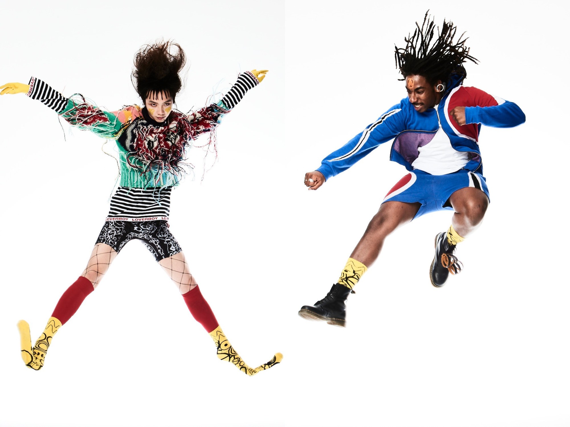
As a young independent designer, navigating fashion’s commercial infrastructure can be a rather bewildering endeavour. From the outside, it looks simple enough, right? Stuff gets shown on a runway; a couple months later, there it is on the hanger — job’s a good’un. But between that point-A-to-B journey from show to shop floor lies a byzantine system of showrooms, sales agents, buyers, distributors and more, with each taking their cut along the way.
For decades, this model served as the unchallenged default for emerging designers looking to bring their work to the world. In recent years, however, spurred by the direct-to-customer access that social media allows, we’ve seen an increasing number of the industry’s most exciting young talents take the task of selling their work into their own hands.
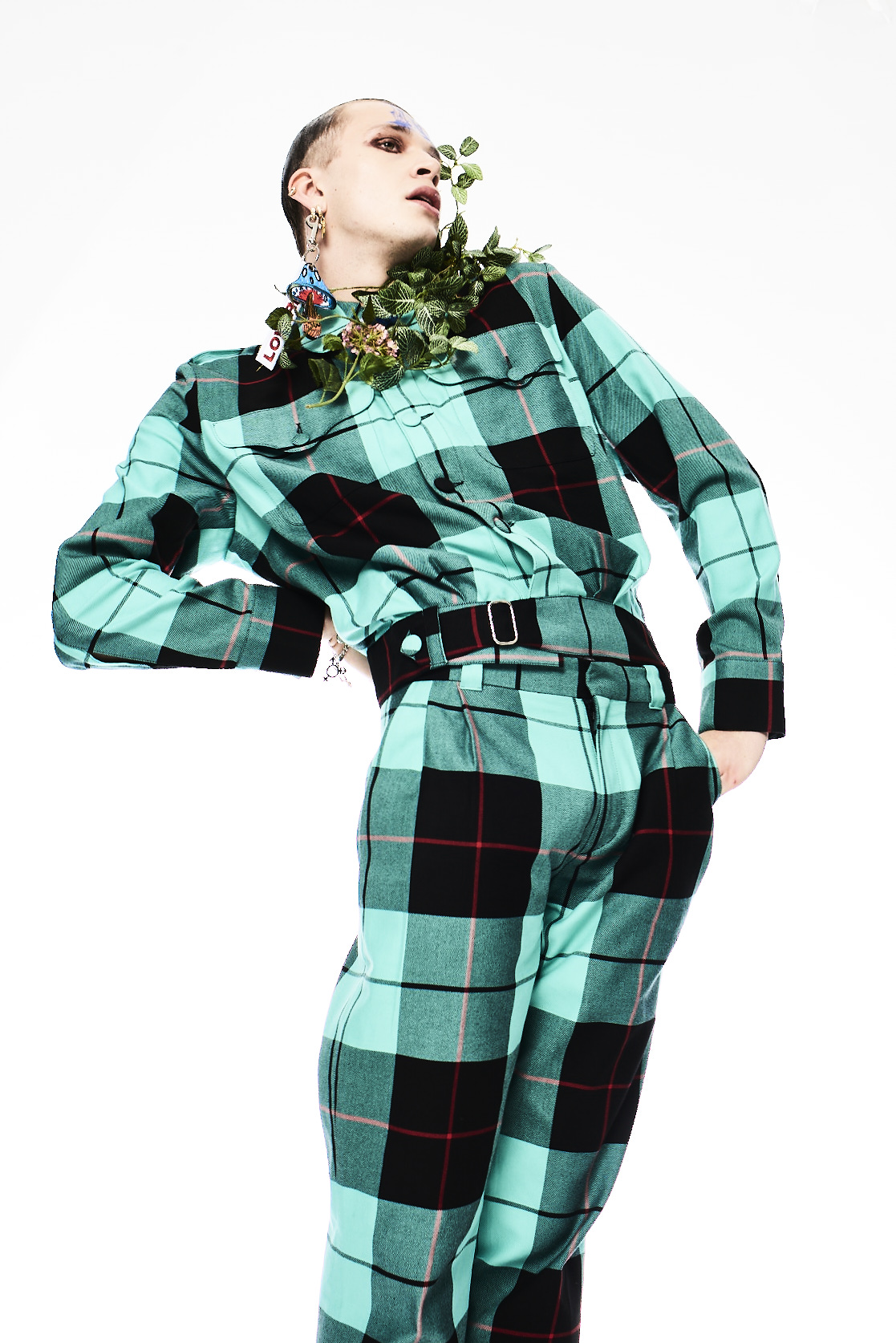
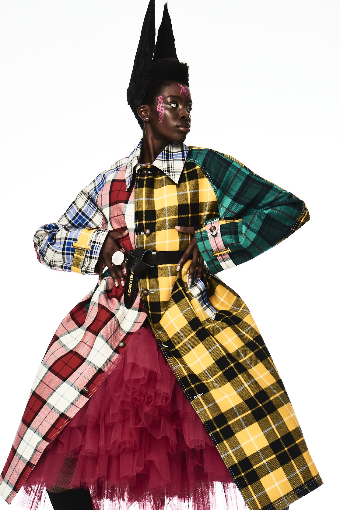
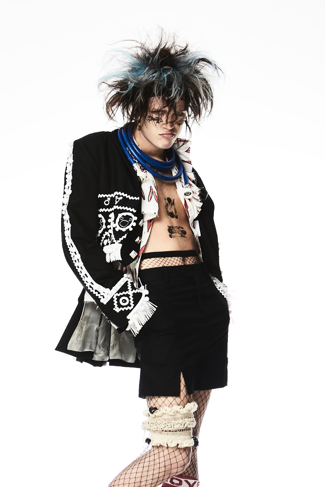
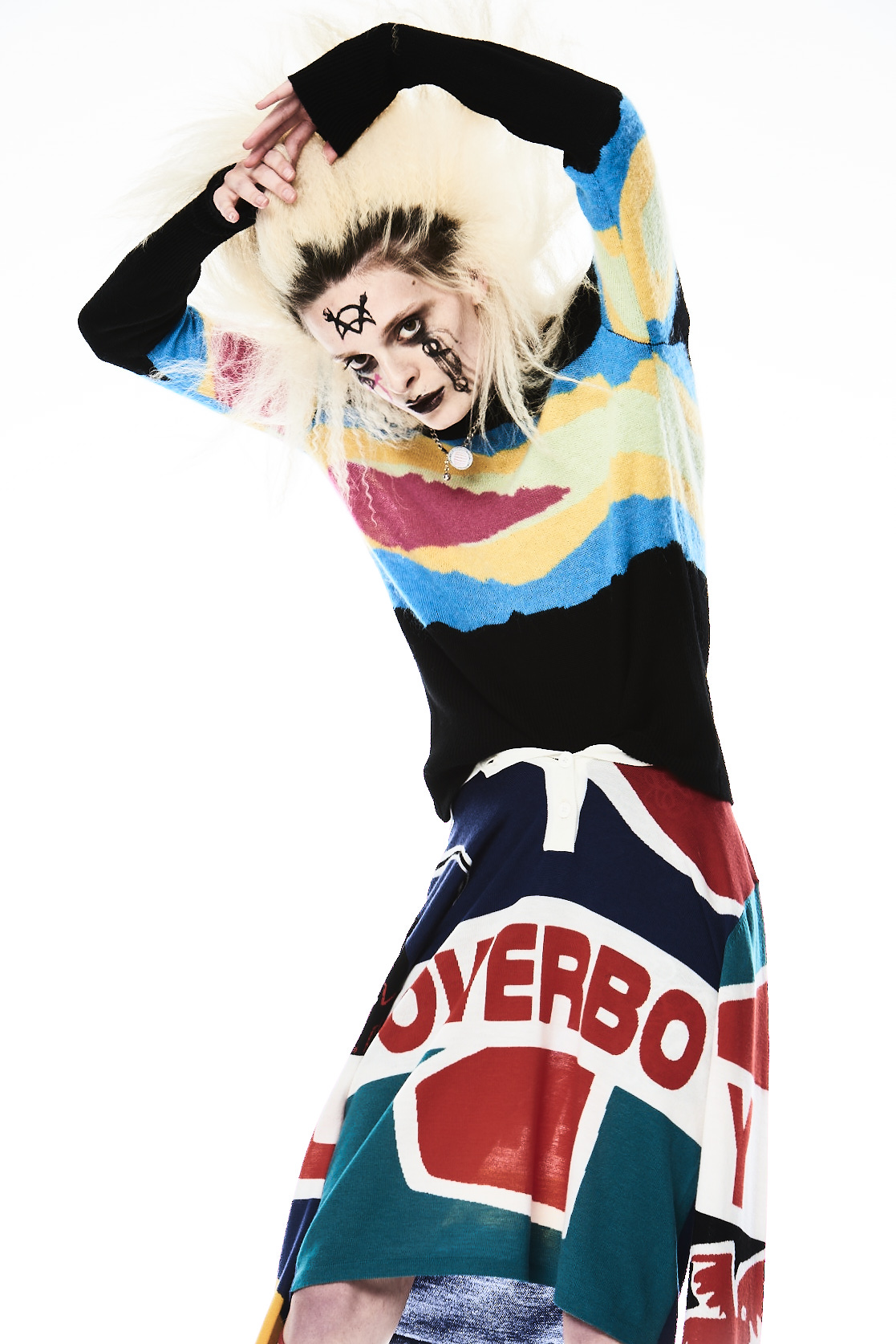
The latest to do so is London’s one and only Charles Jeffrey, who today launches a new digital platform, LOVERBOY.net, built by James Musgrave. More than just your average shopping site, it’s a full-throttle immersion into the vibrant, rollicking universe that the brand has painstakingly elaborated since its founding. On entering the site, you’re invited to ‘choose your player’, before being led to a revolving lineup of fantastical LOVERBOY avatars, shot and styled by Charles himself. As one would expect, they’re clad in pieces from HELL MEND YOU, the brand’s AW20 collection. That’s not all, though; the site also offers brand superfans access to limited edition reissued pieces from the brand’s archive, as well as a range of online-only pieces and a series of exclusive prints — it’s the first time that the designer’s artwork has been available for public purchase.
The site’s video game-style interactivity — which owes much to Charles’ childhood dreams of becoming a game designer — is amplified by Robert Fox’s audio landscape of eerily trippy LOVERBOY ‘adverts’, punctuated by the slurred quips of Hamish, the lovably potty-mouthed, “mildly inebriated” guardian of LOVERBOY’s virtual realm. To learn more about him, the site, and the archive grails on offer, we had a quick catch up with Charles.
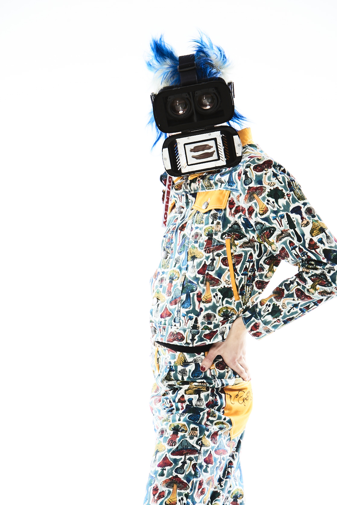
So who is Hamish exactly? Hamish is kind of an alter ego of mine… he’s a bit ‘me-when-I’m-completely-smashed’. He’s our site’s shopkeeper. The idea is that he’s wearing a VR headset, and that audiences experience the site through his eyes.
Where does your interest in video games come from, and how do gaming elements feature on the site? I was obsessed with video games from the time I had my first Gameboy. I guess I would have been about four… and it’s just something I’ve always been into. I loved Pokémon, Digimon… I love the idea of exploring characters, and I’ve always approached fashion like that. A sort of ‘choose your fighter’ mentality — we’ve approached the model shots in that way, almost a superhero line-up.
Many young designers seem to be taking the current climate as an opportunity to launch their direct-to-consumer platforms. How long has yours been in the works, and did the pandemic accelerate the decision? We’ve been working on this site build since the beginning of the year — and to be honest, while it didn’t necessarily speed up the process, I do think that lockdown made the end result better. We saw it originally as a bit of a summer facelift; but as you’ll see from the site, it’s become something much bigger. It’s been really important to me that this platform is kind of the essence of LOVERBOY — LOVERBOY concentrated! — and obviously this time’s been helpful in really getting to grips with who you are as a creative. The site’s really meant to be a space for fun. It’s escapist; I hope it makes people chuckle.
As an independent designer, what would you say are the main benefits to be gained from selling straight to your customers? It’s massively useful to be able to get direct, first-hand insight into what your audience wants to engage with and buy. Instagram allows for a lot of that, and we do spend a lot of time tracking and analysing stuff. We also speak to our stores every week about what’s doing well for their audiences — but there’s a lot to be gained from being able to take a closer look at the part of our audience who I think are going to shop LOVERBOY.net. I think brand sites are invariably where the die-hards end up, aren’t they? Because we have archives on the site as well as new seasons, we’re able to use it as not only a testing ground for new stuff — we’re also able to revisit old favourites and reflect on how they do. This is also the first time I’ve been able to send my prints directly to a LOVERBOY audience; we’re putting around thirty new artworks onto the site. I spend a lot of time doing private commissions, or work in the art space in a way that’s quite industry-focused. These pieces we’re selling are really immediate, personal pieces of work.
How did you go about choosing which archive piece to reissue? Any particular highlights to look out for? I’m so happy we were able to reissue. The idea of seasons feels increasingly redundant, so it just made sense. I’m thinking of it as a bit of a Greatest Hits edit — we chose pieces with some of the best ‘screen appeal’! There’s so much good stuff on there… it goes back as far as our AW18 ‘Tantrum’ show, actually. I think my favourite’s our Go-Go dress from SS20; it was inspired by Poly Styrene.

Visit LOVERBOY.net here.
Credits
All imagery courtesy of LOVERBOY
