Any subculture has its hidden icons — early pioneers whose memory becomes the cherished preserve of its original devotees. One such example is Anarchic Adjustment, the maverick streetwear brand that emerged at the intersection of the skate, freestyle BMX and proto-rave scenes of the late 80s.
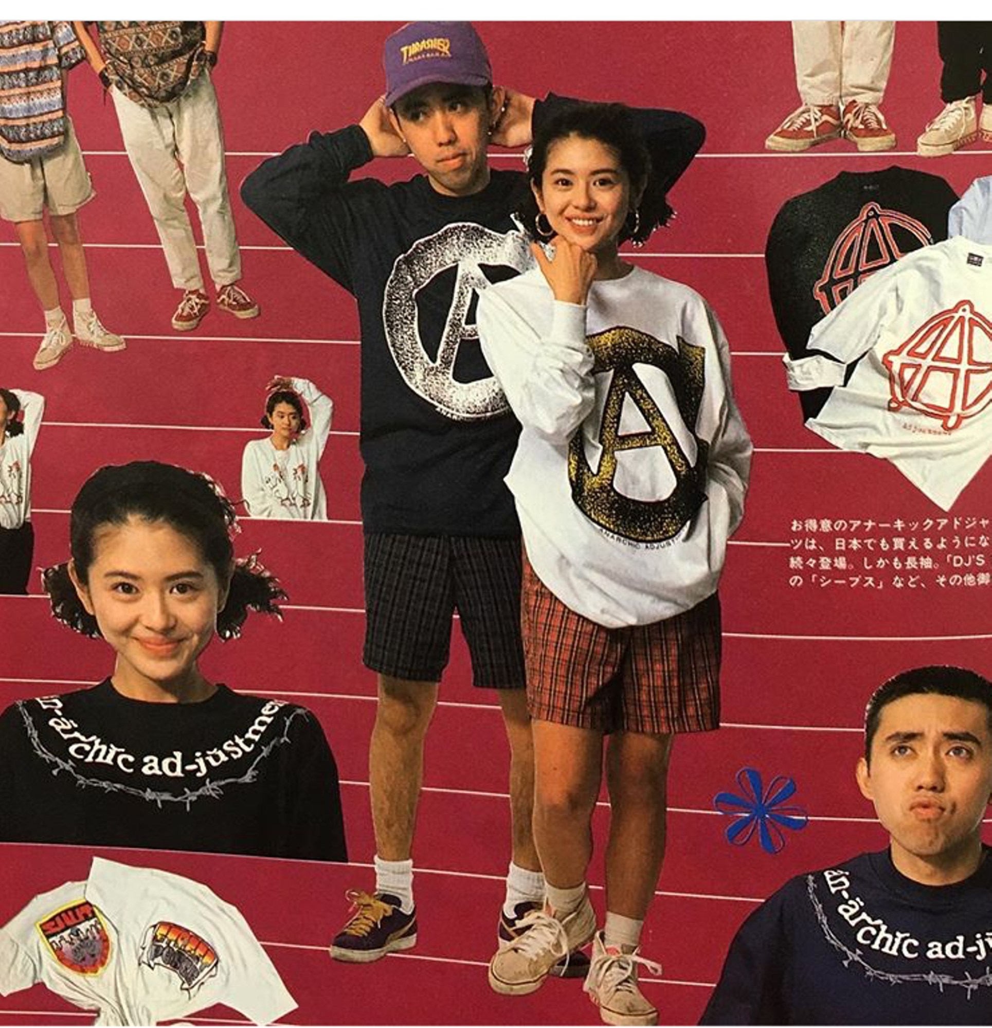
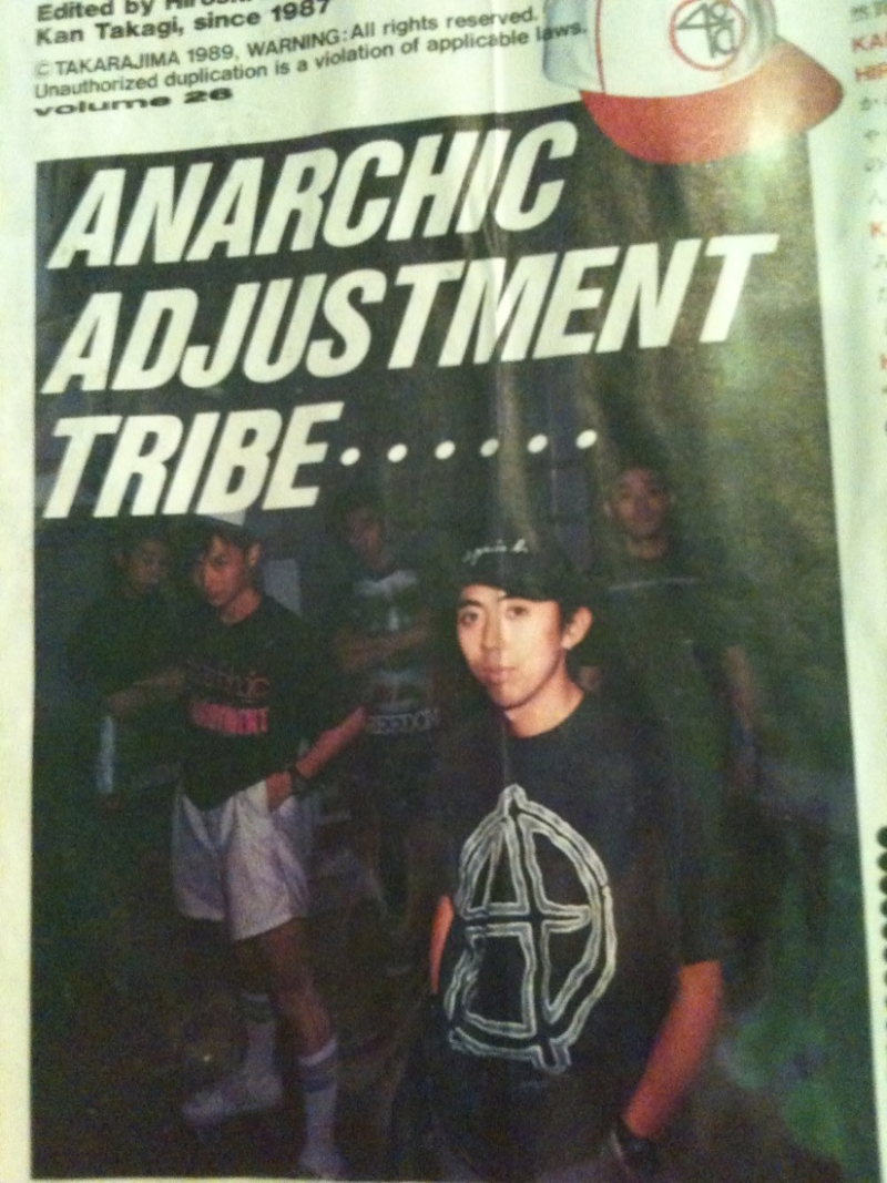
Hailed for its irreverent paste-up graphics, the brand enjoyed cultish success throughout the 90s, particularly in Japan, where it opened two standalone stores. Its roots, though, lie in London, where the brand’s founder Nick Phillip worked as the art director of the seminal freestyle BMX-turned-skateboarding magazine RaD.
“While he was at the heart of the skate scene, he was also kind of outside it,” explains Palace’s Fergus Purcell, the creative mind behind the skate brand’s graphics, including its triangle logo. “He was from the world of freestyle BMX, and at that time in particular, BMX and skateboarding were almost seen as lying at opposite ends of the spectrum. It created an intriguing kind of tension in his work. He was someone who was really out there, doing their own thing — an outsider, essentially.”
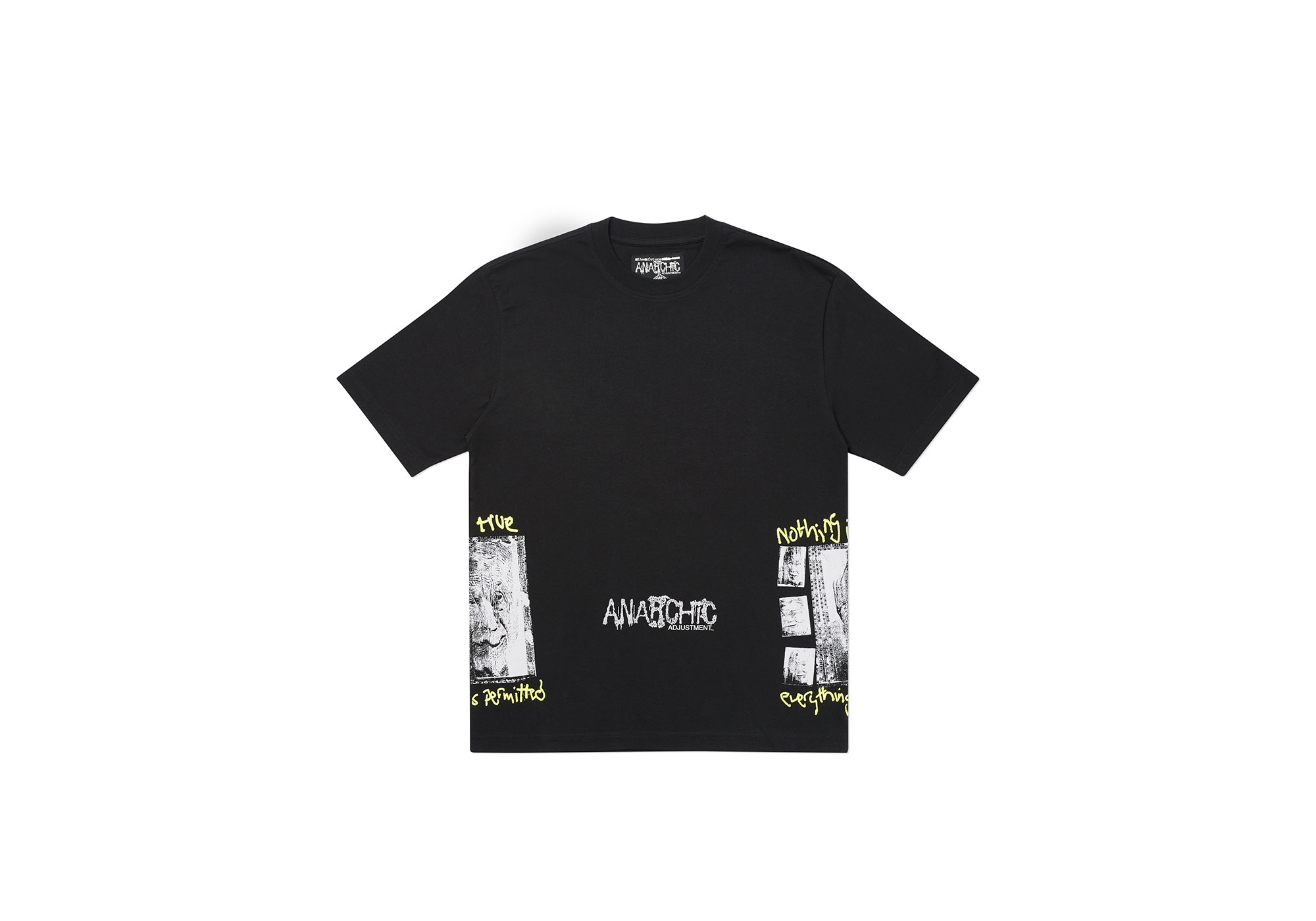
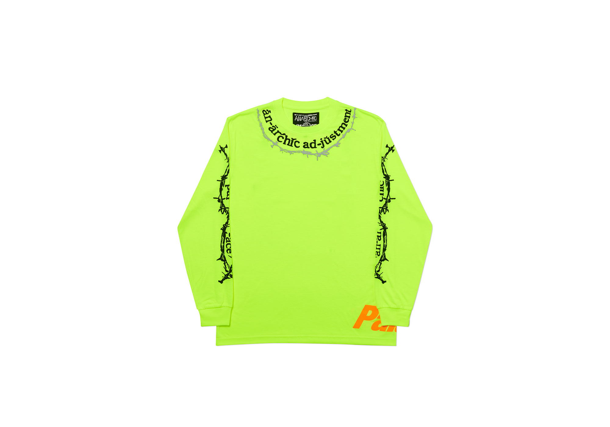
Now, as a new generation of streetwear fans begin to rediscover the significance of Anarchic Adjustment, they’ve joined forces with Palace to create a SS20 capsule collection. Rather than a nostalgic run of re-issues, the collaboration saw Fergus and Nick trawl Anarchic’s early archives, sampling and editing their source material to create something wholly new.
Eager to hear more about this coming together of two of streetwear’s most influential visual minds, we had Fergus and Nick jump on a Zoom call together to discuss more.
Fergus Purcell: I knew your work from reading RaD. I think the first specific Anarchic Adjustment imagery I saw was an advert in the back of the magazine. What struck me was that, though all the skateboard brands were doing amazing stuff, which was especially exciting to my 18-year-old imagination, Anarchic was something different, even in that landscape — something more subversive. Maybe that’s because it was specific to the UK, so there was a different layer you could directly relate to it on.
Nick Phillip: I was just lucky, I just walked into a job at RaD when it was a fully BMX magazine, no skateboards, and they were selling the title to a bigger publishing company. Tim Leighton-Boyce was the only person that wanted to carry on, and believed that it could be something else. I walked in with this really crappy Anarchic Adjustment advert that I’d made for our first ever T-shirt and asked if I could put it in the mag. He said, ‘Looking at the state of the thing that you’re giving us, you need to learn a bit of graphic design.’ So I went off to Saint Martins. They had an evening school. I got into a big row with the professor and got kicked out.
I didn’t know this!
Yeah, basically I went in just needing to know how to do paste art so I could do this thing for this magazine, and he was going on about ‘isms’ and all that codswallop. Then we were all given a 4″ x 4″ card and asked to visually represent a word on it. The word, honestly, was anarchy! And I’d already started Anarchic in my bedroom at that point. Everyone was putting their little cards down, but I just said ‘fuck it’, got some Tippex, and drew a square on the table with an anarchy ‘A’ on it. I thought that truly represented the concept — thinking outside the box, outside the system. But yeah, they fucking kicked me out, they hated me.
[laughs]
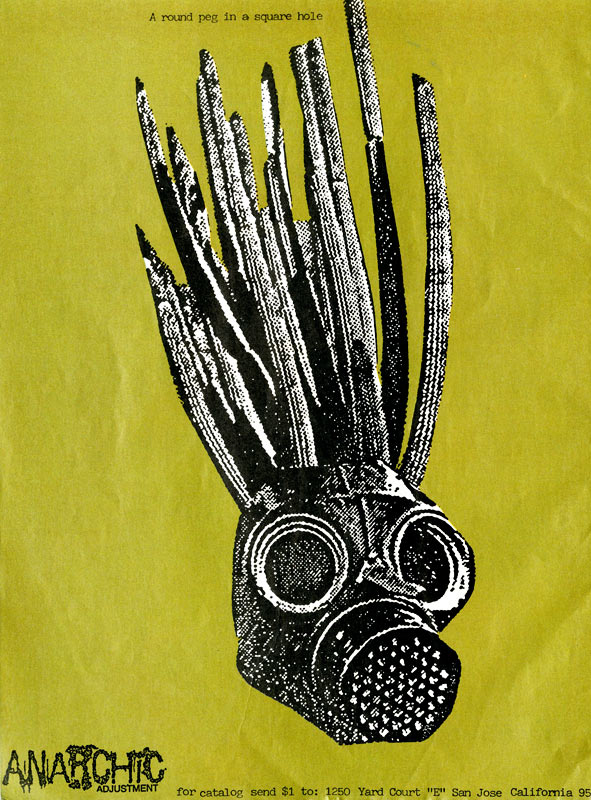
But I did manage to learn enough in the time to create an advert that the magazine would print, and they offered me a job. I made every single conceivable mistake that you can make doing a magazine! I put skateboards through the slide scanner, and did all kinds of shit, trying to make it look like a skateboard zine — xeroxes and scraping fluorescent Sharpie over the slides. It was just a matter of being in the right place at the right time. It was the late 80s, the birth of street culture in London, and I just went with what was going on.
A large part of skate culture has always been the graphics, and your visuals were so exciting and arresting, so unusual for the time. They really made the world of conventional graphics look tired and boring.
Yeah, and if you were a skater, you were carrying a canvas with you all the time, a skateboard.
Another important aspect is that the graphic goes on the underside of the board, which is what’s going to get destroyed. It creates an amazing creative situation, as a graphic is created with its disposability in mind. There were all these things about the culture that were really exciting, and your work still stood out. You just spoke about making mistakes, but if something looks good, it’s subject to its own rules.
Yeah, a mistake in a John Cage kind of way. When you mention destroying, though, it really chimes with RaD mag, which stood for ‘Read and Destroy’. Tim Leighton-Boyce always intended that it wasn’t about being ‘rad’, which sounds kitschy now and has a certain nostalgic value, but it was about reading it and destroying your preconceptions.
You could say something similar about Palace. It first appeared to me when a guy who was working for me at the time he said “Oi, have a look at this, these guys are really cool, they could be the next Supreme — take a look.” I looked at the logo and thought ‘Fucking hell, that’s really cool’. All that meta shit about the Penrose triangle — making the impossible possible, and the impossibility of the possible — just collapsed and became this iconic symbol which you then had on the backs of loads of cool people. Now that we’ve done this collaboration, I’ve discovered all these connections between us, like the South Bank and Slam City Skates. Palace and Anarchic also share this DIY ethic. Looking at the early Palace videos, they were so irreverent and low-res — and that was the point of it all.
That’s why I was so excited when Ben Allnutt, who heads up Palace’s co-branded projects, suggested this. It was always in the back of my mind, but I never proposed it myself as it felt like such a personal project, such a ‘me’ kind of thing. But as soon as he mentioned it, I was like ‘Fuck yes’!
So was I. Fucking brilliant, let’s go for it. The funny thing is that in the time that we were building the collection, Anarchic has had a big revival in Japan among these young kids who hadn’t even been born when I designed this stuff, and they’re buying it now off eBay.
So I was really excited when the prospect of working with Palace came up. I guess the kids in Japan are looking at the roots of streetwear, how the timeline of streetwear developed, and are interested in who influenced who. Back then, Hiroshi Fujiwara really pushed Anarchic Adjustment in Japan, as did his protégé Nigo, who went on to do A Bathing Ape. All these cosmic coincidences meant I was really excited to work on this with you guys.
Pulling it together reminded me of seeing my DJ friends doing remixes — sharing source files, fucking with them, sending the results back and forth and so on. You also came forward with a phrase, ‘the future is unwritten’, which became an important touchstone. I think we were both really keen to avoid this being a nostalgic exercise, so that really gave us an impetus to blur the line between what had previously existed and what we’d added.
When I saw that on the label, I was really stoked that you related to that, because it’s a really positive message. The future is unwritten — we have agency, fucking get on with it! It avoids making the whole thing about ‘Oh, once upon a time, Anarchic was an influential brand,’ and places the future at the heart of things.
Yeah, and that really shaped how we approached designing. It was fantastic to kind of revisit graphics that were made without computers with all of the benefits of current technology.

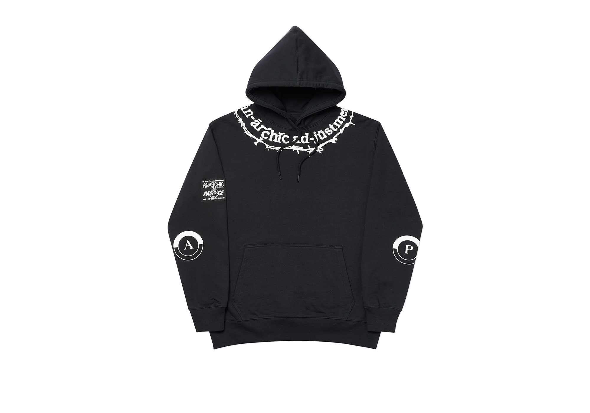
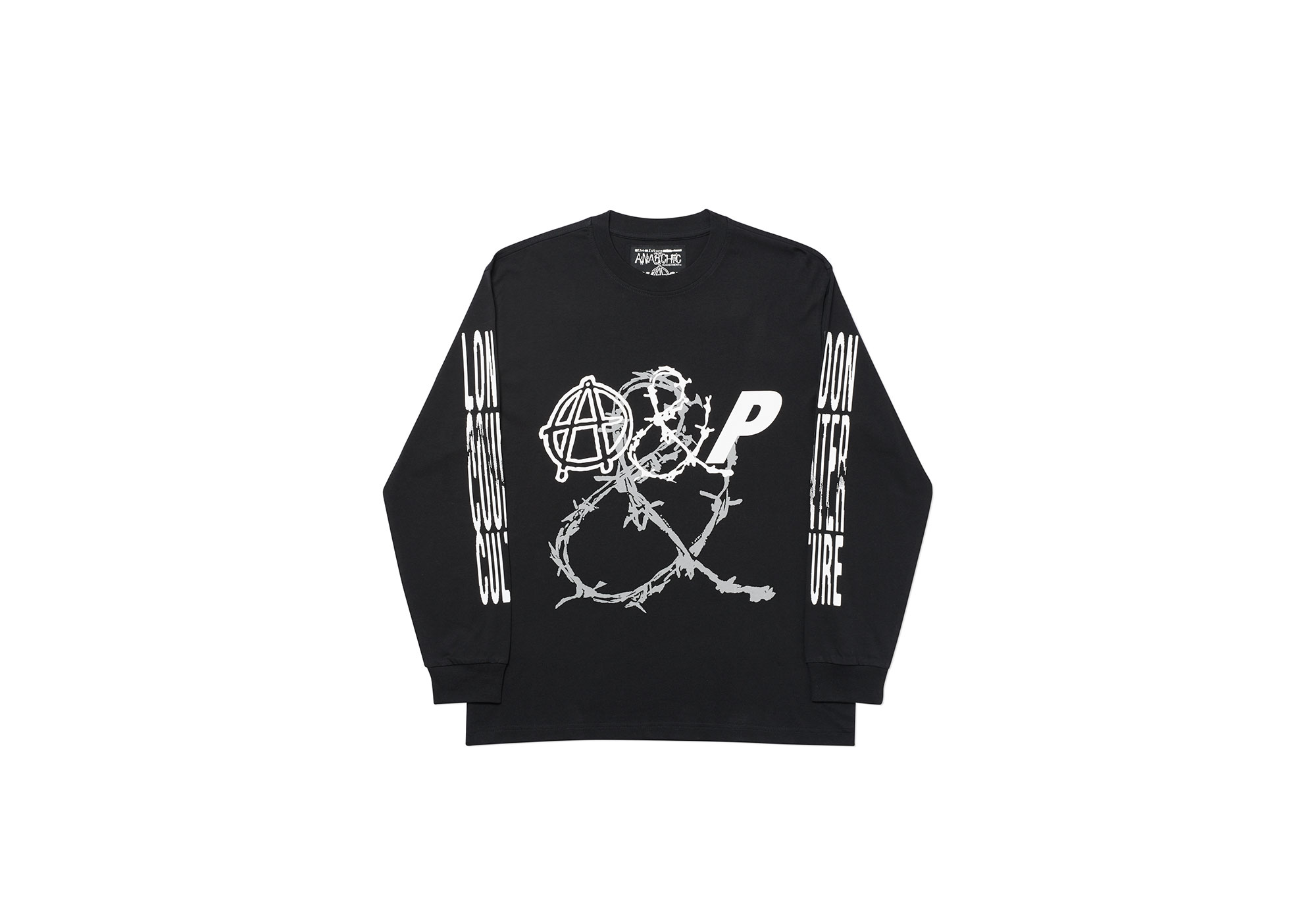
One of your ideas that I really liked was using the clean Anarchic logo, one of the three that we had, and putting a ‘P’ in there in the same font. It’s something you mentioned when we very first started talking about this ages ago, and I remember thinking ‘Yeah, that looks really fucking good,’ so I’m glad that it made it into the final collection. And I think the way you used it, especially the final location on the garments, was amazing. Actually, the locations across the whole collection are great.
I’m glad you bring that up because that aspect was really of its time, but something you pushed in an even more unusual direction. You did prints that wrapped around the side of the garment, on the hip, for example. And I wanted to use this collaboration as an excuse to get into that, which we don’t typically do all that much of at Palace.
There were things like prints on the side of a t-shirt, or the logo with barbed wire around the collar. And printers hate doing stuff like that, they bloody moan about it!
There wasn’t really a blueprint for a lot of stuff back then, though — you didn’t make an Instagram account and follow certain steps, it was a very different kind of world. I was trying to think of words that Anarchic and Palace have in common, and I was thinking insubordinate or disobedient, maybe. I don’t know if there’s another word for taking the piss but also making a statement, but if there is then I think that’s something that the two brands would share.
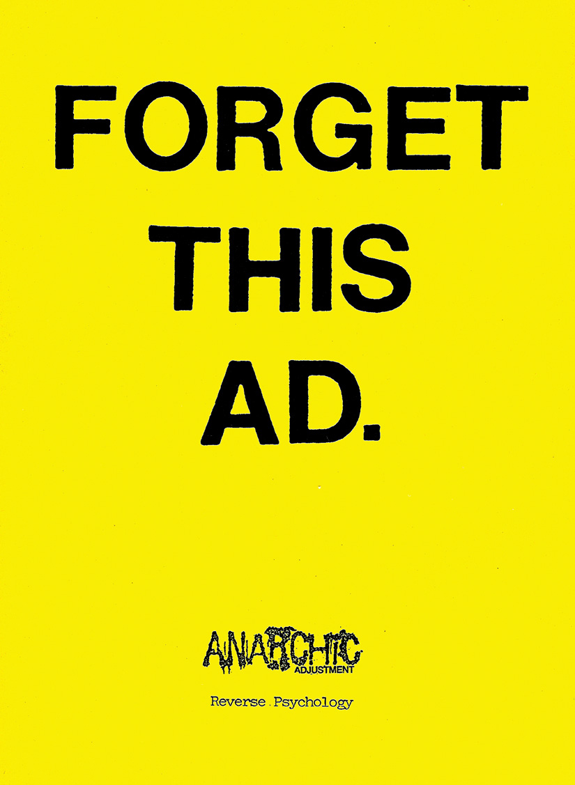
That’s something you were a master of in your advertising — counter-marketing is an appropriate way to describe it.
“Forget this ad!”
Exactly! When it comes to this collaboration, it feels appropriate to talk about it similarly and say that people can make of it what they like, that ultimately it all refers back to this central motif, ‘the future is unwritten’.
Which seems even more relevant now than it was when we settled on it! Today is fucking unwritten, it really is. When I was talking to Ben about the collaboration a little while ago, he said that he’d wanted to do it for a long time, and that one of the things he hoped it would achieve was to let some of the kids who maybe don’t know about the history of streetwear, who don’t know about the history of Anarchic Adjustment, find out about it. ‘History lesson’ sounds a bit fucking didactic, but he said he thought it would be cool if some of the kids realised that this has a history to it — that it’s not just about what the drop is this Saturday. I thought that was a really cool thing.
Palace Anarchic Adjustment launches here on Friday 24 April at 11AM BST
Credits
Archive images courtesy of Nick Phillip
Flat shots via Palace