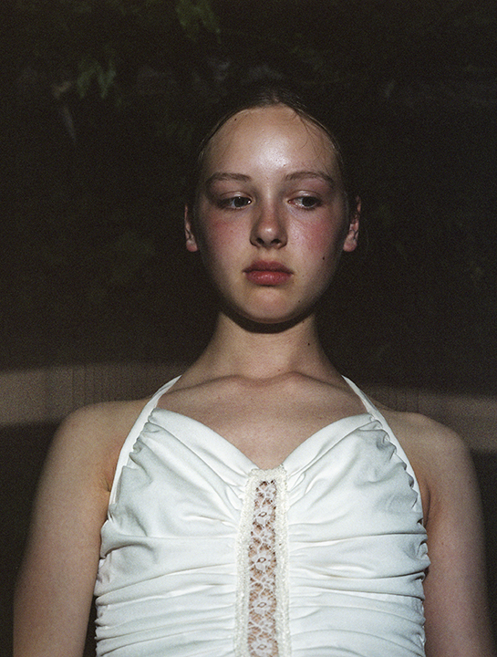
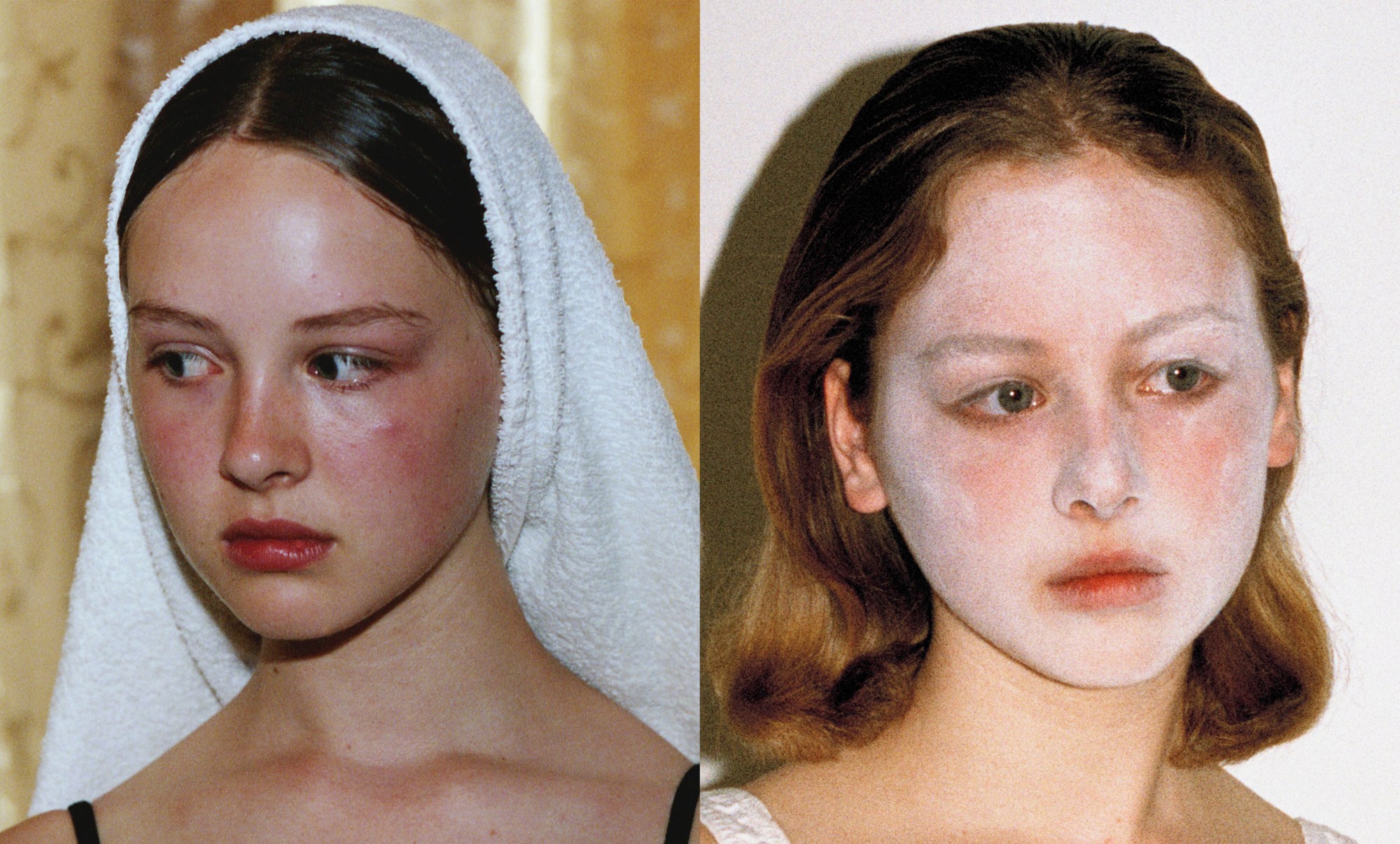
There’s something quite indescribable about the way Alice Neale takes portraits of girls and women, the tender beauty her photographs capture. The blurb for her new book, Protect, published by Claire De Rouen, compares her work to that of the French Impressionist Edgar Degas, which is apt enough to bear repeating, and true, too, in that they both have a knack for capturing quietness and intimacy and solitude.
Protect, as Alice describes it, is about “the moments before a performance, when anything might happen. It’s about setting the scene and watching life as it goes by, then capturing those moments in-between.” In doing so it finds a neat parallel with Degas portraits of off-duty ballerinas, at rest between shows, and his portraits of the modern working women of late 19th century Paris.
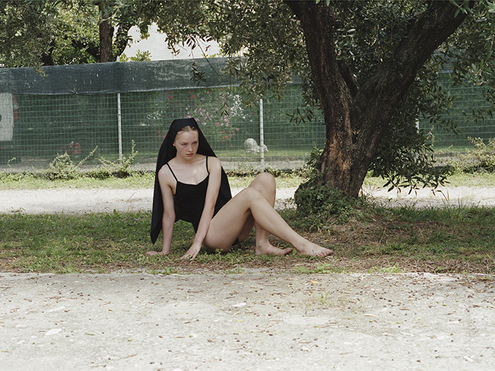
But Protect reaches towards something a little more modern to temper that romanticism with. Created with stylist Isabelle Sayer and graphic designer Rory Gleeson, Protect was shot between Issy’s bedroom in London and the small Italian town of Pietrasanta, in Tuscany. The Catholic church in the centre of town provides a centre point for Protect too. The pictures twisting around classical religious motifs — a towel wrapped around a head, for example — spin a little lo-fi web around the sweet simplicity of baroque devotional portraiture.
Protect finds a thrilling tension in contrasting those historic references with a more contemporary mise-en-scene; cars and modern buildings and chicken wire fences and a bottle of Fairy liquid in the background.
We caught up with Alice and Isabelle to find out more…
How did the book come about?
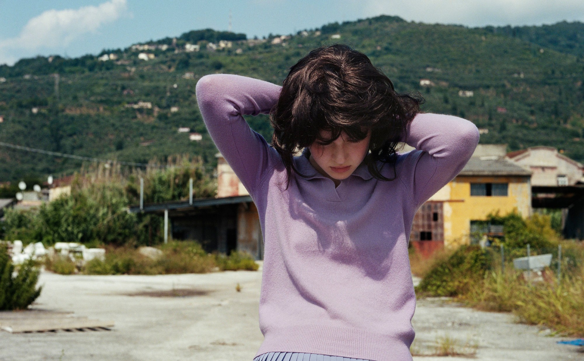
We shot the first half of images in Issy’s bedroom in London. We did this twice because the first time we’d used a bad wig — the second time was more successful. We went through the images from those first shoots and had a conversation about what we felt the images needed, and we wanted to introduce a totally contrasting environment and landscape — Issy put an old 80s Italian backdrop next to one of the portraits I’d taken and we knew we had to go. We travelled to Pietrasanta without too much of a plan and it all unfolded very naturally. A close friend, Matteo, had family in Italy so we went and met them and this intimate portrait of Italy began there with his mother and sister.
And what about the name — Protect ?
We thought of the name after the book had been completed. It comes from wearing a powdered face as a form of expression, stepping into character to perform. Pietrasanta seemed to revolve around the church, and this really ended up shaping the images. Sass — who we used as the model throughout — evolved as a character when we took the project to Italy. The religious connotations throughout the book were very much inspired by our surroundings and day to day life in Pietrasanta and its church.
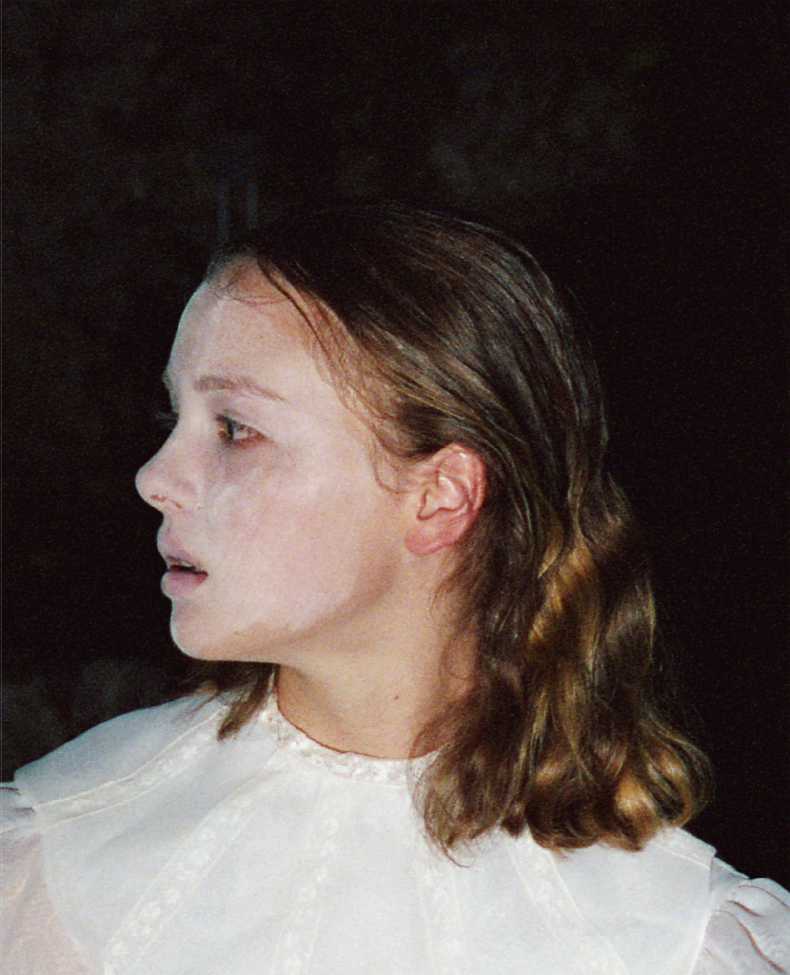
Can you tell us a little about Sass, the model.
Sass is a friend of Isabelle’s and had been keen to be involved with something with her best friend, Yun. So the project began with the idea of shooting both friends together in this theatre-like environment. Matteo’s mother and sister are the other key characters in the book. He took us to his wonderful house and studio where they all live. It was very idyllic and had an incredible view of the mountains.
Issy, can you talk us through the fashion in the book.
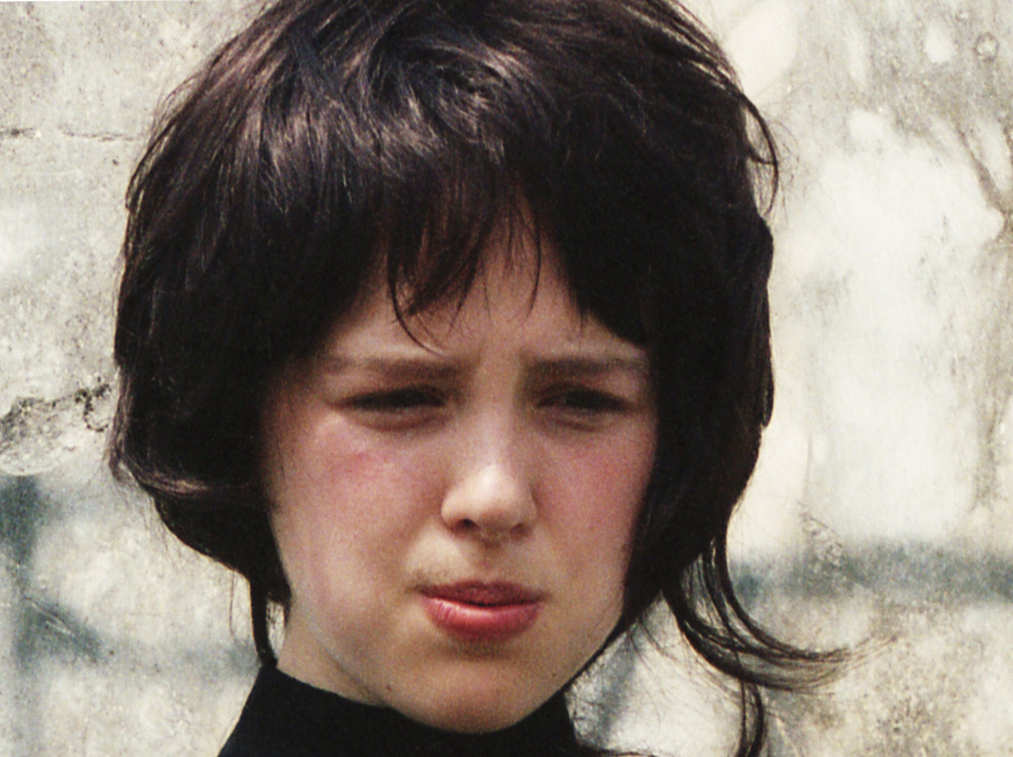
I couldn’t take a lot so I was very particular as to what I chose. Matteo’s family and Sass were central to everything, and I like the idea of them as different characters in 60s, 70s rural Italy. That was just a starting point, but I wasn’t too strict, I just chose things to help create the images, nothing that would dominate. I didn’t have a plan of exactly what I would do in Italy until I arrived. The people walking to and from the main church inspired the story and the evolution of Sass’s character. Some of the pieces I used were from Matteo’s sister’s wardrobe as she owned lots of beautiful things, like her adult communion dress. Also I have to thank Fiona, Steve and Claire at Rellik, Susie at Modes and More and Heather at ChiChiRaRa — everything in the book is from them.
What do you like most about the book?
We like that it really represents us together. We did the whole thing start to finish so we had total control of how we wanted it to be. Rory Gleeson, who did the graphic design of the book, was amazing to work with. It’s rare you leave a project feeling totally content but we did with this. Normally you always feel there is room for improvement or things that you wish you could change. It was also so nice working together on something as a team. The trip to Pietrasanta was really fun, we brought Sass with us — her first time in Italy — and Alyssandra, Alice’s assistant, who took on more of a key role. Nothing was rushed.
Why do you think photobooks are still important?
When an image can change your mood, there’s nothing like a photobook. Isabelle and I can’t get our heads around the internet. We much prefer the pace of a book.
