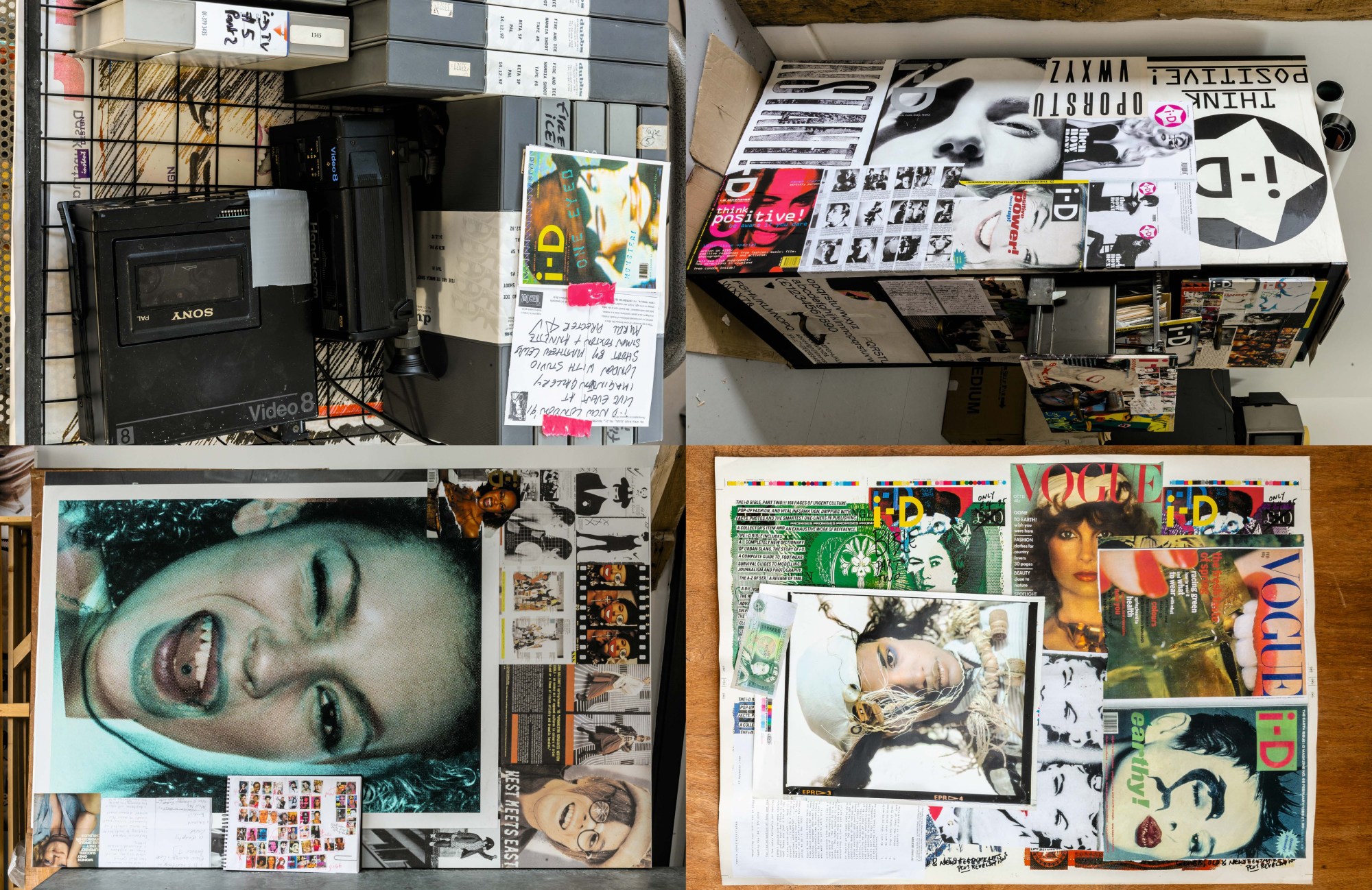
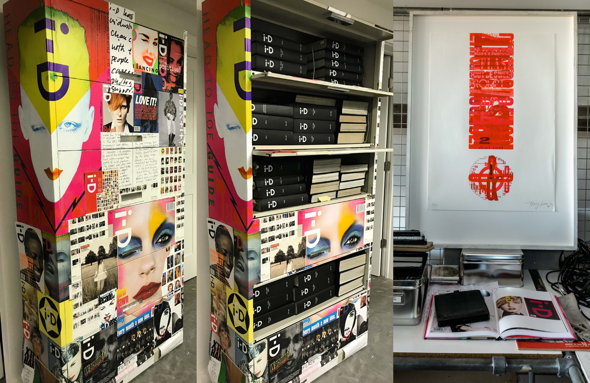
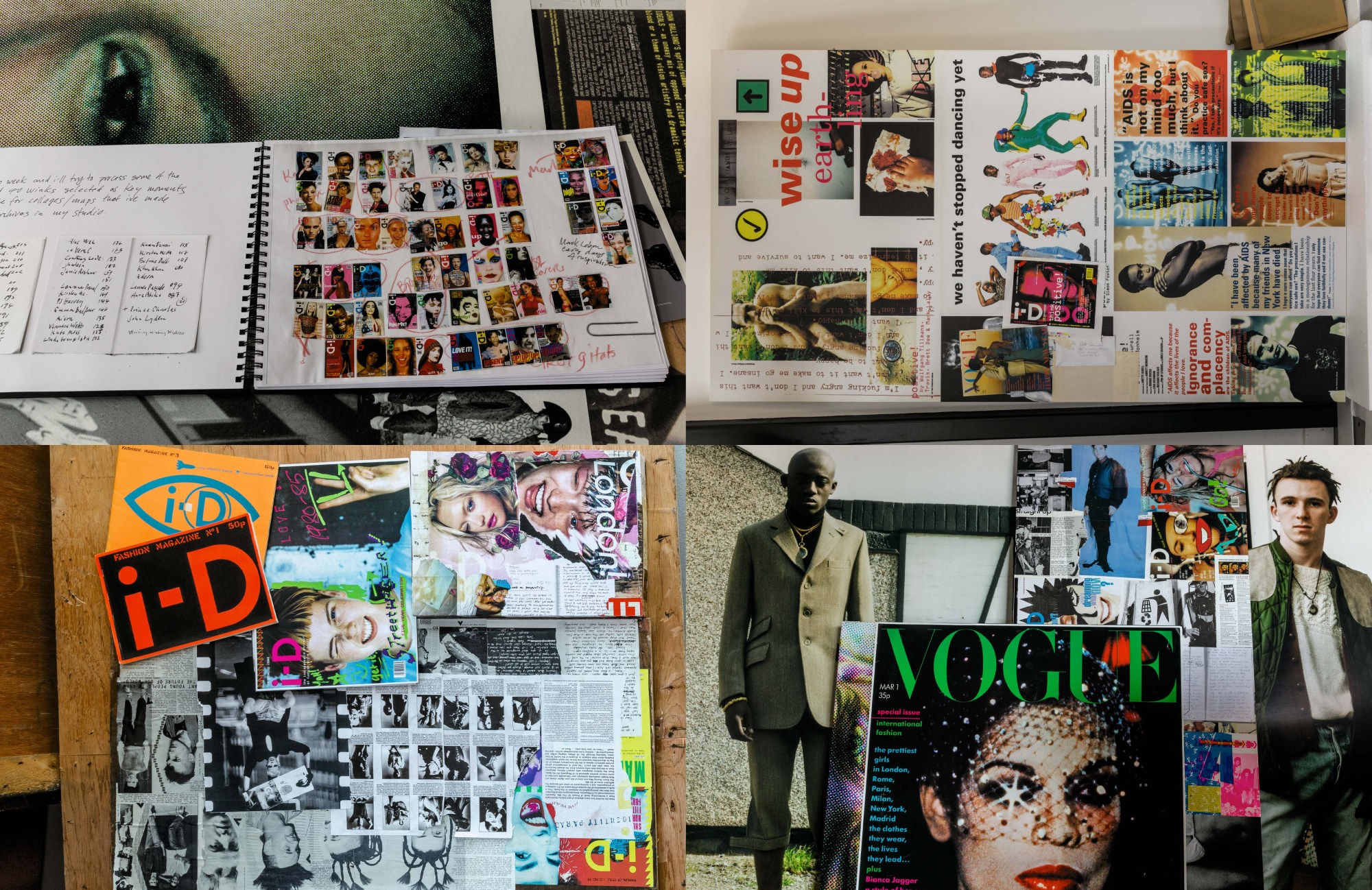
Blink! Wink! The speed of a camera lens. A second, a year, a month, another memorable cover. I wanted to select my favourite winks from the i-D cover archive, from the time that Tony Elliott and Time Out secured the continual survival of i-D until 2013. Because it was really with Tony’s support and organisation that i-D grew into a globally recognised voice for diversity, and it was with Tricia’s constant common sense and massive guidance with our creative team we built a solid identity and tone of respect in the world of style and fashion.
Each cover has its own story and the links between the different covers in each of these collages are part of a larger story that’s been jumbling around my head since we moved from London to Wiltshire in June, 2019.
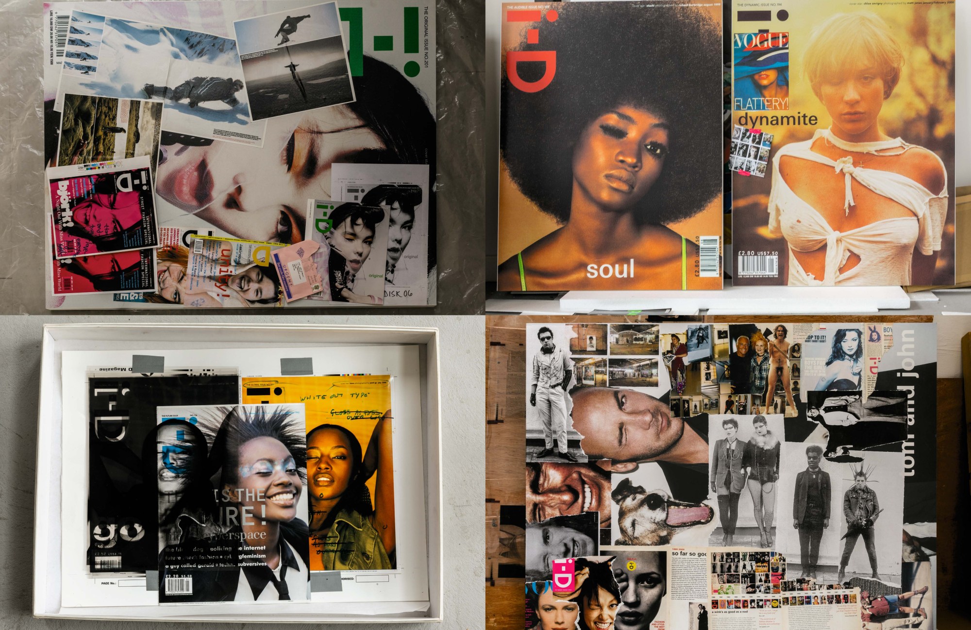
The collages I’ve made for these pages of this anniversary issue of i-D come from me dipping through the archives of i-D, from the Smile and i-Dentity exhibitions, and from my work at Vogue and Vanity Fair. I always thought a magazine should never be able to contain the content inside it. It’s up to the reader to make sense of it all. So each of these collages is a jigsaw, but it’s an incomplete jigsaw. I wanted to map out past ideas using 50 years of salvaged work.
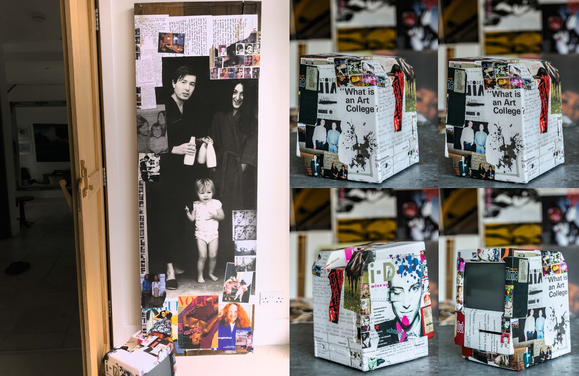
The main image on the first collage was taken at Sherriff Road, the house where we started i-D. Arthur Elgort took it. Vogue wouldn’t pay for your accommodation then, so the photographers would stay at our house. Arthur took this 1974 family portrait as he left in the morning to head into the Vogue office. It was the three day week at that time, we would be putting the magazine together by candle light some days. Arthur shot Grace Coddington’s i-D cover too; the images in the collage span from the 1970s to the 2010s.
I don’t think i-D would have existed without Grace. Caroline Baker was the other stylist who was really instrumental in setting up the magazine, she was a real inspiration. Her styling was like no one else’s at the time, it was about creativity rather than glamour. It was Caroline who brought in that DIY ethic to fashion. There was a politics and creativity that ran through everything Caroline did. When I wanted to do i-D, she introduced me to Joly, who was the fanzine printer, she knew him through the punk scene.
I was given so many rules at Vogue and Vanity Fair — don’t use green, use lots of coverlines, make sure you can see the full face of models. We broke those rules with i-D. I tried to break them at Vogue too. One of my favourite Vogue covers though is the one with the green jelly; they tried to take it off the press as it was going to print but they couldn’t manage it. It ended up selling incredibly well. I wanted to do everything they told me I couldn’t do. At the time there was a belief that lots of different cover lines sold magazines but I always wanted to do a single word. I managed to get the single word “Flattery” onto the cover of Vogue once, I convinced the editor it didn’t need anything else. That was a real breakthrough. We started to do single words on covers more and more in i-D over the years. We’d edit the cover lines right down. It doesn’t seem revolutionary now.
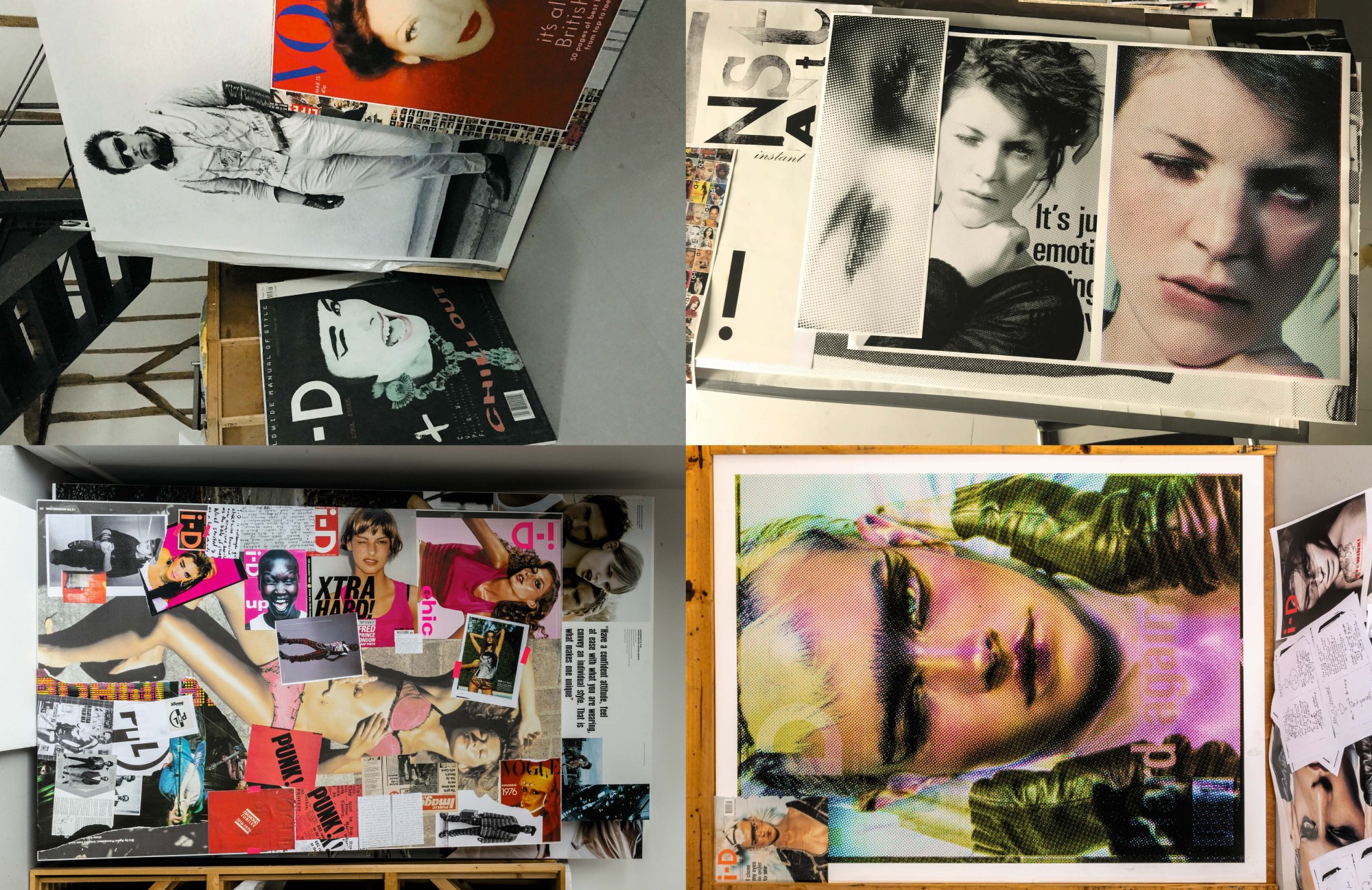
These collages are individually about the basis of an idea, whether that’s the image or the words, and the play between the word and the subject. I’ve arranged some collages by typeface, and you can trace the history of i-D through typefaces too – typefaces are part of the fashion, they identify a period. We’d use some typefaces across eras, others just appeared at certain times. Like the different i-D logos or the key colours in i-D’s visual history. Blue. Pink. Punk to pink, I called it – that bright fluro pink, and the pink and magenta combination. I’ve been obsessed with pink since my early days as a student when I used to wear fluorescent socks.
It’s amazing how global i-D was before most fashion magazine’s embraced the world. For the first four years we were running the distribution of i-D from our house. And after we’d printed an issue we’d get people coming and buying issues from us. People would come from Japan and buy boxes and take them back to Tokyo. From the beginning we were doing events in Japan because I was working with Fiorucci and Elio was buying copies and distributing them in his shops around the world. Fiorucci was the place then. He helped spread i-D around the globe.
Before that we were selling copies out of our house, or Perry Haines and Malcolm Garrett would be selling them out of the boot of his car, a 1969 Plymouth Sport Fury, or out the back of James Palmer’s VW van. Better Badges, Joly’s outfit, would distribute them to record shops. The first bit of advice Tony Elliott gave to us was to stop distributing the magazine like this. We were haemorrhaging money. i-D was funded by my commercial work but we’d run up a huge debt.
The first proper issue we got distributed was the Madonna cover, but no one knew who she was then anyway. To go back to the pink colour, I added a fluorescent background to Mark’s image. WH Smiths complained that the pink clashed with the colour scheme of their shops and that the word “sex” was on the cover too many times. It was ridiculous, because really all women’s magazines were sold on sex. For the Heidi Klum cover Max Vadukul did in 1999, we went down to the newsagents at Old Street station and stole all the coverlines from the women’s magazines and we reran them on our cover. It was the only time we ran lots of cover lines and on both sides. That issue sold incredibly well. That’s the embarrassing thing!
We did these sets of postcards with Caryn Franklin, which Time Out helped us to produce, around the time of the Street Style exhibition at the V&A. And they’re featured here, collaged on the Apple Macintosh. It was the second computer that we made i-D on. The first Apple I had while working with Fiorucci. But this original Apple Macintosh was the workhorse of i-D. It really got i-D off the ground. The Nick Knight cover on it was a favourite of Tony Elliot’s. The other cover is a postcard of Charlotte, Nick’s wife. Each postcard we produced at that time, for that exhibition, featured a favourite cover of someone who worked at i-D. Tricia’s favourite was the Jeny Howorth cover Mark Lebon shot. I collaged that in with Gemma Ward in another spread, with her two covers, one shot by Emma Summerton and the other by Nick Knight – the one by Emma is another one of Tricia’s favourite covers. That collage is all about jumping generations. It’s got the first issue, the 10th issue, the 25th anniversary issue and the 5th anniversary issue.
The collage next to it has the Neneh Cherry cover – that issue was really a response to the death of Ray Petri at the height of the AIDS crisis. He was such an incredible collaborator. It’s about spreading a positive message and that’s always been a part of i-D’s ethos. The Neneh cover had the free condom inside. I still have a complete issue somewhere with the condom still. That issue also features a very young Edward, when he was modelling for Simon Foxton. That’s all part of the story. i-D was very ahead of its time in the fashion industry in the way it would champion these causes. For i-D the concept was always about something hidden – i-D is inside the word hidden after all – or about having another side to you, something deeper. One eye open and one eye closed. It became part of the ethos, it was a fashion magazine that wasn’t about facade, but about something deeper, a socially conscious outlook on the world. Tricia always felt the way you make your purchases has a political element – whether that’s food or clothes or magazines. She was the inspiration.
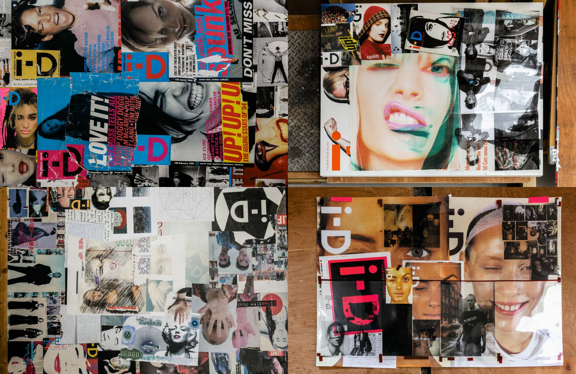
I’ve tried to include a lot of people who had their first covers with i-D here, the list is incredible, Sade, Veronica Webb, Naomi Campbell, Alek Wek, Kirsten McMenamy… And the industry didn’t always think of these girls as natural cover stars but i-D would feature them, would put them on a cover. Edward was a champion of those girls.
There’s not one favourite cover. But I’m very proud of having both our “kids”, Kayt and Matt, shoot covers. The Liberty Ross cover Kayt shot is one of my favourites, and I think my favourite of Matt’s is his image of Chloe Sevigny. I think Matt can really capture emotion. With Kayt’s Liberty Ross cover we tried to recreate something I’d tried at Vogue. David Bailey was photographing Jackie Bisset. He’d shot about thirty rolls of film of her and in the last shot she was swearing at him. She had gritted teeth, she was really pissed off. I pushed it through as a cover. It was the only image from the shoot that wasn’t a big cheesy grin. This one frame had all the emotion in it. It was a great image.
In the Japanese collage there’s an image by Takashi Homma – the cover star was like the Japanese version of Madonna, and she didn’t speak English. Takashi just asked her to do a wink, and the first wink was perfect. He shot about thirty more rolls that day, but it was the first shot on the first roll that we ran with.
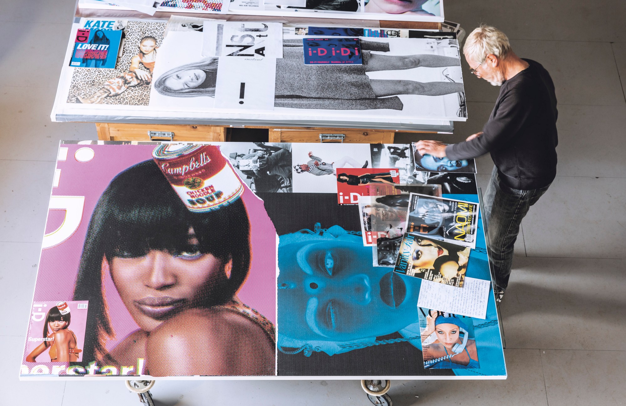
I have no idea which i-D cover sold the best but it’s probably not one I like that much. The newstand is a funny place. Any cover you did with the aim of selling loads of copies always seemed to be a failure. The cover should be about marking a moment in time. It should be about giving meaning to whoever bought it. For example I remember having Azzedine Alaïa on the cover, photographed by Sølve Sundsbø, and that one really meant something to me. Richard Burbidge achieved some great covers, sometimes through manipulation – he really understood the graphicness of the i-D cover. Nick Knight did so many amazing covers, and I love all of them, but he hated doing the wink. I have different favourites of different photographers, and the favourites change all the time. But my favourite cover? Ask me tomorrow and you’ll get a different answer.
I’m extremely grateful to all the people who have supported the i-D idea over the last 40 years, especially Tricia, i-D’s Original Mum, and Tony Elliott, our partner and mentor for over 30 years.
Acknowlegements to all the people who joined the i-D family train for more than half a lifetime who would fill a book. After giving up a secure job art directing British Vogue I suggested the idea to Tricia in 1980 the idea to infiltrate the mainstream. Now watching former i-D editors hold prestigious jobs at Conde Nast, Holly Shackleton, Elgar Johnson, and with Edward Enninful making massive political history as Vogue’s Editor in Chief. Together with Dylan Jones, mastermind at British GQ, whose fabulous new book Sweet Dreams eloquently traces the cultural importance of the 80s [A Decade of Ideas]… Just a few of the many hundred who gave energy and voice to i-D, we feel very proud for the family that continues to grow.
