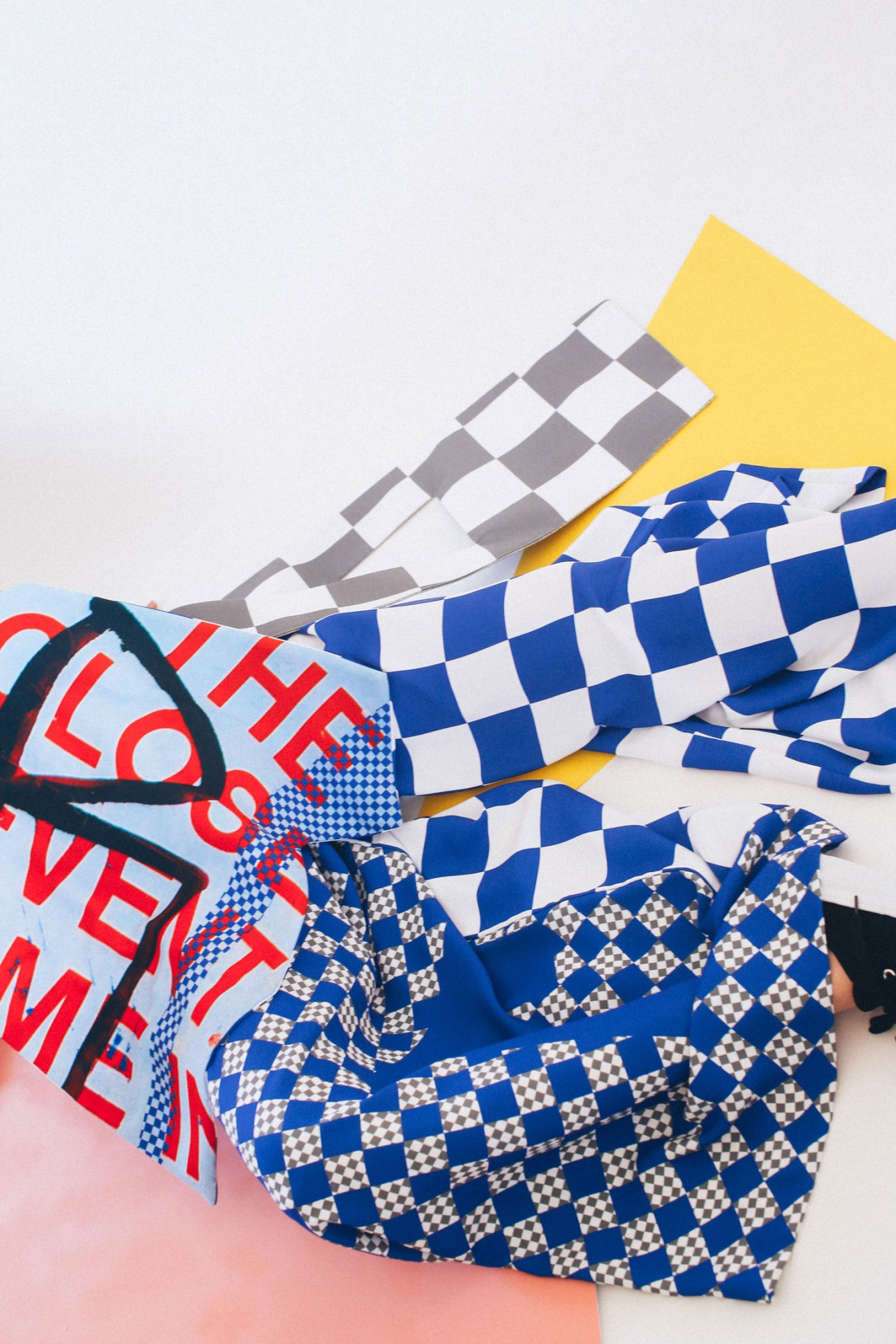
For her first collection, April Yap looked to two parts of her world to create a style so fresh and on point it’s hard to believe that she’s a 23-year-old graduate. CNTRL-C is a mix of vivid graphics and wacky shapes folded like origami around the body and finished with zigzag, glitter-edged cut-outs. She was equally inspired by Chinatown, its interpretation of her own culture, and the 21st century digital art boom.
We never knew orientalism and Photoshop were such a slamming mix.
Your collection is pretty offbeat and fun, what influences this style?
I’m really influenced by photography, and because my collection was so print-focused, I took all the photos myself. My favourite fashion photographer is Viviane Sassen, I really love the angles she uses and her photography style is so colourful, vibrant and energetic.
How did they all feed into the CNTRL-C collection?
The major inspiration was Chinatown, mainly Sydney’s Chinatown. My background is Singaporean Chinese and I found it so amusing that it’s not representative of Chinese culture—it’s more like this orientalist idea of Chinese culture. I wanted to riff off that and play with the mismatched nature of all the bits and bobs within that space.
From there, because I was working on the computer so much, I realised that there’s this idea of space in computer programs. I started taking things from Photoshop itself, like the element of the transparency layer’s chequered background, which I thought was really interesting. When you’re doing stuff on Photoshop you’re constructing something and it’s all fabricated, much like Chinatown it’s this constructed culture.
You’re obviously influenced by the technology in your daily life, how does just generally being online play into your design?
With the collaging, I’m taking my pictures out of their original context and placing them together. I guess you could say I was inspired by Tumblr because it’s so image based; when you have Tumblr and you’re scrolling through your feed you’re taking inspiration from everywhere. I think being online so much everything needs to be Instagrammable, things need to be quite bold and graphic.
How did you develop the collaging technique?
I’m not a great drawer, so when I design I just started collaging onto figures and that’s how the shapes came about. I tried to keep as true as possible to the collaging that I did on paper and then transfer that back into the body. Obviously I had to make certain adjustments so that it would fit the body, but the armholes weren’t traditional armholes and things were coming out in different places. The layering came from that, sticking paper over paper, and that’s what I wanted to do with the body.
Do you design with a specific girl in mind?
The market I’m designing to is cool kids who wear street style clothes. My muses are these cool girls like musician Chela, she’s cool but she’s slightly dorky. I’m inspired by the spirit of that kind of woman—like Solange Knowles—they are adventurous and expressive and just really honest. That’s how I design.
So what’s next?
I’m definitely going to do a capsule collection from this graduate collection. I want to translate some of my prints onto more wearable pieces like t-shirts, shorts, and sweaters to test that to market. The challenge, especially in the fashion industry in Australia, is I don’t know if people necessarily understand what I’m trying to do. It’s hard as a young emerging designer trying to get people to understand your vision. You need to convince people that, hey, this is cool this is what’s new.
Credits
Text Lucy Jones
Photography Rachel Dray
Model Bianca Hepburn @ London Mgt
Make up Holly Bradridge http://hollybradridge.com/
Hair Kyye Reed
Connect to i-D’s world! Like us on Facebook follow us on Twitter and Instagram
