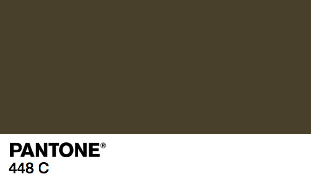
While taste is clearly subjective, apparently the question of the world’s worst colour isn’t: it’s Pantone 448 C. This was established by research agency GfK, after they dedicated three months of studies to their quest for the world’s most offensive hue.
Pantone 448 C is a drab brown that has been described as “death,” “dirty,” “tar,” and the marginally better, “opaque couché.” The quest wasn’t purely a matter of interest, it was actually in the name of public health. The Australian Government called on GfK to identify the best — or worst — colour for tobacco products packaging in their latest effort to dissuade people from smoking. Going off those adjectives, it seems like they found a pretty suitable match.
The dull, muddy brown will soon adorn all cigarette packaging, alongside the already present graphic photos depicting the impact of smoking on various body parts. While the impact of plain packaging is constantly debated, other countries are catching on: the United Kingdom, Ireland and France have also passed their own “plain packaging” laws. While we’re not really fans of opaque couché, if it helps people quit smoking and get healthy we’re willing to reconsider.
Credits
Image via Panatone