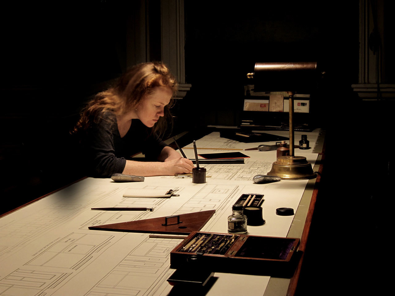
Dublin-based graphic designer Annie Atkins worked for an advertising agency in Iceland before going on to get two degrees: one in Visual Communication and one in Film Production. She got her first job straight out of film school working on the set of the third season of The Tudors, designing everything from stained glass windows to medieval parchments. But it was when she got the call to head up her first feature film – Wes Anderson’s The Grand Budapest Hotel – that her work got thrown into the spotlight. From the map praised by M. Gustave for its artistic promise, to the Mendl’s cake boxes that have become Atkins’ most prized possessions, creating the imaginary world of The Grand Budapest Hotel in a remote part of Germany required incredible attention to detail from the highly skilled graphic designer…
Did it feel like it was a big leap going from an advertising job to working in film?
When I left advertising, I thought I was leaving design behind – I’d fallen out of love with it, really, over the years. I’d started thinking about writing and photography and filmmaking instead, but when I got to film school, all of a sudden, a whole new world of design was opened up to me, and I loved it again.
What’s changed since you worked on The Grand Budapest Hotel?
Everything! You know, I’ve been making graphic pieces for shows for years now, but nobody ever really showed much interest in it before. I called it “all the stuff that everybody sees and nobody cares about”. Now all of a sudden, the work has had a light shone on it. I think the way Wes uses graphic design in his storytelling helps people realize that all films have graphic art in them, it’s just that they never noticed it before. Now I’m getting invitations to travel around the world and talk about my job – it’s crazy.
What was it like working with Wes Anderson?
The whole thing was fantastic. Living with his cast and crew for the winter was like living inside one of his movies. He took us all to this little town, Gorlitz, on the German-Polish border. You could literally walk across a footbridge and have lunch in Poland on your day off.
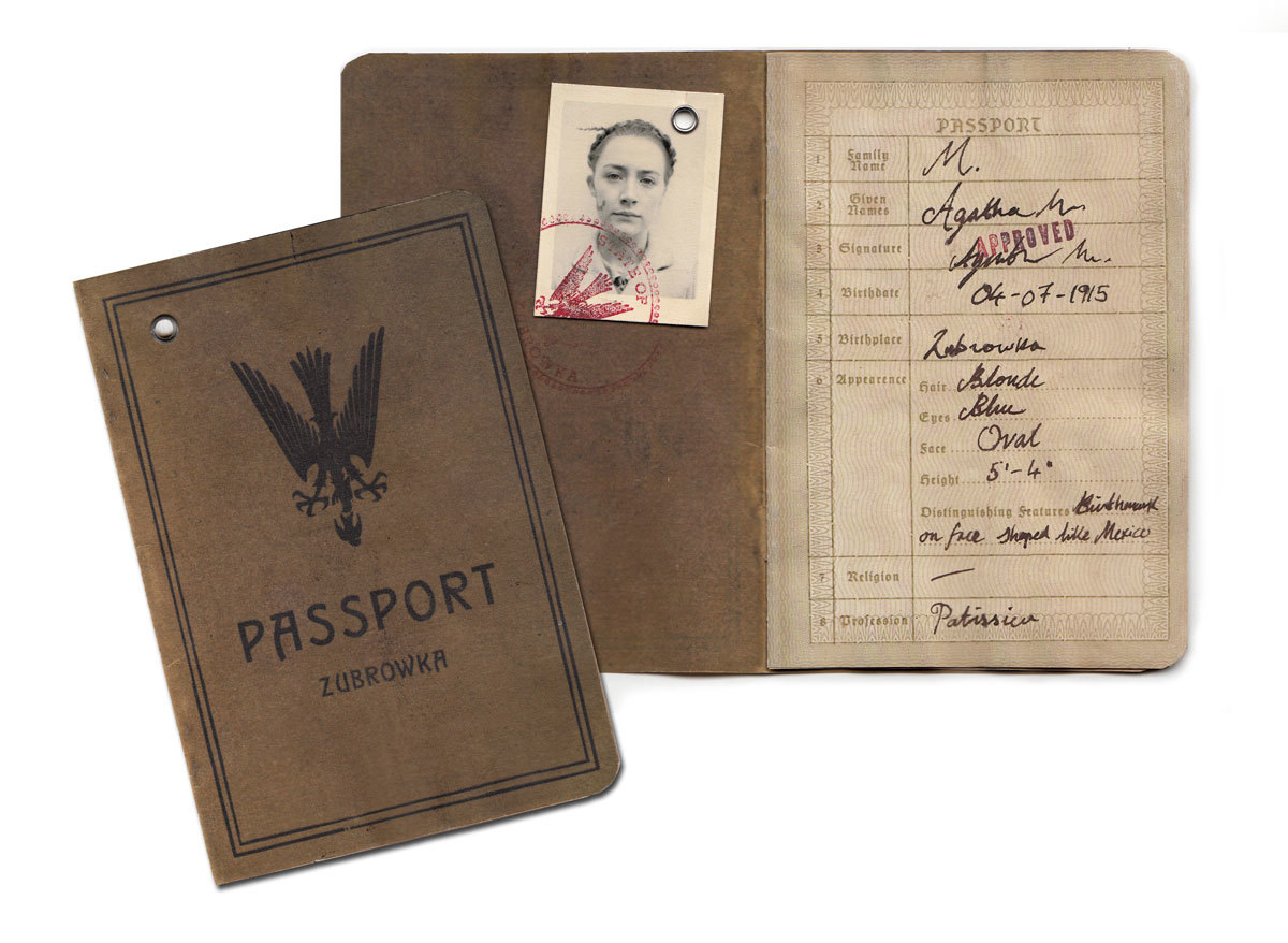
Working on The Grand Budapest Hotel‘s fictional world meant recreating everything, from bank notes to stamps. Did that give you more creative freedom, rather than other projects where you were in a specific time period?
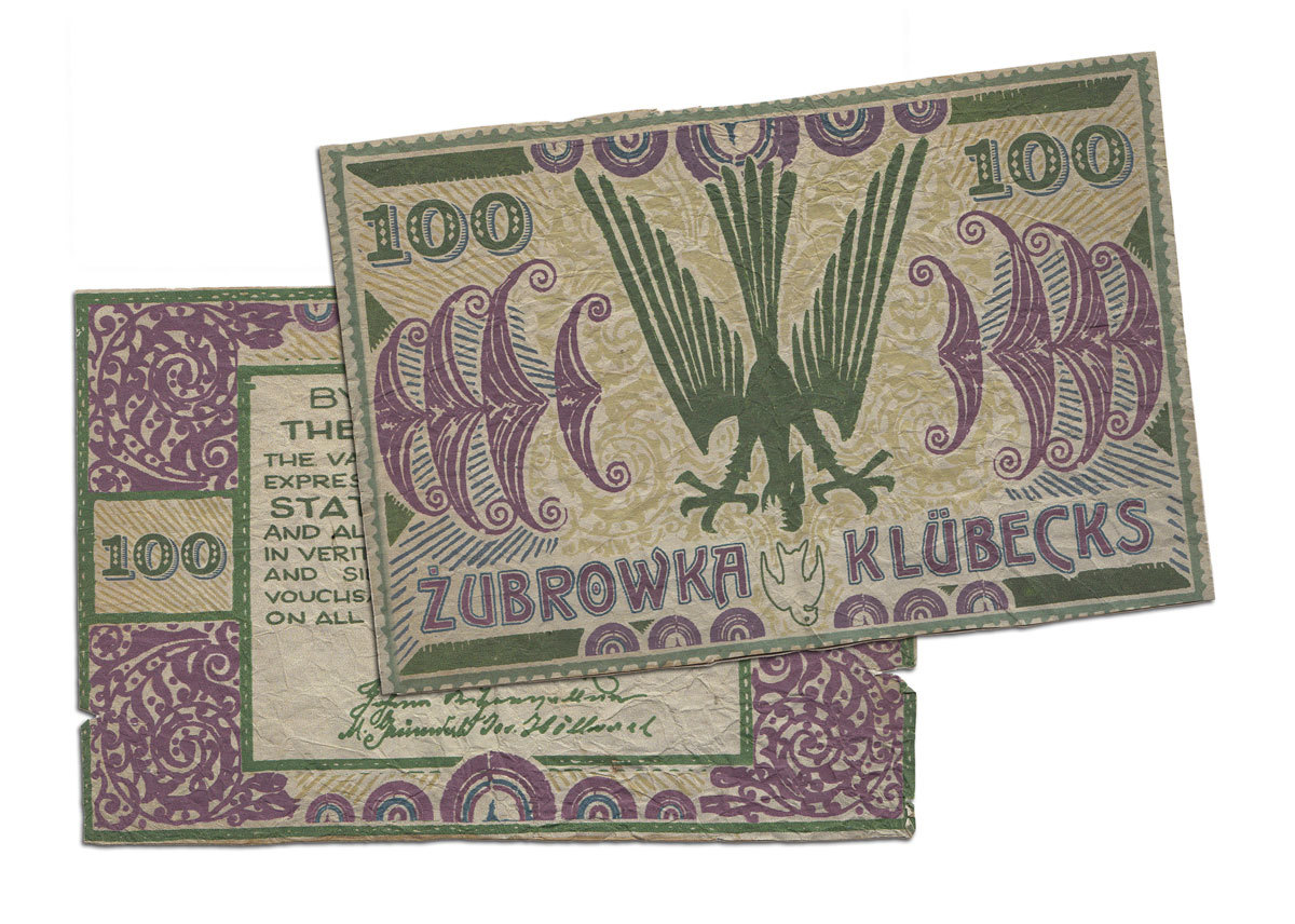
Yes, it’s a fictional world, so that was fun, but we actually started every graphic piece by looking at a real reference from the time. The bank notes are a good example, actually. I remember working on a TV drama set in the 19th century where I made very large banknotes (they would have been three times the size of modern banknotes at the time), but the director didn’t want to shoot them because he felt they were comically large, even though they were historically accurate. On The Grand Budapest, Wes really embraced these differences. We were always studying how things had been created differently back in the day, rather than making assumptions. That was fascinating to me. So many period shows I work on, the first thing you’re told is that everything should be muted and sepia toned. It’s a shame, because design around the turn of the last century was so colorful and vivid and we’re writing it out of history by making shows in tones that audiences assume are realistic just because they’re so used to seeing faded old sepia photographs from the time. It’s one of the reasons I loved working with Wes and his production designer Adam Stockhausen so much. It was all so colorful and playful, but also rooted in reality.
Is your job harder when you’re working abroad in a secluded location?
Gorlitz was pretty secluded, yes, but it had a great pool of local craftspeople that worked with us on various props. The local bookbinder, for example, and a glass painter, and the rubber stamp shop. These are traditional methods that we use a lot in creating graphic props for period pieces.
Have you ever found that on set you’re really happy with a prop but it just doesn’t come across well on screen?
There are tricks I’ve learned over the years to stop things from jumping out too much. I tend to use off-white and cream colored paper so that it doesn’t reflect the camera lights too much. The trickiest bit is making sure that everything works in an actor’s hands: that things open and close the way they’re supposed to, that things don’t fall apart, that you have plenty of repeats in case something gets destroyed on set. Some font styles are easier to read than others – Germanic blackletter can be a hard read on camera if it’s for an important headline or some other kind of plot point. You learn from experience.
What are some of the pitfalls you have come across in your career so far?
Oh, I make mistakes all the time. I put a spelling mistake on the Mendl’s box, which was embarrassing, especially as I take such pride in my excellent nerdy spelling. We corrected it in post so you can’t see it in the movie, but it wasn’t my finest hour. On a personal level though, I think the biggest pitfall has been just how consuming working in this industry is. I haven’t had a social life in a while. It would be nice to see my family again soon, too.
Is there any particular period of history you like working on?
Victorian London is probably my favorite period. I love it all that attention-crazy typography.
Props are often made just to help the actors get into character, do you mind that some of your props never get to be seen properly?
I think people assume that every prop you make has to be for the cinema audience, otherwise what’s the point? But film design doesn’t work like that. We’re creating a world for the actors and director to do their work in. I would estimate that only 10% of the work I make is ever seen in focus by the camera.
What’s been the most challenging prop so far?
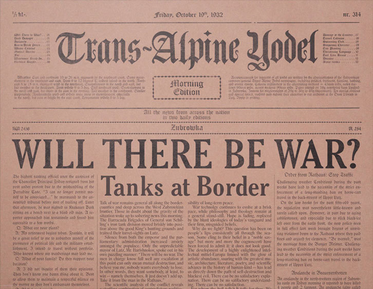
Creating an entire national press for the fictitious Empire of Zubrowka was pretty challenging. Wes scripted the Trans-Alpine Yodel, which is the local daily paper that breaks all the news in the story, but he also added The Continental Drift, The Daily Fact, and a whole pile of other titles for the newspaper reading room in the 1960s version of the hotel.
What’s your favorite prop and why?
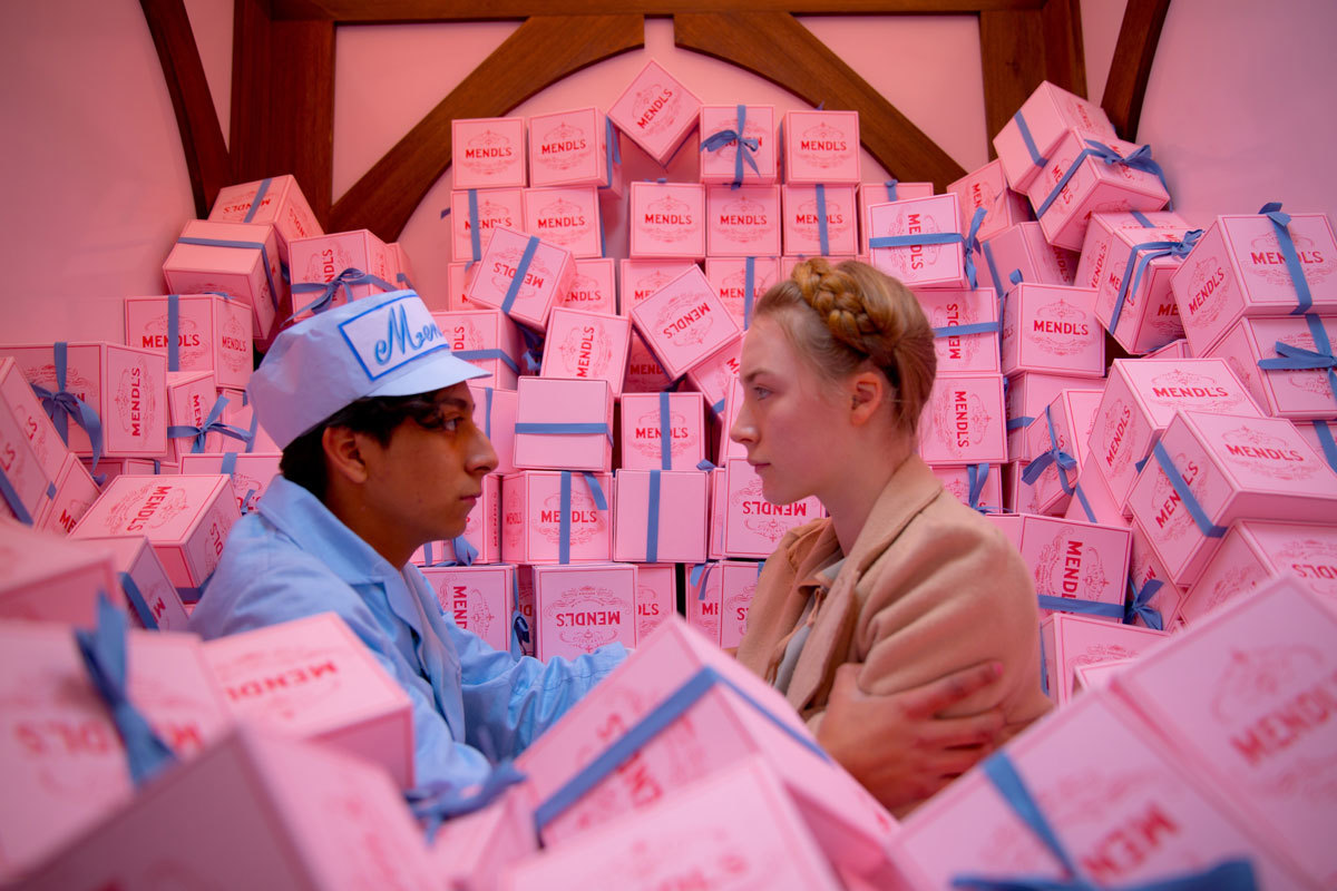
I love the Mendl’s box. People email me asking if I have one I can send them and I always have to say no. It’s the most precious piece in my collection. You can buy cheap imitations on the black market but I know right away they’re not for real. They don’t have that spelling mistake in them, for starters.
What are you working on next?
I wrapped work on Spielberg’s new thriller earlier this year, Bridge of Spies, which will be the next thing to be released – in October, I think. At the moment, I’m making some graphic pieces for Ang Lee’s new movie Billy Lynn’s Long Halftime Walk, and also working on an as-yet-unnanouced game for Playstation 4.
Credits
Text Rebecca Boyd-Wallis
Images courtesy of Annie Atkins