
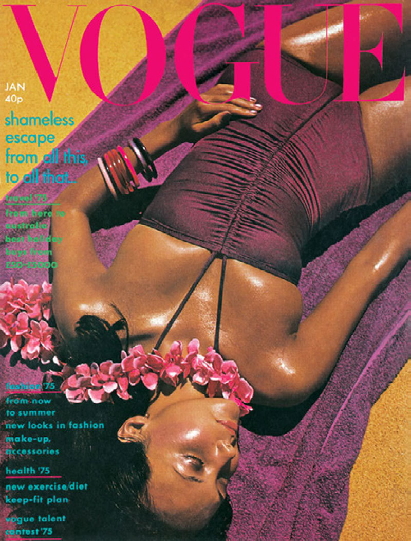
The first (of many) rule breaking covers
Pre-punk, post-60s was a great time to be art directing Vogue, following on from Barney Wan, who picked me to do the job in 1972. His style was immaculate and sophisticated and I struggled with that conformity at first, it took a year to change things. It was the January 1974 cover by David Bailey that broke the rules. Anjelica Huston and Manolo Blahnik were the models, styled by Grace Coddington on a trip to Corsica and the south of France.
Somehow during the selection process of the cover options, David Bailey, Grace and I managed to convince Beatrix Miller this landscape, full length, image of Anjelia and Manolo was the best, most exciting and brave cover option. When the advertising director clinched the unplanned sale of a gatefold inner cover advert to south of France tourism, we broke the standard full-face shot. Before Alex Lieberman, Vogue’s creative Director in New York, could stop the press, or tell us to change it the issue sold. So 1974 became a fun year for covers.
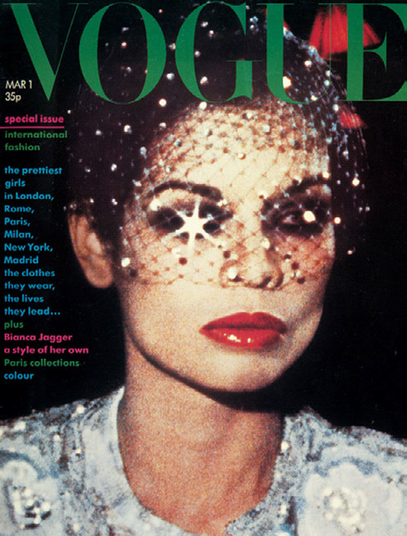
The accidental cover
Bianca Jagger was on the March cover photographed by Eric Boman. Eric was a great illustrator who was completely untechnical with cameras, but as a good friend of Bianca he did a fashion story with her in Paris.I was projecting possible choices with the 35mm projector in Beatrix’s office. One was a photograph of Bianca on the balcony of the Paris Opera house, looking great, but very small in the photo. I knew the only way to get it used was to make a 10×8 transparency cropped to the cover area, which made the colour and grain contrast increase. The print production manager still complained, but it remains one of my favourite covers alongside the the green jelly cover from February 1977.
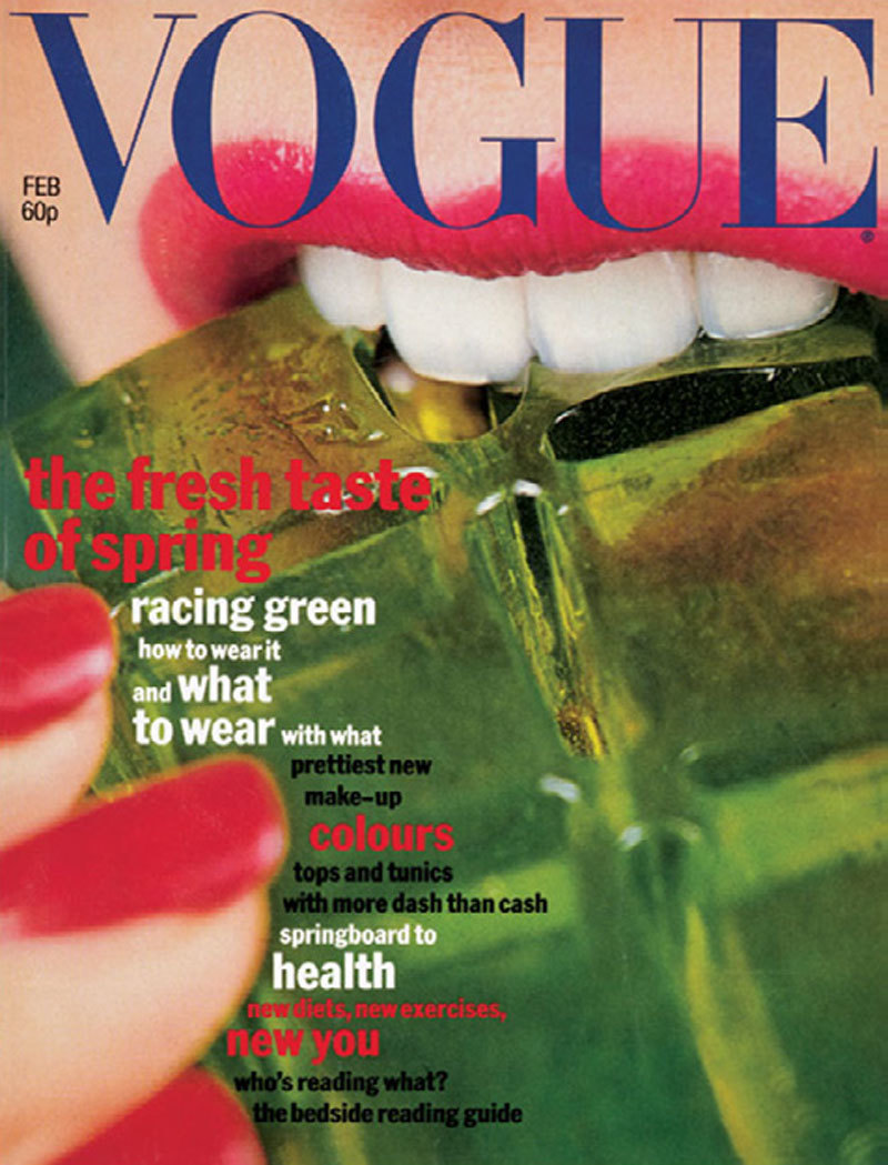
Shot by Willie Christie, the image was originally for an inside editorial that Grace and I convinced Beatrix to run with. We got approval from Bernie Lazer, the managing director at British Vogue, who had to defend the decision when Daniel Salem, the European Company Director demanded to have it stopped on press.
The amazing Grace cover
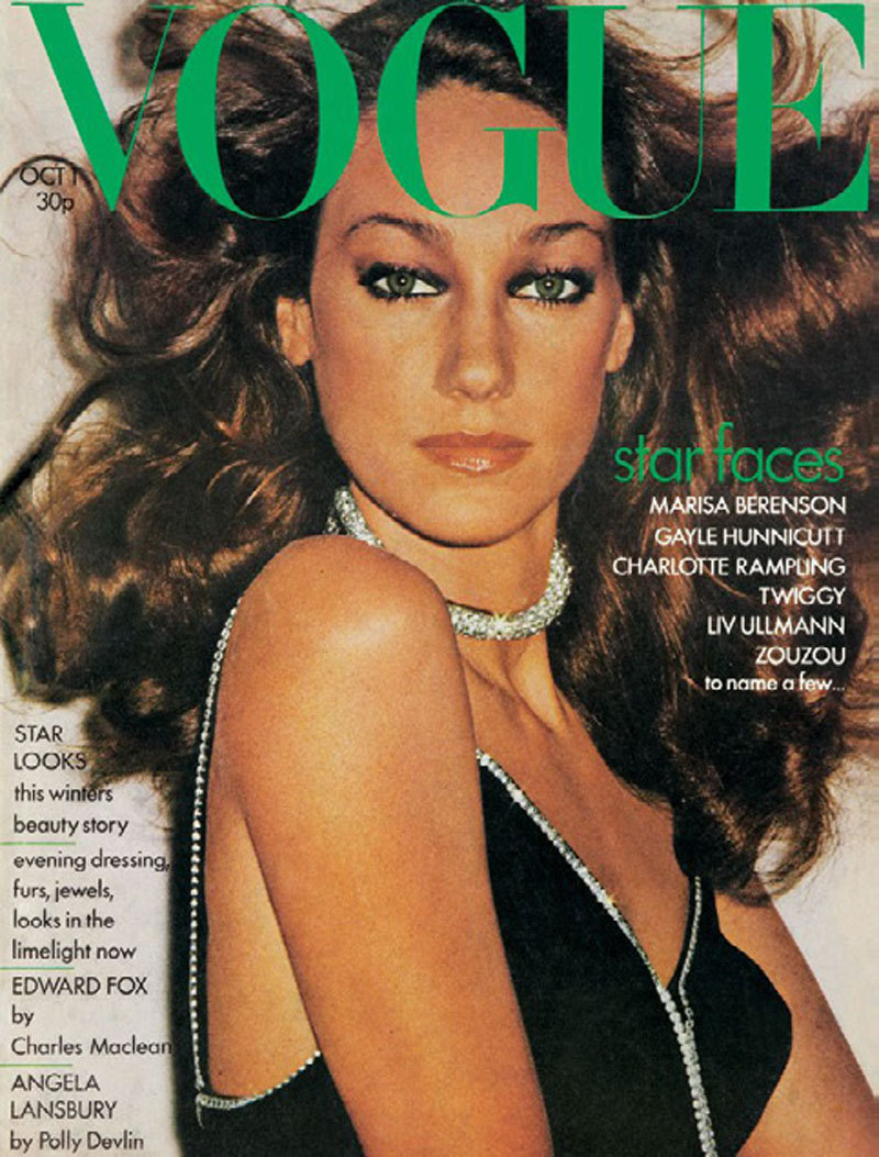
Grace Coddington always produced the best covers, particularly with Norman Parkinson, like Jerry Hall’s first cover with a blue phone tucked into her swim cap, and again Jerry in Russia wearing a soviet construction workers helmet. Grace was the only fashion editor Helmut Newton would work with at British Vogue. His last cover for British Vogue was of Marisa Berenson in October 1973.

He only supplied three choices as 35mm slides, which would all be kept in a safe filing cabinet. We were on a deadline and everything was passed by Beatrix to go, but the slide was not in the cabinet. For a day we panicked until my PA, Jill, turned out the huge waste bins in the Conde Nast basement to find the lost original 35mm slide.
The instant cover
Oliviero Toscani and I had a really good working relationship. I learned a lot from him, he always wanted to catch the energy of the moment instead of a static perfection. For the March 1 1975 (Vogue at that time produced 16 issues a year) I wanted to push the instant image quality of the new Sx70 Polaroid camera.
I wanted to push the instant image quality of the new SX-70 Polaroid camera. David Bailey had previously shot two editorials that had proved the printers could reproduce from Polaroid prints. Even if they might disapprove of the final result, it was what I liked. I knew that the red could be saturated and the skin tone washed out. We had the cover image within 12 shots of Polaroid SX-70.
The Down Under cover
David Bailey was the most creative photographer during my time at Vogue — he was like a naughty elder brother and we were able to try all sorts of ideas together. Bailey charmed Beatrix into some of my favourite covers, like Marie Helvin in Brazil. The cost was too great to send a team to Brazil, so Bailey travelled with a writer and returned to make the fashion in London. Using a projector he cut out collages and made crude montages before the computer even existed.

At that time David Bailey only wanted to photograph his wife Marie. The upside down cover was an obvious joke for the Australia trip issue, and Marie with the clown for December 1975 Christmas issue shot on grainy film.
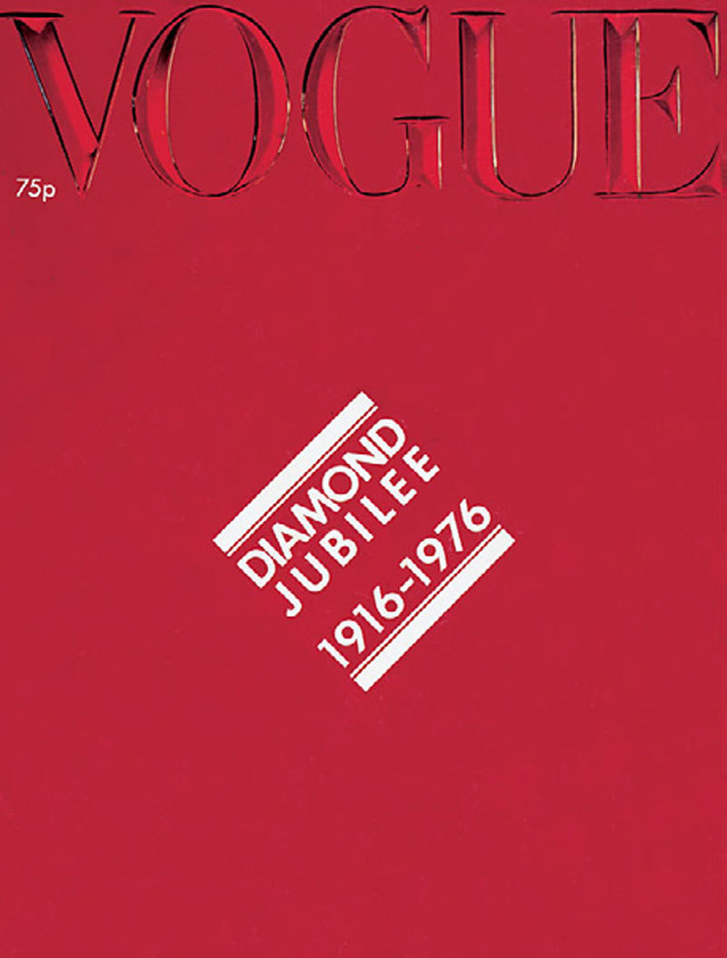
The beginning of the end cover
The cover I resigned over was the Diamond Jubilee cover, October 1976. I wanted to turn the cover into a window, so I asked for an engraving of the Vogue logo to be made in glass, and had it photographed. It took two weeks for Watermans, a specialist crystal glass cutter in Ireland, to engrave the letters into 8mm-thick plate glass. It took another week for Vogue photographer James Mortimer to get the right picture, so that the glass caught the spectrum and you could just see a little bit of light hitting the cut-glass, like a rainbow catching the letters. It was 1976 and this was before Apple Macs and Photoshop were invented, so we had to do it for real. It was a symbolic idea.
Unfortunately one of the head men at Conde Nast Europe had other ideas and wanted to see the repeat of a red cover that had been very successful for Vogue Paris. It is magazine folklore, that if you have a red cover you get better sales. We had to re-shoot the glass, this time with a red background, but the subtlety of the idea was lost and the spectrum was eliminated by the background colour. That was the day I decided to move on, although it would be another year before I finally left. I could only put the original story into a book I made in 1998 called Catching this Moment. I’ve still got the original engraved plate of glass as a memento.
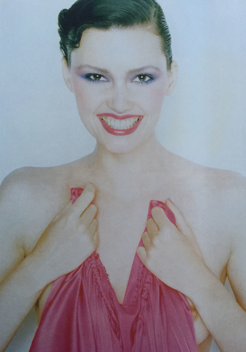
The #freethenipple cover that never was
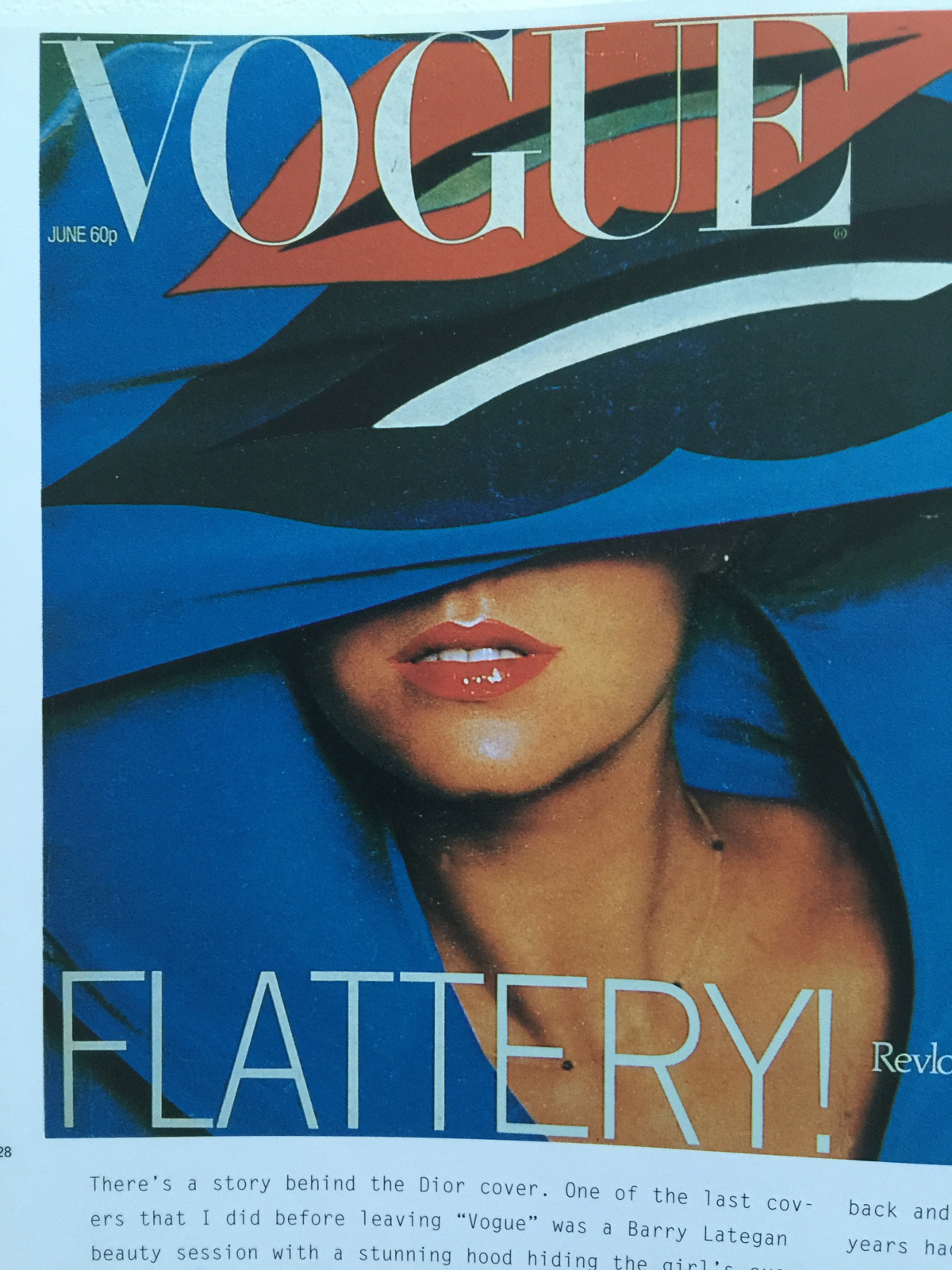
One of the last covers that I did before leaving Vogue was a Barry Lategan beauty session with a stunning hood hiding the girl’s eyes. We convinced the distribution manager that this cover would be successful – the make-up credit went to Revlon who paid for the gatefold so that we could run the image landscape. It was incidentally the first time I convinced them to use just one word on the cover, as they were convinced cover text sold issues.
Dior, who booked more advertising pages through the year, wanted the following issue to be equally strong – with their own make-up credit. Fouli Elia, the photographer, was given the task of photographing a fuchsia pink dress and when I went down to the studio the two of us agreed the result was going to look dull. I’d tried for some time to convince the management to allow a nipple on the cover, so I asked the model if she had any objections to a paparazzi-style picture, which captured her getting changed in the dressing room. The results showed her clutching the dress, not wearing it – nipple exposed. The model’s famously “dazzling” smile was eclipsed by the twinkle in her eye. I prepared a presentation of the cover with a print. It was a Friday afternoon and the editor at Vogue, Bea Miller, and I convinced the distribution manager that this was a good follow up to the Lips and Hood cover, and when I went home for the weekend I assumed it had been sent off to the printer. When I got in Monday morning there was something going on. My art department felt like a morgue. Nobody was saying anything. But I soon learned that the cover was being re-shot and that I was banned from talking to Fouli at the studio! It was a dull exit from Vogue but overall I look back and think how many brilliant opportunities the five years had provided. Working with people of such high calibre was an amazing education.
The post Vogue covers
After Vogue there was the opportunity to do something new. An ex-editorial director of L’uomo Vogue, Flavio Lucini, launched Donna. It was intended to look at fashion from a different perspective. I devised the graphics so that I could design it from London. The photography wasn’t brilliant, so I used to bang the type over the pictures, it was a bit of a shock for the advertisers. The graphics were strong but within two issues they were watering it down.
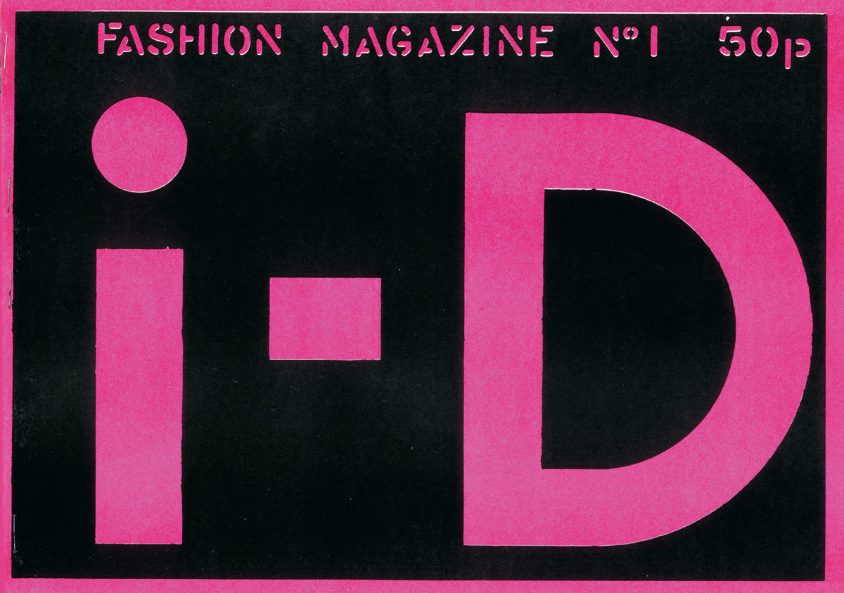
I’d been promised the opportunity to produce a magazine on street-style, but Flavio said, “no one’s interested but we’ll wait six months and see.” Then he started a menswear magazine and I got fed up waiting. So I started trying to find a publisher in Italy for my idea. I went to this guy called Jolly who had a company called Better Badges and was the main printer of fanzines in London. I said I wanted to do a fashion fanzine. He said, “OK the deal is if I print them you buy the copies off me. We’ll do 2000 to begin with and distribute them through record shops.”
The covers were always a collaboration, with the best getting away with a new memorable image, marking the day, month or year. I accepted the challenge and knew some would be winners and others would be average. It took a year for me to leave in the end, and otherwise i-D may never have happened.
Vogue 100: A Century of Style runs from 11th February to 22nd May at the National Portrait Gallery