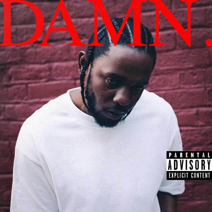
When the cover art for Kendrick Lamar‘s highly anticipated album DAMN. hit the internet earlier this week, it was met with a little confusion. Of course, any news of new Kendrick music is great news, but the typography left some fans cold. It seems people’s expectations of a typical album cover’s production value — high budgets, glossy text — haven’t been met, and that’s pretty interesting. A common criticism is that the cover looks as if anyone could have executed it in Microsoft Word. But does that make it bad? One of the men behind DAMN., Vlad Sepetov, has taken to Twitter to weigh in on the discussion.
Vlad also worked on the artwork for To Pimp a Butterfly, so there’s certainly a level of trust between him and Kendrick. On Twitter, he wrote, “Already seeing a lot of discussion about the cover. and i’m really excited about it. it’s interesting to see people talk about ‘bad’ design.” The designer made it clear that he aimed to disobey some conventional designer wisdom to create something “loud and abrasive,” a vision that Kendrick and Dave Free (his manager) both shared. We like it too.
Kendrick Lamar’s ‘DAMN.’ drops this Friday, April 14.
Credits
Text Georgie Bretherton
