Even those with the most cursory interest in fashion would have to be living under a rock to miss the rollout of creative director Riccardo Tisci’s new vision for Burberry. With the carefully timed drop of a redesigned logo and a new signature print, the storied British house’s radical makeover was splashed across social media, sharpening Christopher Bailey’s romantic, historically-informed vision into something so cutting-edge it could draw blood.
Yet this branding blitz hasn’t gone without criticism. The new print, designed in collaboration with the legendary Peter Saville, was trashed by some for being eye-wateringly gaudy, while Diet Prada (never ones to mince their words) poked fun at its resemblance to pretzels. Others have argued that the overlaid logo labels inside garments are disrespectful to his predecessors at the label, and that the newly pared-back sans serif logo is inappropriate for the grandeur of Burberry’s status as Britain’s greatest fashion house.
Digging deeper, it appears that this aggressive marketing campaign is more than just Tisci flexing his newly tartan-clad muscles. As noted by fashion media’s sharp and reactive source for all judicial matters, Julie Zerbo of The Fashion Law, it’s a legal necessity. A rebrand isn’t simply a matter of posting the new logo on Instagram and updating the website header: you have to prove the cache of international recognisability to protect the new logo as Burberry’s intellectual property. It seems Tisci has done this with an unprecedented onslaught.
It makes sense that Tisci’s debut show would be a similarly emphatic statement of a new age for the house. Totalling 135 looks, the show was a rollercoaster ride through garments that will satisfy every subset of Burberry’s broad customer base — as Tisci himself said, it was a collection for “mothers and daughters, fathers and sons”. With the sheer volume of looks on offer, the references to both Tisci’s design trajectory and the house itself came thick and fast. Fret not, however. We’re here to guide you through some of the stranger and sillier corners of the new Burberry universe as seen through Tisci’s magpie lens.

British punk met Tisci’s design history in the collection’s most remarked-upon shirt
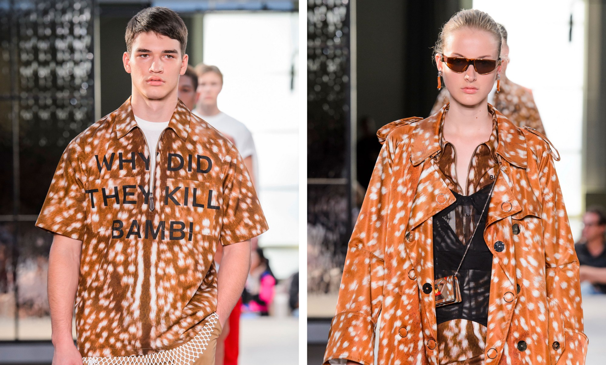
If there’s one piece that has been picked apart more than any other, it would have to be a short sleeve shirt in a deerskin print emblazoned with WHY DID THEY KILL BAMBI. While the immediate reference is to a 1979 Sex Pistols track, Who Killed Bambi — incidentally co-written by none other than Vivienne Westwood, with whom Tisci is collaborating on an upcoming capsule collection – some have also linked it to one of Tisci’s most memorable pieces from his tenure as creative director at Givenchy.
The opening look of his autumn/winter 13 ready-to-wear collection was a neoprene sweatshirt with a spliced print of Bambi, swiftly becoming a street style favourite and later worn on the red carpet by everyone from Carine Roitfeld to Lily Collins. The Burberry shirt served as both a tacit nod to Tisci’s personal history, and also a reference to the house’s announcement earlier in the month that they will be going fur-free (more on that later). Bonus points also for those who spotted the unicorn motif across shirts, inspired by a 19th-century company crest Tisci found while digging through the archives. While Bambi might be dead, it appears her mythical horned cousin lives on.

A subversive take on Burberry’s heritage couldn’t go without a nod to Miguel Adrover
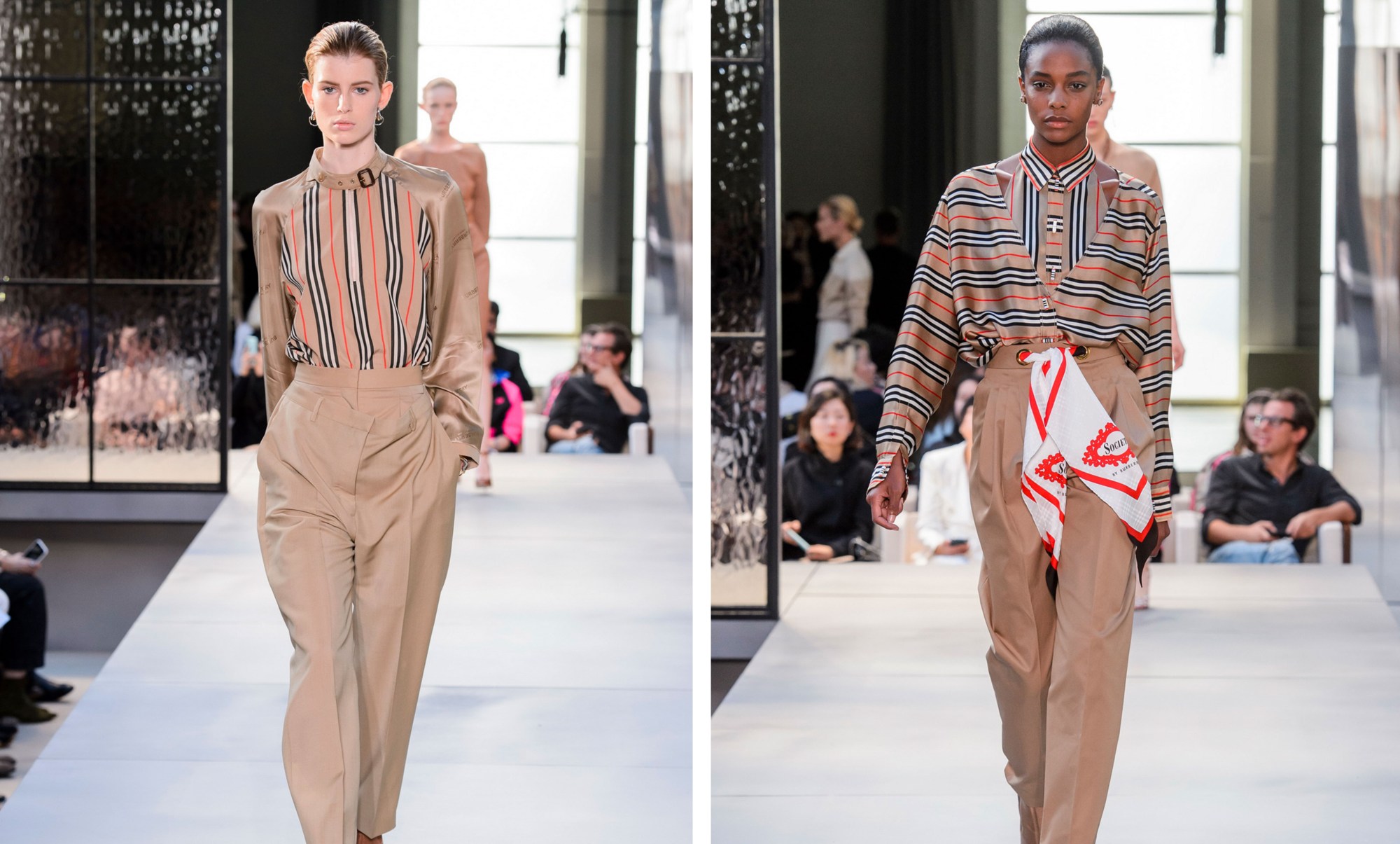
The history of the Burberry nova tartan is both checked and chequered. Many registered their surprise at Christopher Bailey’s revival of the house check in 2017 with a flashy collaborative collection with the king of post-Soviet style Gosha Rubchinskiy. The print’s rampant popularity around the turn of the millennium saw a roaring trade in bootlegs, which in turn led to a deeply classist association of the nova check with working class culture. With the current sportswear boom, the revival left a sour taste for some. The irony was laid on thick and many interpreted it as part of a trend (partly popularised by Rubchinskiy) of luxury houses appropriating working class dress.
Tisci sidestepped these thornier social implications by looking instead to a more playful riff on the Burberry house check, courtesy of the renegade designer Miguel Adrover, whose brief rise and fall as New York Fashion Week’s enfant terrible in the early 00s saw him send Canal Street knockoffs and dresses constructed from recycled luxury garments down the runway. One of the most memorable looks was a reconstituted Burberry trench turned inside out to make a high-neck dress — one can only imagine the face crack of Adrover’s lawyer upon seeing this garment for the first time. While Adrover’s star might have faded, this chopped and screwed take on the Burberry staple received multiple nods from Tisci throughout the collection, possibly serving as an acknowledgment of a similarly provocative creative spirit.

Acknowledging the brand’s new cruelty-free ethos, or a tip of the hat to our favourite drag queen?
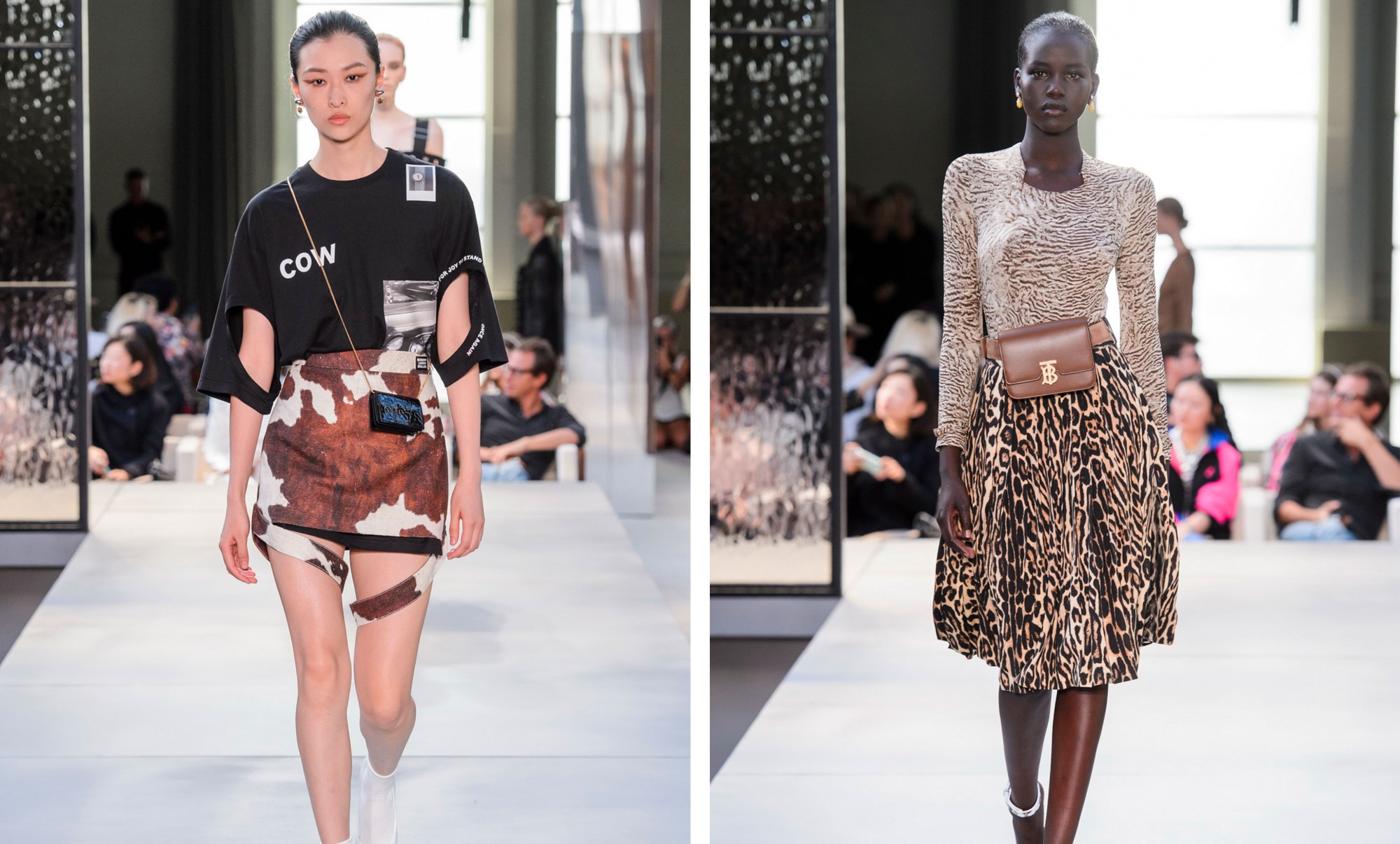
Another look that was widely posted on social media was a t-shirt with cutouts that spelt the word ‘cow’, which various online sleuths saw as a reference to Burberry’s recent commitment to go fur-free. When cow hides can now be replaced with digital printing, a top doesn’t even need to be fabricated from leather to resemble the tactile appeal of bovine skin. Could it also be a post-Virgil Abloh, Saussarean play on the relationship between word and textile, sign and signifier?
For those who think I might be reading a little too much into this, there’s an even more esoteric interpretation doing the rounds: some followers noticed a reference to RuPaul’s Drag Race alum, the self-proclaimed “heart of season ten”, Monique Heart. During the Diamonds and Denim runway challenge, Michelle Visage pointed out that Heart’s dress was not in fact imitating the hide of a brown cow, but instead a giraffe print. Her now iconic response? “I saw it and thought: brown cow? Stunning!” For those who don’t follow Drag Race, it’s worth knowing that Visage’s biting critiques are a highlight of the show, but even in this case she died laughing at Heart’s adorable naivety. Could Tisci’s brown cow be a very explicit nod to this campy corner of the cultural zeitgeist?

Was Tisci also giving a two-fingers-up to the parlous state of British politics?
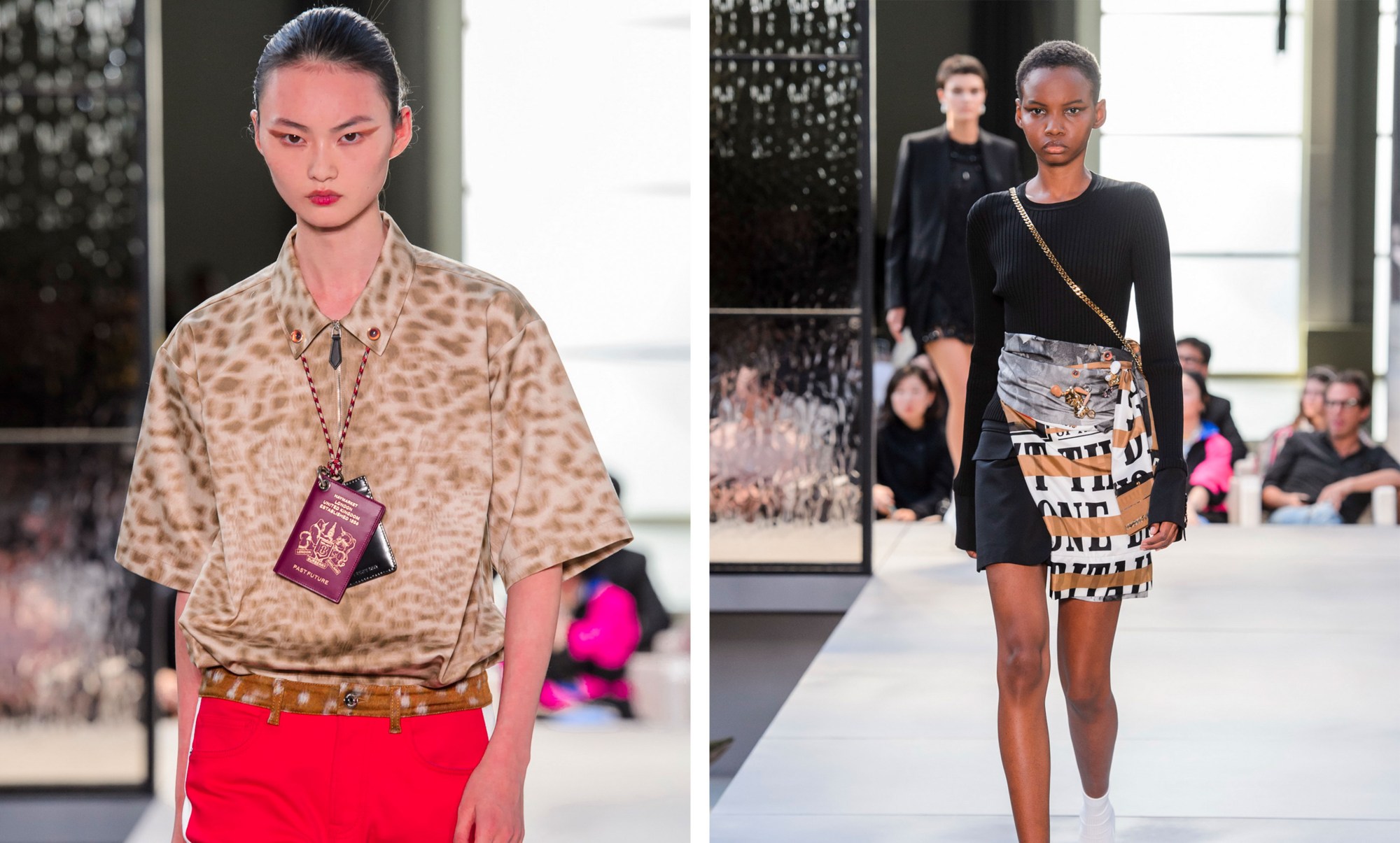
Another of the most Instagrammed styling details from Tisci’s show were the British passports hanging from model’s necks. Much has been made of the Brexiters’ desire to return to the blue passports of yesteryear. An objective that was fulfilled earlier in the year when in a moment of delicious irony, the contract was moved from its current British manufacturer to the Franco-Dutch firm Gemalto. It was fitting for Tisci to touch on his status as an Italian in Britain at a moment of profound uncertainty for EU nationals — while his citizenship is secure thanks to his top-ranking corporate job, there are many of his Italian brothers and sisters living in the UK who are facing a more precarious future.
This sly critique of a post-Brexit, isolationist country was touched on more subtly in a skirt that — with its elongated font — carries more than a faint echo of the sensationalist headlines that cover a certain gutter press rag we won’t deign to mention. Tisci decided to cover them with what looks like masking tape — read into that what you will. A reception held at Downing Street on the final evening of London Fashion Week saw legendary lensman Nick Knight confront Theresa May about the Chequers deal, partly out of concern for the negative impact her vision of Brexit will have on the future of Britain’s fashion industry. It was only a matter of time before we saw the overwhelmingly anti-Brexit outlook of the fashion industry appear on the runway – and in this case, it seems it took an Italian to take the plunge.

