In July 2019, the world was a very different place. It was back then that A Magazine Curated By’s Dan Thawley, Thérèse Boon Falleur and Blake Abbie first struck up conversations with Luke and Lucie Meier, offering the husband and wife at Jil Sander’s helm the curatorial reins for the publication’s 21st edition. Though no one could have foreseen the fraught social climate into which it’s now being released, the timelessness of the theme they settled on all those months ago endures.
Across a roughly 200-page uninterrupted flow of imagery, followed by a legend of text contributions, “Human Nature/Mother Nature” quietly observes patterns of transience in human culture and the natural world, as well as the points at which they touch and diverge from one another. Sober, sublime mountainscapes as old as time mix with childrens’ drawings of similar scenes. And just pages before John Pawson‘s photograph of one of the ancient, rock-hewn churches at Lalibela, model Leon Dame stands in a Jil Sander coat against a smudged Paris skyline, Sacré-Cœur barely distinguishable in the distance.
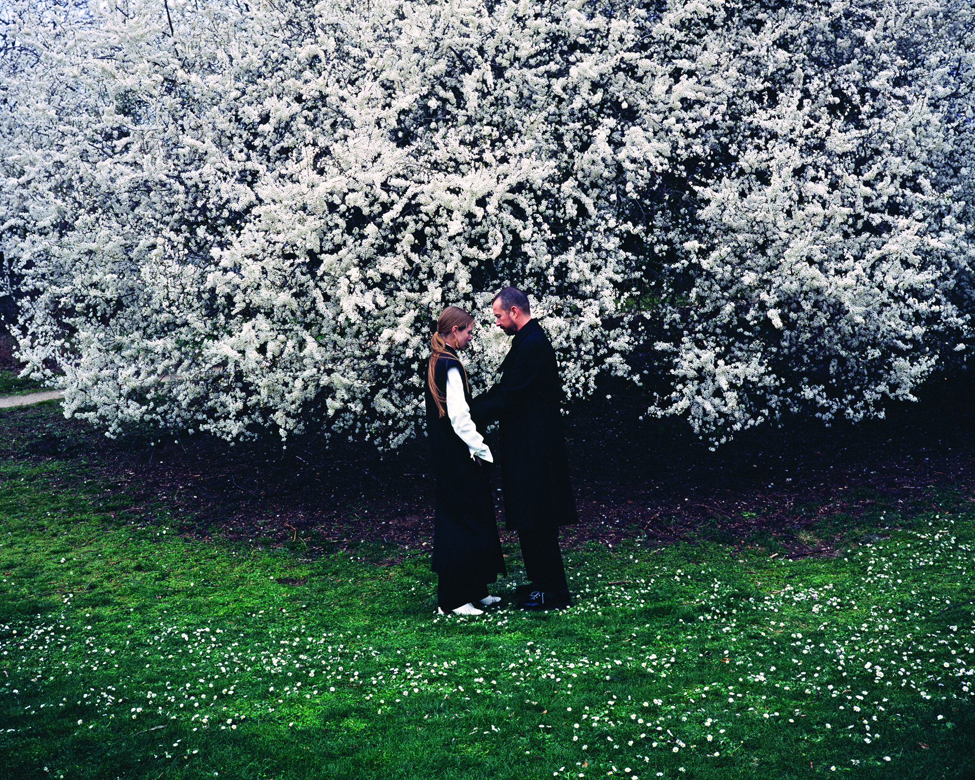
More than a general reflection on such points of commonality and contrast, it’s a deeply personal meditation on “the duality within nature that inspires our work and our life,” the couple write in their Curators’ Letter. “Within our understanding of Nature, one unequivocal truth has emerged: While a child doesn’t understand the circumstance, as adulthood progresses, a deep appreciation occurs for Nature, during which there is an undoubtedly comparative viewpoint, and through this develops the understanding that things today are different than they were in the past — the fact that change is constant and inevitable and all-encompassing.”
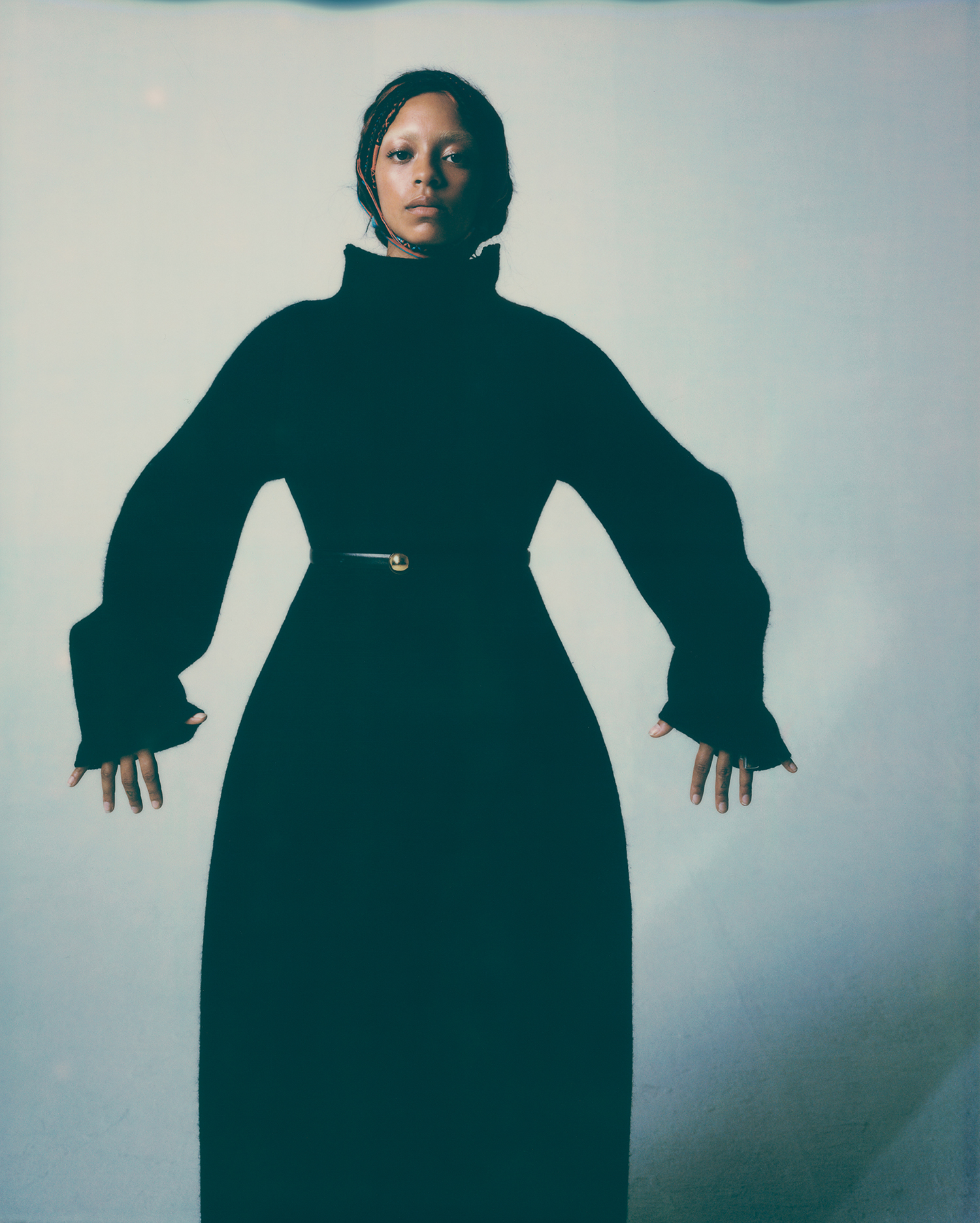
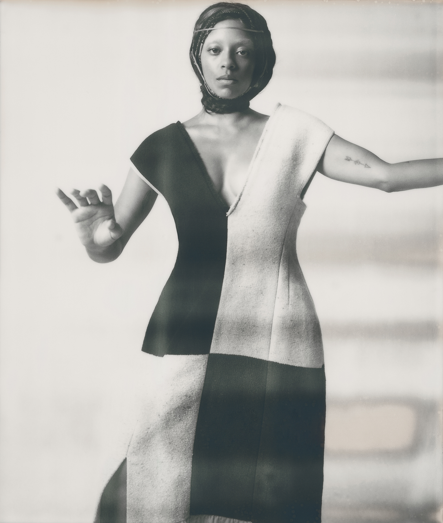
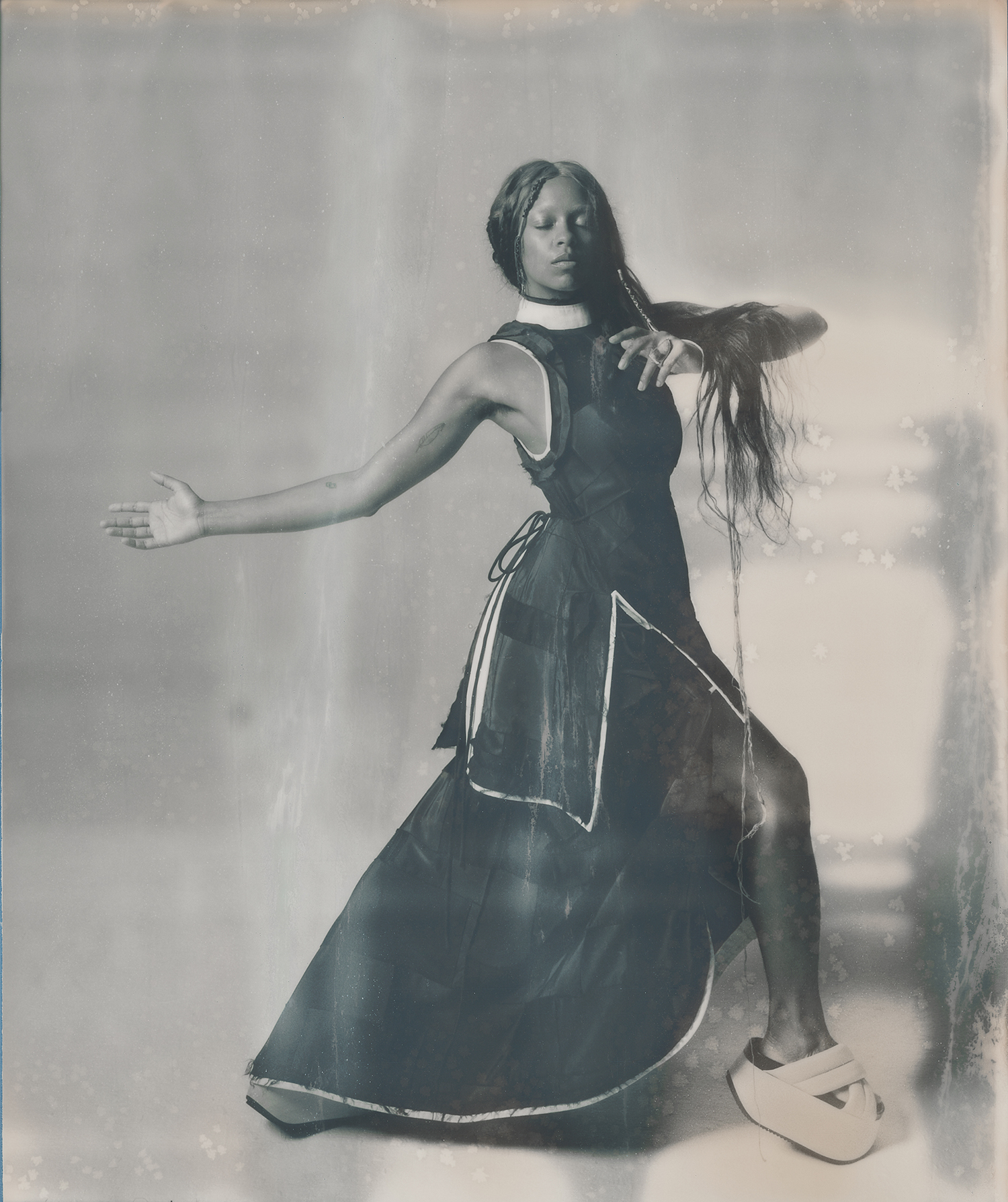
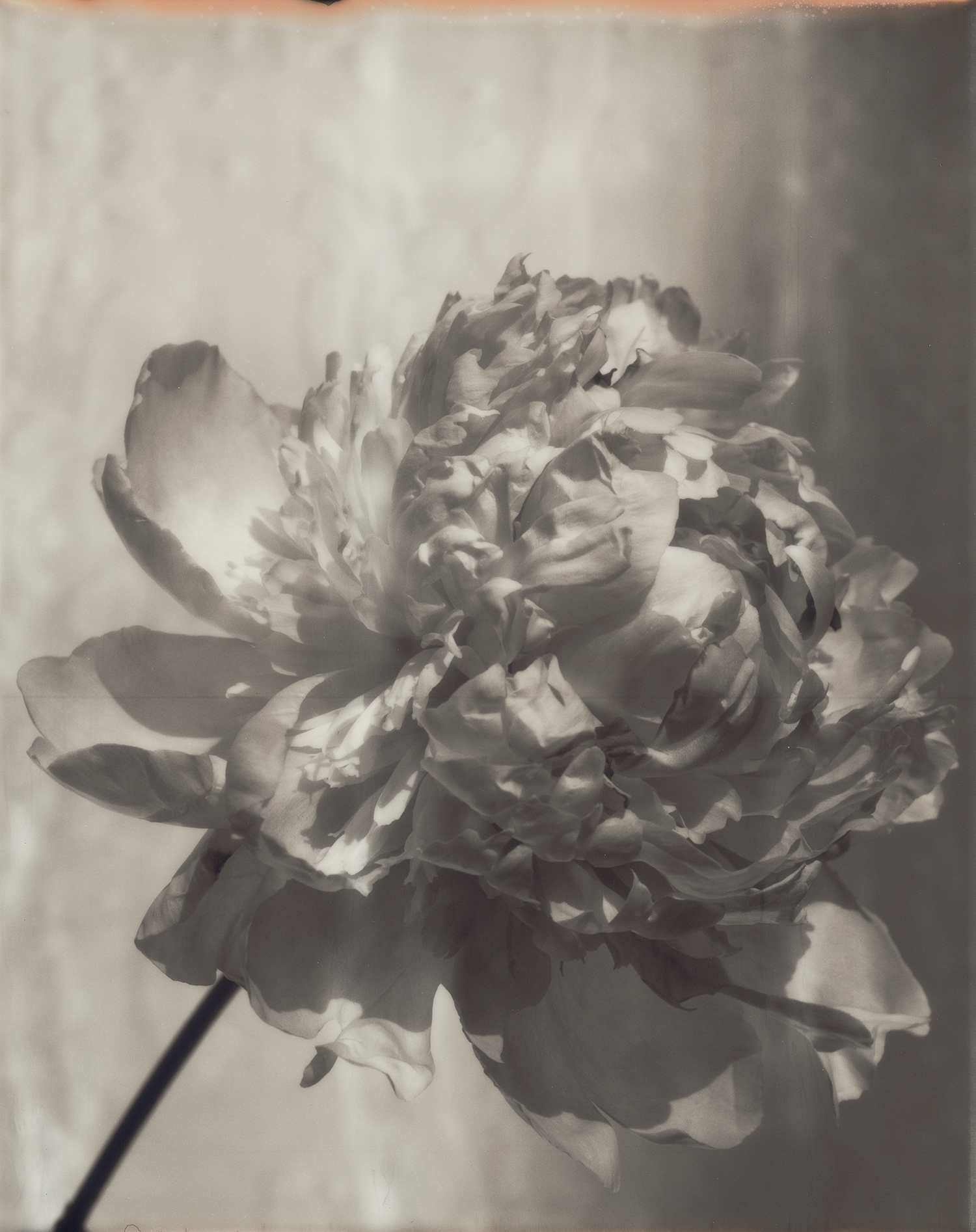
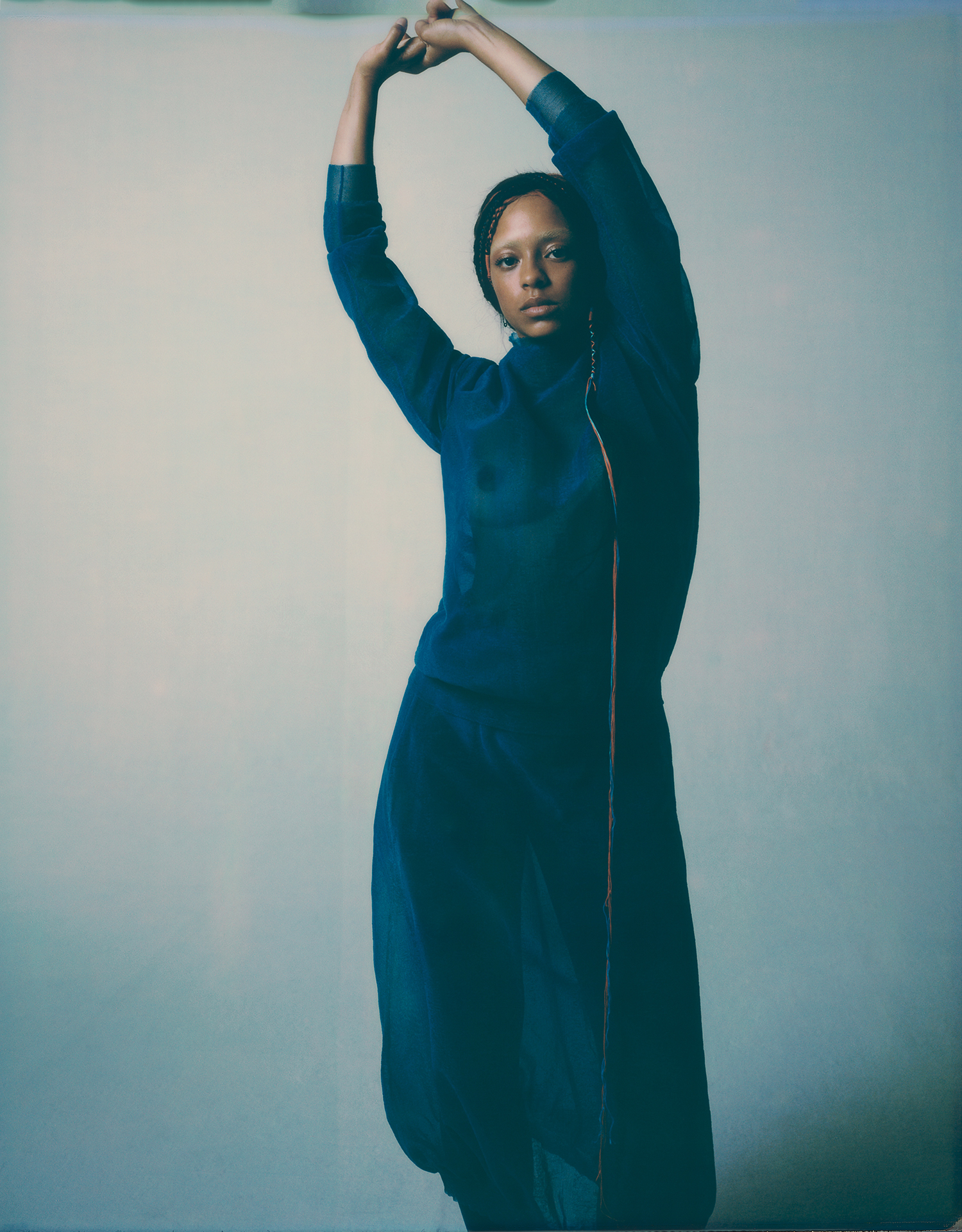
Equally important is a focus on the people that occupy these shifting landscapes. There are Giasco Bertoli’s photographs of anonymous mask-clad pedestrians, shot from the window of his Paris apartment around the onset of the pandemic. Or Richard Bush’s pictures of Kelsey Lu, styled by Sarah Richardson, and prefaced by a text penned by the musician herself. Shot on 10×8” Polaroid film, the images communicate the singer and cellist’s air of shadowy romance, a hallmark feature of the work Lucie and Luke have presented throughout their tenure at Jil Sander.
“Kelsey’s very romantic, and so easy and spontaneous. With her, you get a story where you can introduce other narratives,” he says. “I think the flowers possess a fragility and romance, the kind of femininity and fragility that Lucie and Luke have instilled in Jil Sander. Even though the final result is a bit odd, and slightly conceptual, it’s all just enough, and I think it lends a certain truth.“
Here, we speak with Dan and Thérèse, A Magazine Curated By’s editor-in-chief and managing editor, on Lucie and Luke’s vision for the magazine, Richard’s images of Kelsey Lu, and the newfound significance the issue’s theme has acquired as our understanding of the meanings of fashion and publishing shift.
The issue’s theme has acquired new relevance in light of the pandemic. But when you first started discussions about the issue with Luke and Lucie back in July last year, what did it mean to you then?
Dan Thawley: I think there was an initial thought from our side that it would be more to do with the way they approach fashion and the craft of making their very delicate, precise Jil Sander garments. The shows they had over spring were very related to raffia and weaving, and there was perhaps an assumption from our side that that would become more important in the magazine. But it turned out that they wanted to express something very much outside of fashion, which was interesting for us to navigate as well. Every designer we work with has a different point of view on how they want to incorporate clothing and fashion into the magazine, and for Lucie and Luke, it was definitely auxiliary.
Throughout the issue, there seems to be a constant juxtaposition of imagery that features seasonal fashion and moments when nature and culture are shown at their most permanent: the opening picture of the moon, or the images of Petra or the churches at Lalibela, for example.
DT: It’s definitely one of the most important aspects to their graphic treatment of the magazine. And separating the text and the images so explicitly was important. The idea was to create this very strong flow of imagery from around page 20 to page 220, with the text following on from that. Luke and Lucie were interested in pulling this idea from a large pool of art books, looking at the way an artist’s monograph shows their work and the importance of one image speaking to another image. There was also the inspiration of the early SIX magazines from Comme des Garçons in the late 90s as well, in terms of the really strong idea of contrasting human and industrial elements with nature, and also contrasting proportion and scale.
What’s also interesting is that, rather than looking at Lucie and Luke exclusively as the creative directors of Jil Sander, it fleshes out their personalities in a much broader, much more human sense. How important was it for you to articulate who they are as people in this issue?
DT: It was important in the sense that designers do change roles, and they carry their own identities that sometimes are stronger or parallel to that of the brand they currently work in. Luke and Lucie both have interesting stories prior to Jil Sander, and I think our choice to work with them was also to do with the fact that they are a married couple. Luke also comes from the world of streetwear. He had a very long career at Supreme, but they both studied at Polimoda in Florence. It was also important not to get locked down in that idea that people have, that ‘Oh, it’s a man and a woman, he’s from street, she’s from luxury and they put that together and it’s a magic pairing.’ It’s more complex than that.
Thérèse Boon Falleur: Yes, and what was really interesting about working with them was really seeing how each of them works, and how they understand one another’s process. Whenever we worked with them, they each took a very different approach to creation. Luke has a more intellectual approach — he really goes through his ideas and concepts first. Lucie, on the other hand, is way more visual — she finds her way by laying out images and seeing how things make sense visually. Understanding how the dialogue between them works was very interesting.
For the images published here, Richard Bush shot Kelsey Lu. How did she come into the equation for the issue?
DT: Kelsey Lu has had a relationship with Luke and Lucie for some time. They’re big fans of hers and invited her to give a concert in Tokyo in 2018 for the reopening of their boutique. When we were looking into people that were connected to their world and what they were interested in, she really made sense. There’s a duality in the kind of music that she creates, the instrument she plays, her vocals, the fact that she’s a very poetic character. Her recent performances, titled “Grounded”, are all to do with the four elements, particularly earth, so we really wanted to harness that, and invited her to sit for some portraits in Paris in March, which was one of the last shoots that we did.
TBF: I think the shoot also reflects the way Kelsey Lu plays a lot with her hair, which you’ll see in any work she produces. Here, it was quite subtle. Rather than use wigs or anything like that, Eugene Souleiman worked with different-coloured threads, gently knotting them so that they almost look like they’re her real hair. Because they’re Polaroids, you don’t see too many details in the final images. But you nonetheless see that her hair, and the way it’s styled, plays an important role.
We talked about what you had in mind setting out, but how would you say the final issue relates to things as they are now?
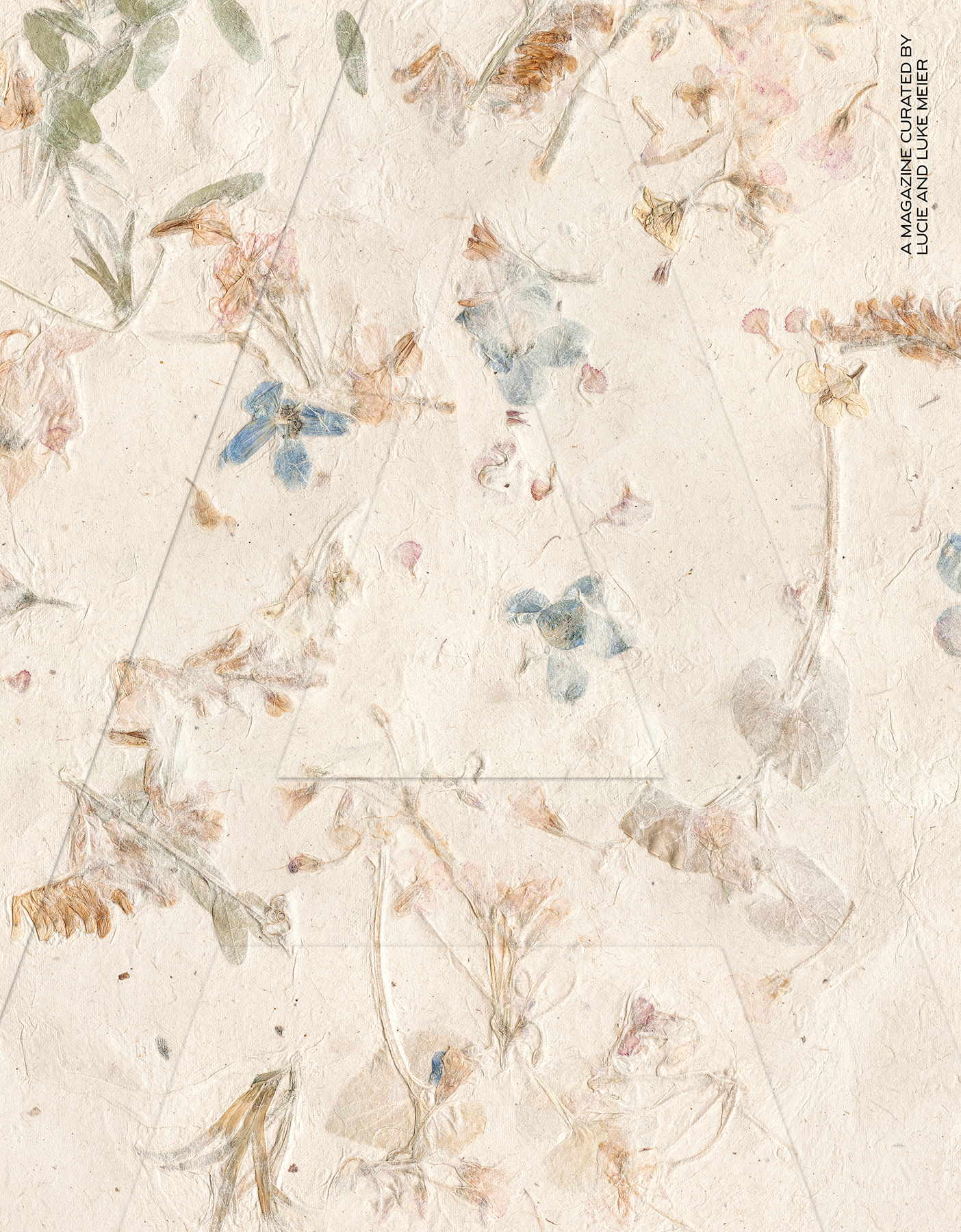
DT: Well, one thing that hasn’t changed from the outset is Luke and Lucie’s focus on the object of the magazine. We always offer our designers the choice of paper, the choice of treatments, and the physical, tactile elements of the magazine, and they were very excited by that. There was always the idea of working with a fully recycled paper, which really allowed it to correspond to that open, natural texture that’s so important to them in the clothing — the idea of this woven, artisanal object. The cover’s also a part of this story. There’s a whole investigation into Japanese washi paper, and pieces that Luke and Lucie have personally collected over the last couple of years, in the publication’s text section. It’s made in the mountains of the Noto Peninsula by a paper artisan, who provided them with these beautiful handmade papers with wildflowers that he collects from around his studio. We were unable to make every magazine with that paper, as it’s very fragile, and intended for creating wrapping, or even framing on the wall. What they were able to do though was to 3D scan it, which translates its textures and tactility, and the final result really resembles its original pressed flower elements. Looking at the future of print and why we should print things now, our response is to make a beautiful collectable object that people will want to keep, and that, in itself, is doing its best for the environment.
Credits
Kelsey Lu images
Photography Richard Bush
Styling Sarah Richardson
Hair Eugene Souleiman
Make-Up Lucy Bridge
All clothing Jil Sander


