More than two decades into his career, Raf Simons's weird and wonderful creative universe has come to encompass far more than just clothes. With references spanning the worlds of art, film and music, he’s fashion’s very own pop-cultural encyclopaedia. Looking back across Raf’s collections — from his eponymous label to Jil Sander, to Dior, to Calvin Klein, to his SS21 Prada debut — it seems there isn’t a corner of countercultural history he hasn’t, at some point, funnelled into a fashion show. But where did it all begin? In this three-part series, we take a deep dive into the self-contained world of references Raf has developed and returned to again and again.
For our final instalment, we’re looking at the myriad ways in which art from across the centuries and shaped and inspired Raf’s designs. While today he’s regularly spotted at the openings of Frieze and Art Basel snapping up works by the artists of the moment, his interests extend all the way back to Pop Art, early modernism and even the painters of the Northern Renaissance. Here, we explore how Raf turned groundbreaking artworks into groundbreaking fashion — from Mondrian to Sterling Ruby and everything in between.
Modernist Greats
When Raf was announced by the Prada Group as the creative director of Jil Sander all the way back in 2006, it was a decision that instantly raised questions. How would a designer with little to no experience in womenswear go about taking over such a beloved brand? Despite occasional forays into tailoring, Raf was best known for a grungy, youth-driven aesthetic — could this translate to the house of Jil Sander, known for its tasteful, grown-up minimalism?
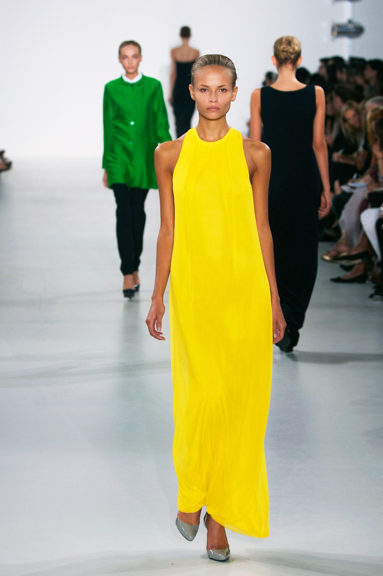
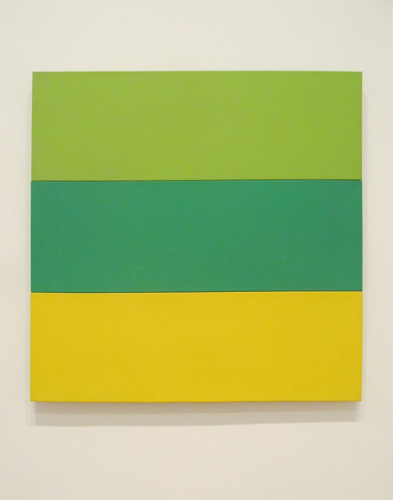
What he had up his sleeve was a background in industrial design, and with it a keen understanding of the tension between form and function, placing him in surprisingly good stead to take the reins at a label with a tradition of purity and precision. His inaugural womenswear collections were a one-two punch that channelled both his penchant for modernist décor (at university, he idolised the work of Le Corbusier’s furniture designer Jean Prouvé) and his fascination with the titans of post-war American abstract painting. He sent out his first show as an entirely monochromatic series of perfectly-cut suits, shirts, coats and trousers that recalled the sleek lines of a mid-century modern interior. His second introduced bursts of bold block colours recalling the work of 50s Color Field painters, including Ellsworth Kelly and Barnett Newman.
But this wasn’t the first — or indeed, the last — time Raf would look to the modernist canon for inspiration: there are also the Rothko-inspired mohair sweaters he sent down the runway for his own label’s AW08 collection, or his ultra-rare “De Stijl” sneakers and backpacks from the same year that riffed on the black grids and primary colours of Piet Mondrian.
Mark Leckey’s ‘Fiorruci Made Me Hardcore’
Another of Raf's trademarks is his willingness to blend the worlds of art, film, music and technology in a single fashion show, and his admiration of those with a similarly tangled outlook on late 20th-century pop culture. It makes sense, then, that one of his favourite artworks is Mark Leckey’s seminal 1999 film piece, Fiorucci Made Me Hardcore. A visual collage of archival footage from Britain’s various underground clubbing scenes across three decades, it begins in the ’70s with Northern Soul, and memorably culminates with a bass-blasting dive into the rave scene of the late ’80s and early ’90s.
The film has recurred as a reference for Raf: first on his own runway for SS07, where he projected it as a backdrop, and later in Jil Sander’s SS12 men’s collection, with tees and knits that mimicked the static of lo-fi camcorder footage and crossbody bags that were fit for the dancefloor. Finally, in his SS16 show — again for his namesake label — Michel Gaubert not only remixed it for the soundtrack, but the parkas and baggy trousers on the runway directly referenced raver looks from specific moments in the film. From his early encounters with the output of Factory Records, to his AW01 show that celebrated Richey Edwards of the Manic Street Preachers (featuring bomber jackets patches of the fly poster that did the rounds after the guitarist’s mysterious 1995 disappearance), what exactly is it about British club culture that has made it such a pervasive influence on Raf’s work?
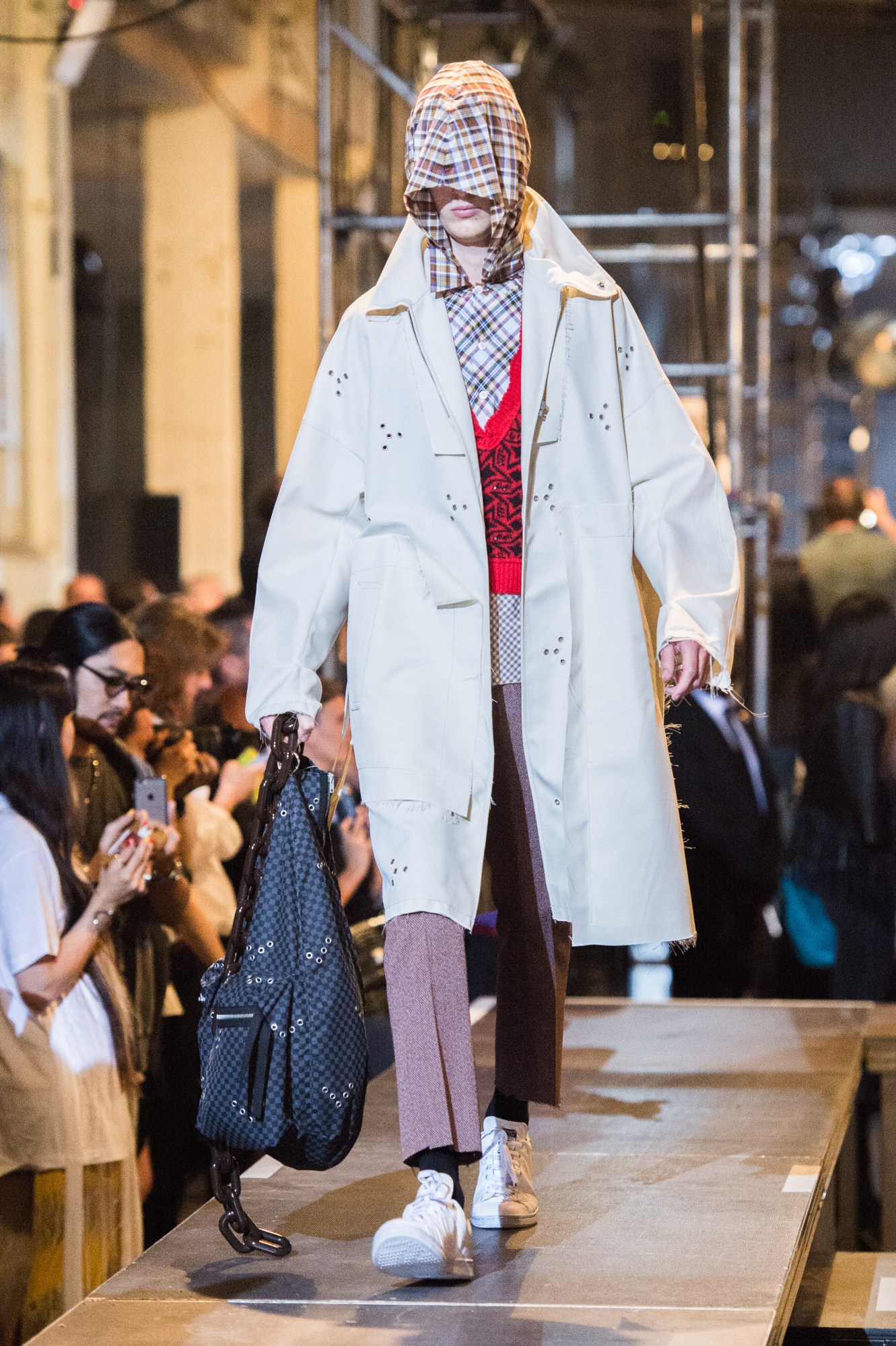
The answer is identity, and how the clothes we choose to put on our bodies communicate the person we are: the films we’ve seen, the books we’ve read, the music we listen to. There are few moments in music’s countercultural history that hold as distinctive a sartorial stamp as British acid house and rave scene. It was Fiorucci that made those clubbers hardcore — if we’re taking Leckey’s word for it, at least. There are even fewer designers who have the ability to distil a cultural moment into a fashion collection, but Raf — whether touching on a clubbing revolution that speaks to the disaffected youth of today, or, more recently, his references to decades-old American horror films for an age of political anxiety at Calvin Klein — is able to take the past and wrap it up for the present day with unparalleled ease.

Northern Renaissance painters
Following an emotional departure from Jil Sander, the fashion industry was awaiting Raf Simons's debut collection at Dior with bated breath. How would this master of clean, modernist-inspired design translate his vision to the extravagance of a house like Dior, with its legacy of Monsieur Dior’s billowing evening gowns and the bombastic spectacles staged by John Galliano? The answer was balance: in a tasteful nod to the house’s association with florals, for his inaugural AW12 couture collection, he simply covered the walls of the Dior ateliers with a million fresh flowers.
While the silhouettes were in keeping with Raf's polished minimalism at Jil Sander, he also embraced the incredible resources of Dior’s petites mains with intricate hand beading, feathers and brocaded silks. For something more contemporary, he introduced specifically-developed fabrics designed by his favourite artist, Sterling Ruby, with tie-dyed ripples that ran horizontally down structured gowns. It spoke as much to Monsieur Dior’s obsession with florals and rosy fragrances as it did to Raf's Belgian heritage, where the rich tradition of the flower trade in the Low Countries still dominates; from the tulip bulbs of Golden Age Amsterdam, to the overflowing bouquets and banquets painted by 17th-century artists as reminders of mortality at a time of religious puritanism.
It wouldn’t be the first time Raf dove into the annals of art history to find a reference. For his AW15 Dior couture show, he cited the kaleidoscopic, otherworldly visions of the Early Renaissance painter Hieronymous Bosch as an influence, specifically his masterpiece The Garden of Earthly Delights, with models weaving in and out of stained glass panels with a pointillist interpretation of flowers that scattered the light in hypnotic patterns. For his AW18 own label show, held in New York, he enlisted long-time collaborator Alexandre de Betak to create a set inspired by the decadent still lives of Flemish Renaissance artist Jan Brueghel the Elder. Plates were stacked high with grapes, wine bottles sat around uncorked, and lush blooms of flowers framed the elevated runway. It seems that even if his reputation holds firm as a minimalist, Raf isn’t averse to the occasional burst of opulence.
Word Art
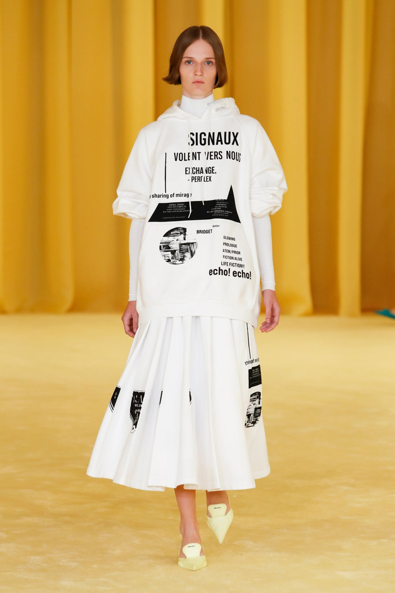
A picture paints a thousand words, or so the saying goes — although Raf Simons might be inclined to disagree. His use of sloganeering from his early days as an independent designer all the way up to his Dior womenswear has seen him channel the visual impact of words to unique ends. Take, for instance, his seminal Virginia Creeper collection. A meditation on the American horror tradition, it served as an interesting precursor to his designs for Calvin Klein, where he touched on many of the same ideas, albeit in a slicker, more luxurious context. Today, the AW02 collection is one of his most coveted in the resale market, with a simple sweatshirt spelling ‘Nebraska’ in collegiate type inevitably appearing on Grailed with a $2000+ price tag. (Buoyed partly by a paparazzi shot of Kanye wearing it, and also Virgil Abloh’s riff — or copy, we’ll let Diet Prada decide that one—on the sweater for his second womenswear collection back in 2014.)
For Raf Simons, he began exploring the sartorial power of words with his ‘summa cum laude’ bombers for SS00, foreshadowing the high school horror of Virginia Creeper. He then touched on globalisation with his chopped-and-screwed corporate logos for his SS03 Consumed collection, and later, printed knitwear with texts about poltergeists and ghosts in the machine for his SS05 History Of My World collection, perhaps his most personal expression of his youth lurking in the shadows as a cultural outsider. Later, at Dior, he would print phrases that once again whispered of the botanical world for his spring/summer 2014 ready-to-wear collection: primrose path, alice garden, whispering yellow. And finally, with his first collaborative collection with Prada last month, his use of bold slogans against Constructivist-inspired graphics proved to be one of the most visible Raf-isms on show. So where did this instinct for combining word and image come from? The most likely answer is, once again, art.
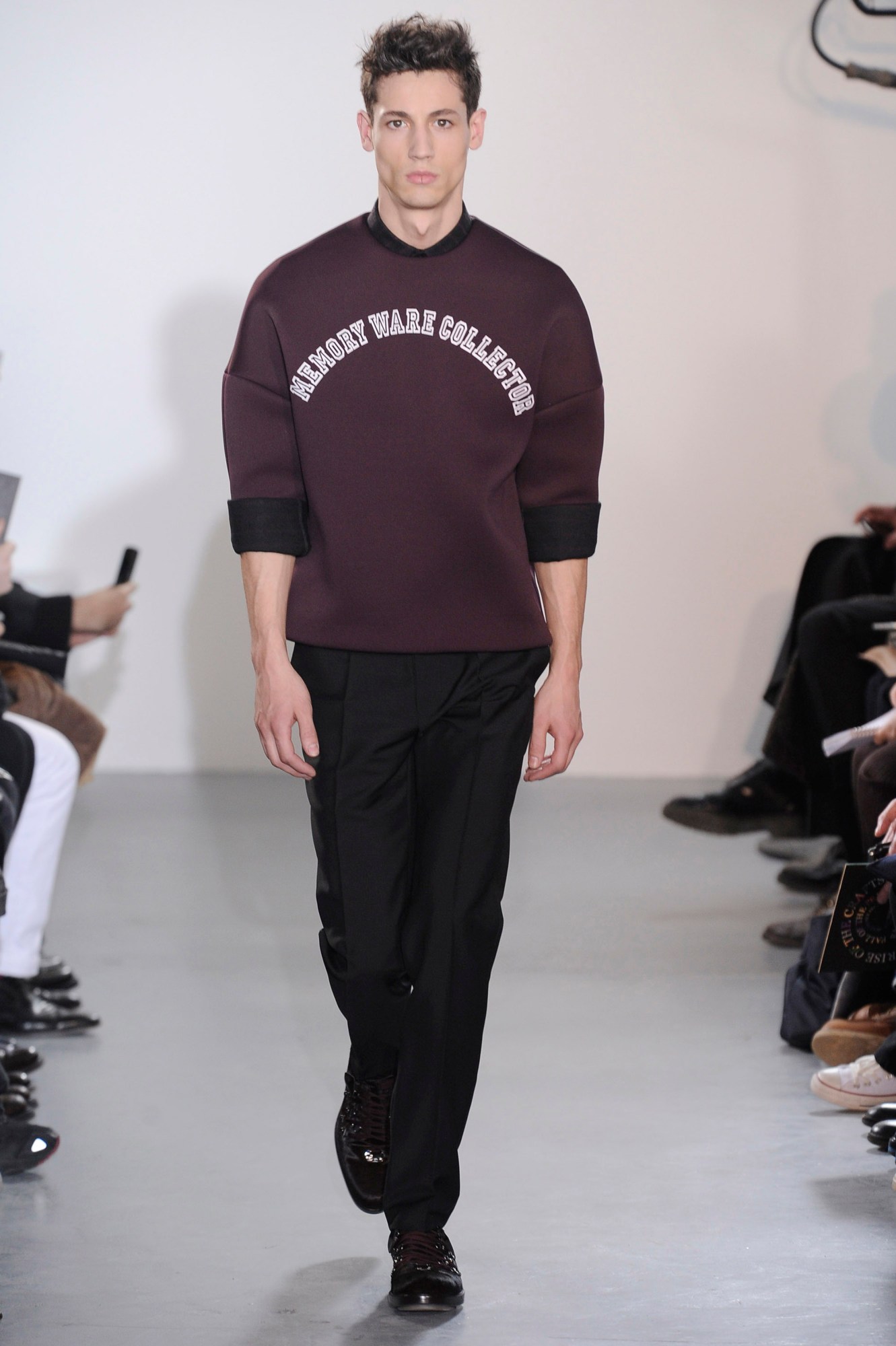
Raf is a well-known collector, owning many pieces by the artist Christopher Wool, who he also collaborated with on his SS09 collection, printing tank tops with Wool’s signature stencilled typeface to read lines from Leonard Cohen songs. Another of his most revered artists is the late Mike Kelley, whose iconoclastic approach to sculpture and childlike sense of wonder has always resonated deeply with Raf. (At his apartment in Antwerp, a series of Kelley’s flags sit pride of place across a whole wall of his living area.) For Raf's AW11 collection, he directly referenced the title of Kelley’s work — Memory Ware — with sweaters printed with the phrase. It’s a tidy fit for Raf's special kind of sentimentalism. Clothes from past collections are passed from owner to owner on the second-hand market, imbued with the memories of their previous wearer or echoing the cultural moment they reference. The irony is, it’s a magic that’s almost impossible to express in words alone.
Andy Warhol
When Raf assumed the role of chief creative officer at Calvin Klein in 2017, one of his first moves was inking a deal with the Andy Warhol Foundation that provided him with three years of unrestricted access to their archives. Some initially interpreted this collaboration as trite; a simplistic parallel between Warhol and Klein as totems of American consumerism. What fashion pundits couldn’t predict, however, was the remarkable swerve in politics that would take place with the election of Donald Trump. In the words of the New York Times’ Vanessa Friedman, “it turns out he was more prescient than anyone knew. Just a year later we are living in a Warhol moment inside a Warhol moment inside a Warhol moment — in a country run by the most Warholian president we have ever had.”
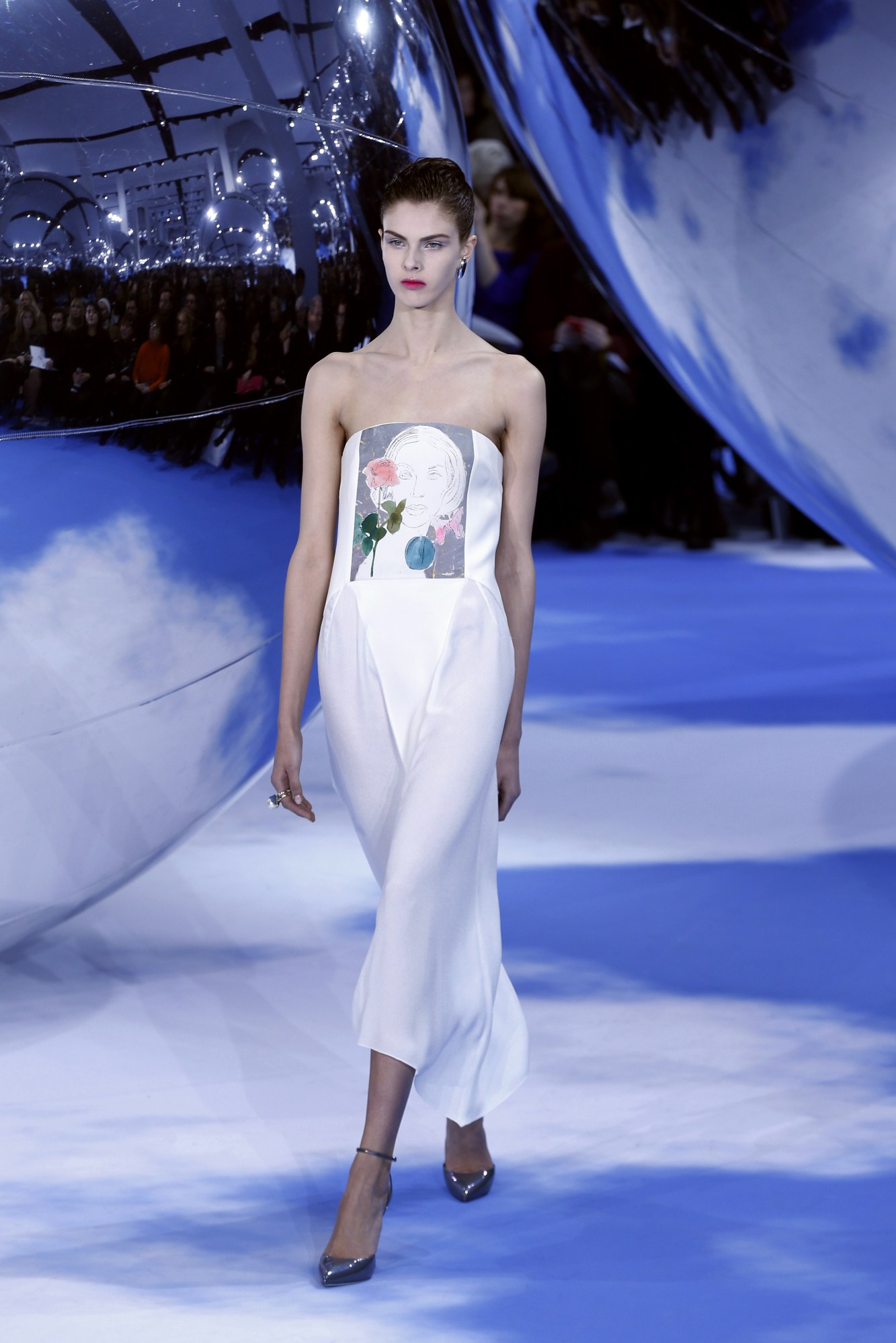
On the other hand, Warhol had long occupied a central spot within Raf's canon of favoured artists. Take his AW13 ready-to-wear collection for Dior, which saw drawings from Warhol’s early years as a freelance illustrator printed across dresses: everything from an asymmetrical peplum decorated with a bouquet of flowers, to a sheer white shift dress embroidered with scribbled stilettos. “I was interested in the delicacy and sensitivity of the early work he did,” Raf told Vogue after the show. They aren’t words you would necessarily associate with Warhol, but it's a testament to Raf that he dug deeper, and uncovered a lesser-known realm of the artist’s expansive body of work.
When approaching the Warhol collaboration for Calvin Klein, a designer’s first instinct might be to double down on the associations of Warhol with a certain era of debauched glamour: the polaroid portraits or repeated silkscreens of movie stars and Studio 54 glitterati to reflect the high society clients of Calvin Klein’s mainline collections. Again, Raf delved into the murkier corners of Warhol’s output: opting to print, for example, the eerie Electric Chair series, and the disturbing images of smashed-up vehicles from his Car Crash paintings. By highlighting Warhol’s darker, more iconoclastic images, Raf was bringing a Trojan horse into the star-spangled house of Calvin Klein — a vision of the American dream turned American nightmare.


