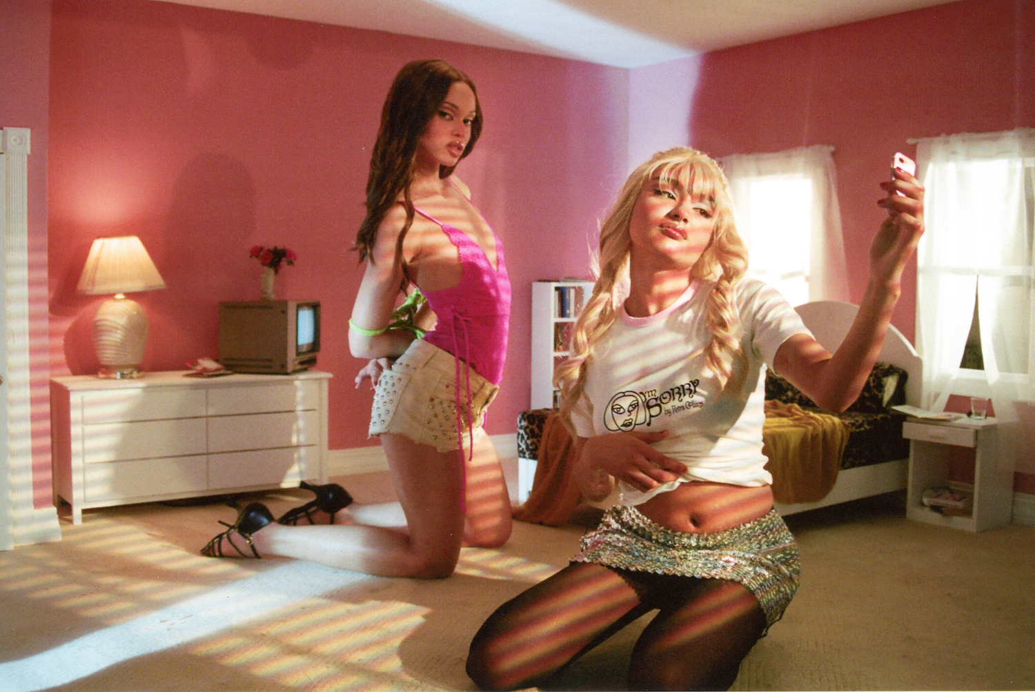
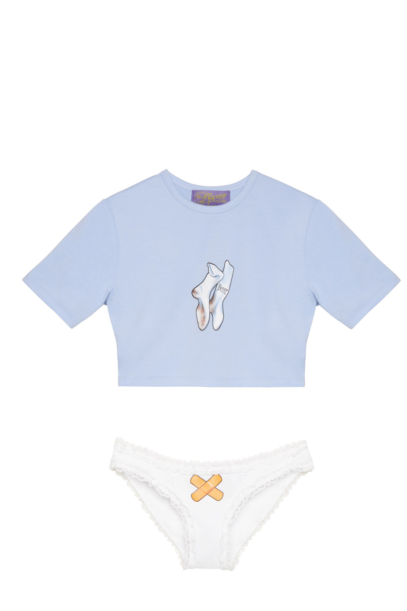
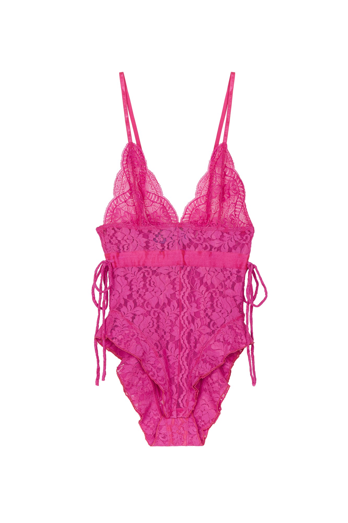
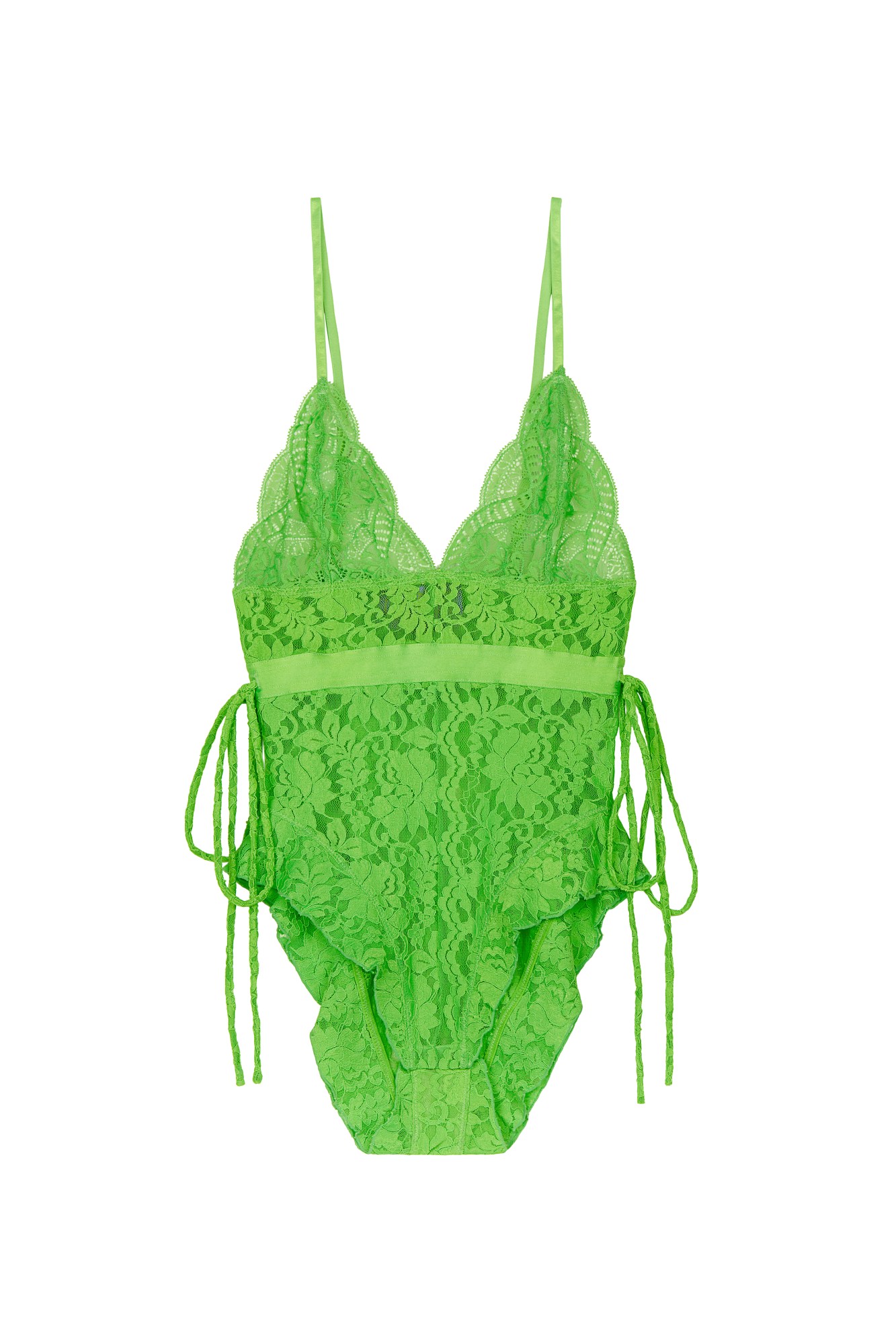
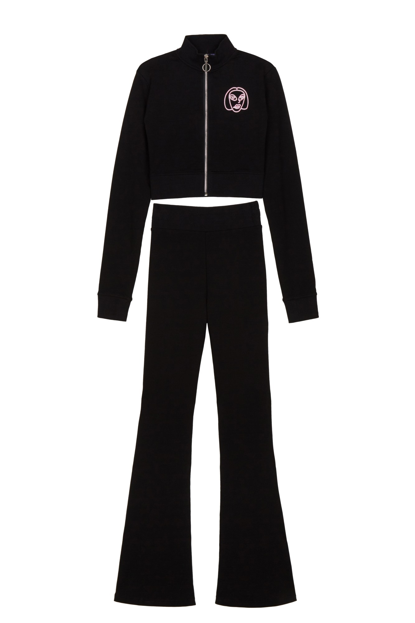
When we reach Petra Collins, it’s still morning in LA. She’s excusably groggy, having just woken up, which feels pretty appropriate given the focus of I’m Sorry, the collection she’s been working on in partnership with Canadian e-tailer SSENSE. Its first drop, released today and revealed exclusively here on i-D, offers a capsule of easy-wearing garments — think satin pyjama twinsets and slip dresses, hoodies, flared tracksuits, and highlighter-hued lace bodysuits. ‘I guess because of the time period we are in, we decided on clothes that were really focused on the prints, and they’re items of clothing that you can wear at home or in bed,” she explains.
On first glimpse at the palette of pastel pinks, greens and blues, the pieces appear to be perfect attire for the sweetest, most innocent of dreams. A closer look though — particularly at the prints, developed in collaboration with Korean manga artist Migo — hints toward a side to what goes down in the privacy of one’s own bedroom that’s far from prim or proper. It’s what makes I’m Sorry such an apt encapsulation of the world she’s crafted through in her photography, speaking the same language of childlike whimsy and soft sensuality, darted through with a suggestion of lurking darkness.
To hear more about the process behind the artists’ first foray into fashion-making, how she dreamt up its twisted graphics, and the enduring influence of the internet on her work.
What made the prospect of working on a collection of garments so appealing to you?
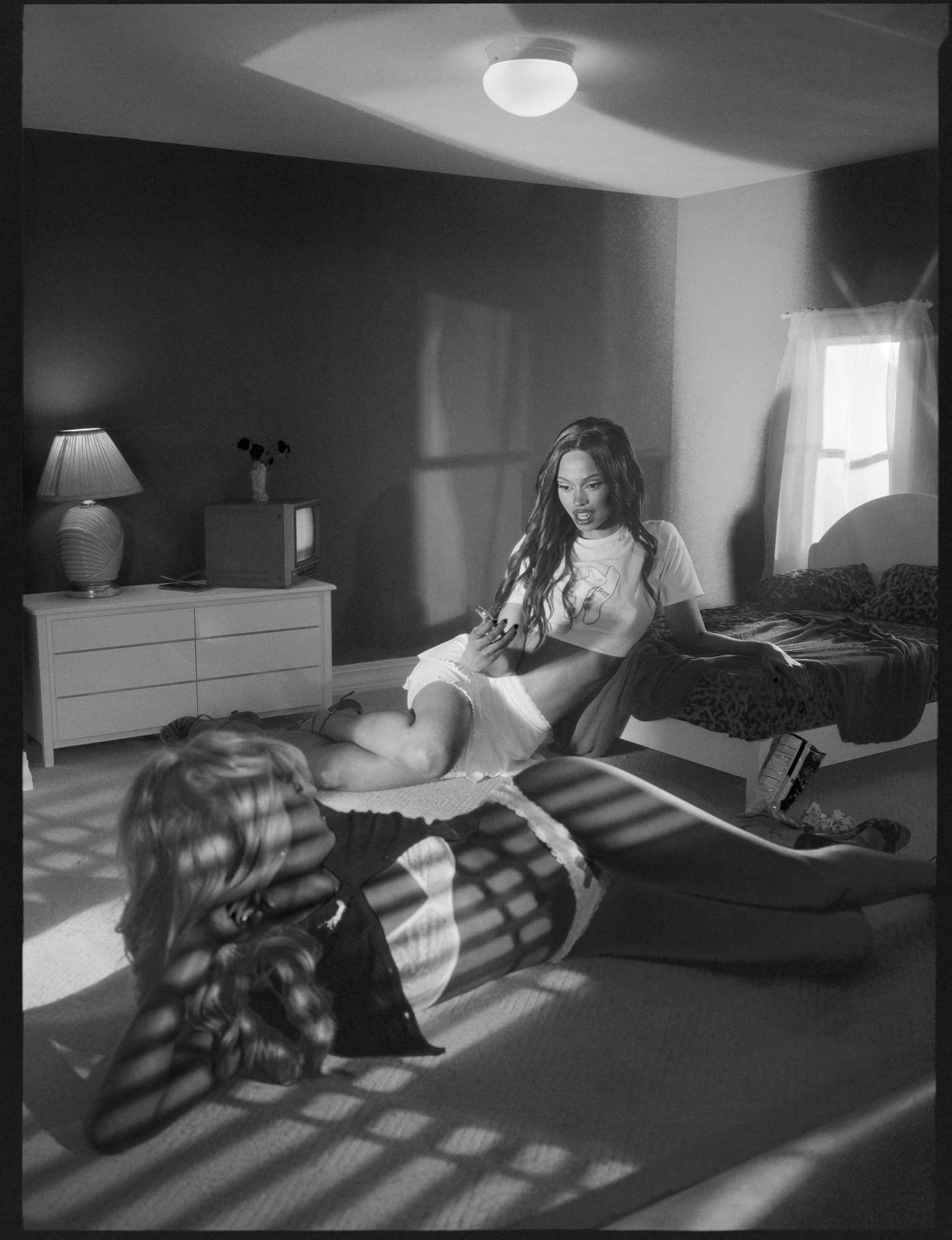
I was super excited! Obviously, clothing and fashion have been a big part of my life, and a big part of my imagery. When I’m taking photos, I always see clothing as costume design. Even with my everyday clothes, I’m like, ‘Okay, I’m building my character for the movie of my life.’ [laughs] I wanted to make things that my friends and I, or anyone who liked my art, would wear.
As you said, fashion plays such a central role in building the worlds that you create in your imagery, but how did you find the process of translating your visual world to fashion?
I love working with other mediums. When I started taking photos, I actually came from dance, and thought I was going to be a dancer. When we are working on the clothes, it was interesting because my brain had never necessarily thought that way. I worked with my old assistant, Dean DiCriscio, who is basically now my design partner. We started with a moodboard. In the beginning, I was like, ‘I want to do this,’ or ‘I want to do this specific thing,’ but I guess because of the time period we are in, we decided on clothes that were really focused on the prints, and they’re items of clothing that you can wear at home or in bed. The things that I want to wear right now are things that make me feel comfy and safe and happy. Right now, we don’t necessarily know what our future will hold. In the next drop, it’s all about going out and pieces that are flashy and wearable outside, and maybe a little more difficult for home. But I just wanted to do something that was really dreamy and comfortable, that was really influenced by the times.
So how would you introduce I’m Sorry?
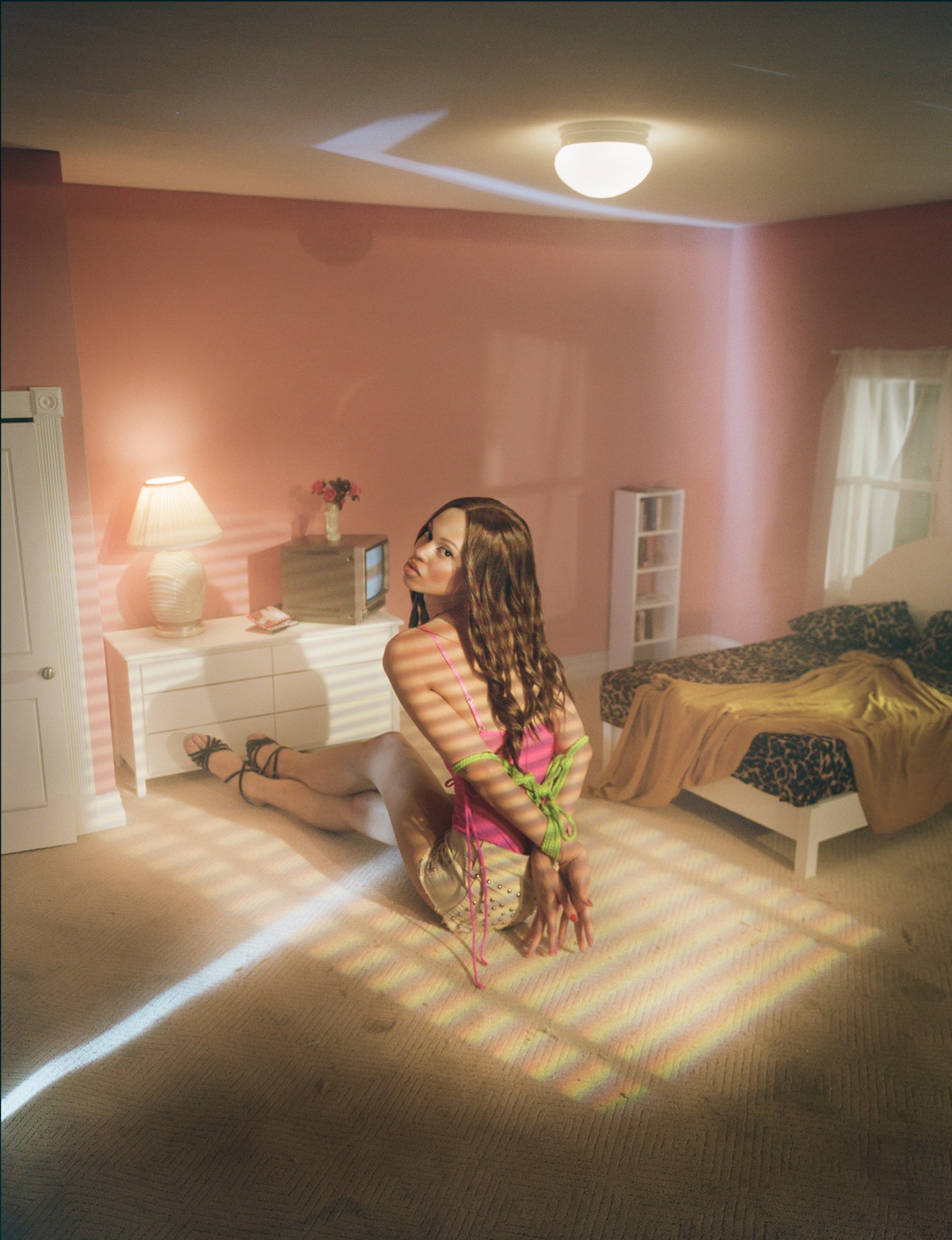
Well, it’s a Canadian saying, basically! In Canada, we’re constantly saying sorry, so it kind of refers to that. But I guess that because I started playing with fashion I was really young, and it was one of the most important things to me as a teen, it was the thing that I would use to shield myself or separate myself from others. So I’m Sorry is kind of that. It’s clothing right out of my crazy twisted bedroom. I started working on it at the tail end of my Baron book, which was a whole exorcism of my childhood self, so a lot of that aesthetic went into the clothing, too.
How did you then seek to convey that through the graphics?
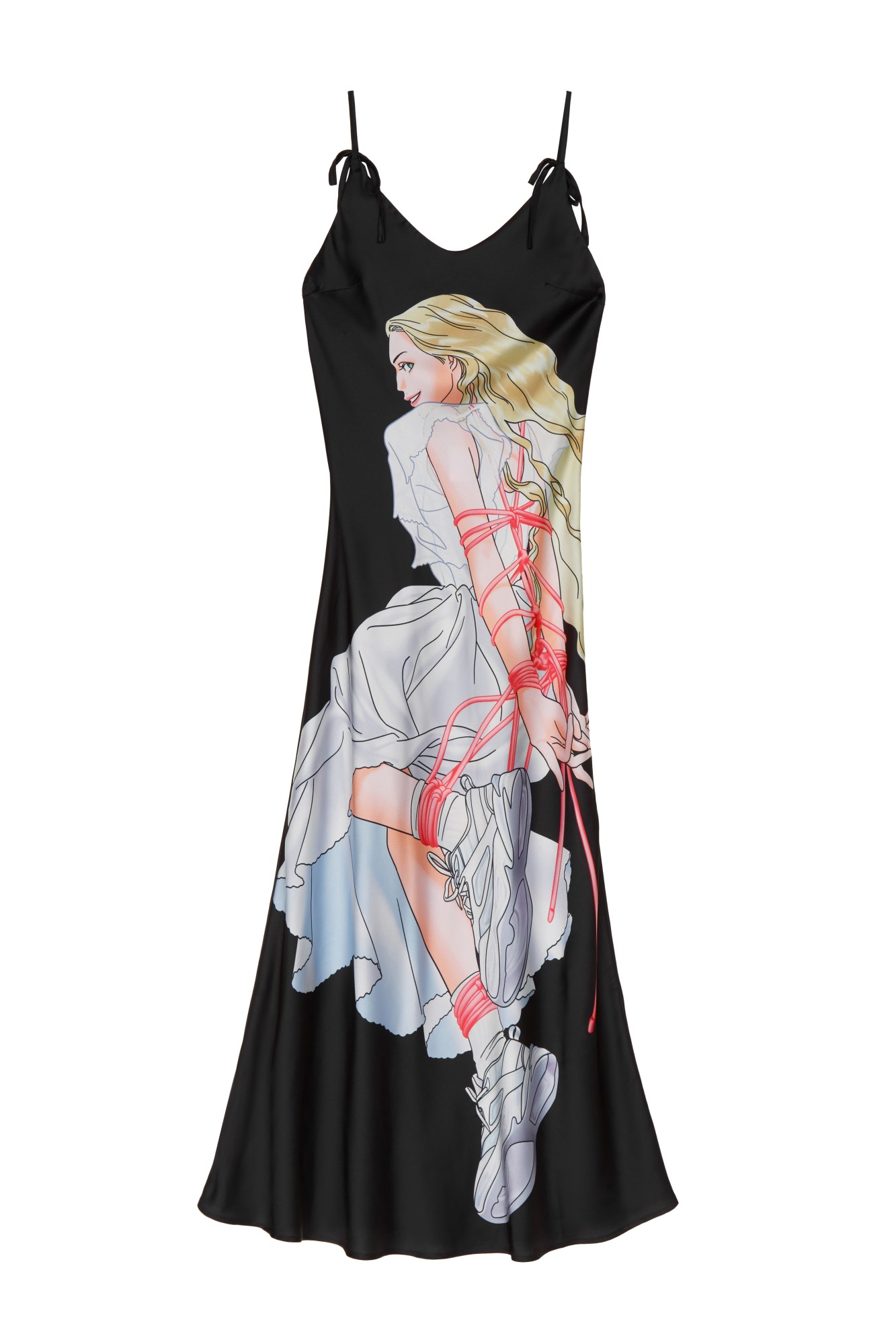
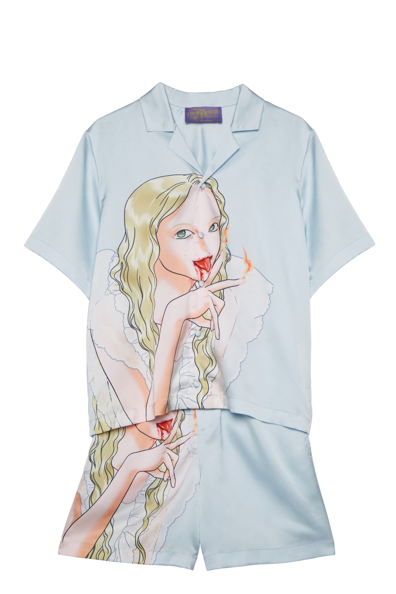
Yeah, the graphics are a little different… In your bedroom, you also have nightmares, and I’ve always been super obsessed with dreams and how they hold your sexual trauma, or your wildest thoughts, so we kind of put that into the character. Which is funny, because the pieces are baby blue or baby pink, but then they’re also pretty sexy and a little bit violent, which was fun. I was also influenced by things that I was, and am, watching.
You collaborated with Migo, a manga artist. How did you come across his work?
I was looking for artists that I love online, and I honestly have no idea how I found his page. Also he was like, “What the fuck are you asking me for?!” [laughs] But I just immediately thought it was such good work, and I was drawn to his aesthetic right away — it sort of matched mine, so I just started DMing with him. It’s so cool, too, because he’s based in Korea, and neither of us speaks the same language. It’s been like very interesting and super fun being like, ‘Hey, I’m this person from the other side of the world and I really love your work,’ and translating our ideas to each other.
Were you working with any specific visual references when developing the prints?
Yeah, there were so many! Honestly one of the first images that I showed Dean was this beautiful painting of these cockroaches sitting around a picnic table in the woods with champagne glasses. And I used a lot of like childhood references, too. And there’s the raccoon in the dress [laughs] and Patrick from Spongebob on the cross. Also, right now, I’m so interested in filters and how the internet has influenced changes in plastic surgery, which was a big part of the shoot. I really love mixing these childhood fantasies with what has happened in the world. It’s one of my favourite things, and part of this is how my generation was obsessed with Bratz dolls, and then everyone actually ended up getting surgery to look like that. So… all of that is what goes into a simple silk shirt!
There’s always much more to the iceberg than it’s tip, isn’t there? But how did you find the experience of bringing all of this together with SSENSE?
Honestly, it was really fun. For the first time, I had to figure out how to translate certain things that I wasn’t necessarily used to translating. But it was really cool — not just because they’re Canadian, too, but also because so much of their team are women.
You teased some of the pieces in the cover shoot you did for their magazine — could you tell us about the creative direction and concept you developed for that?
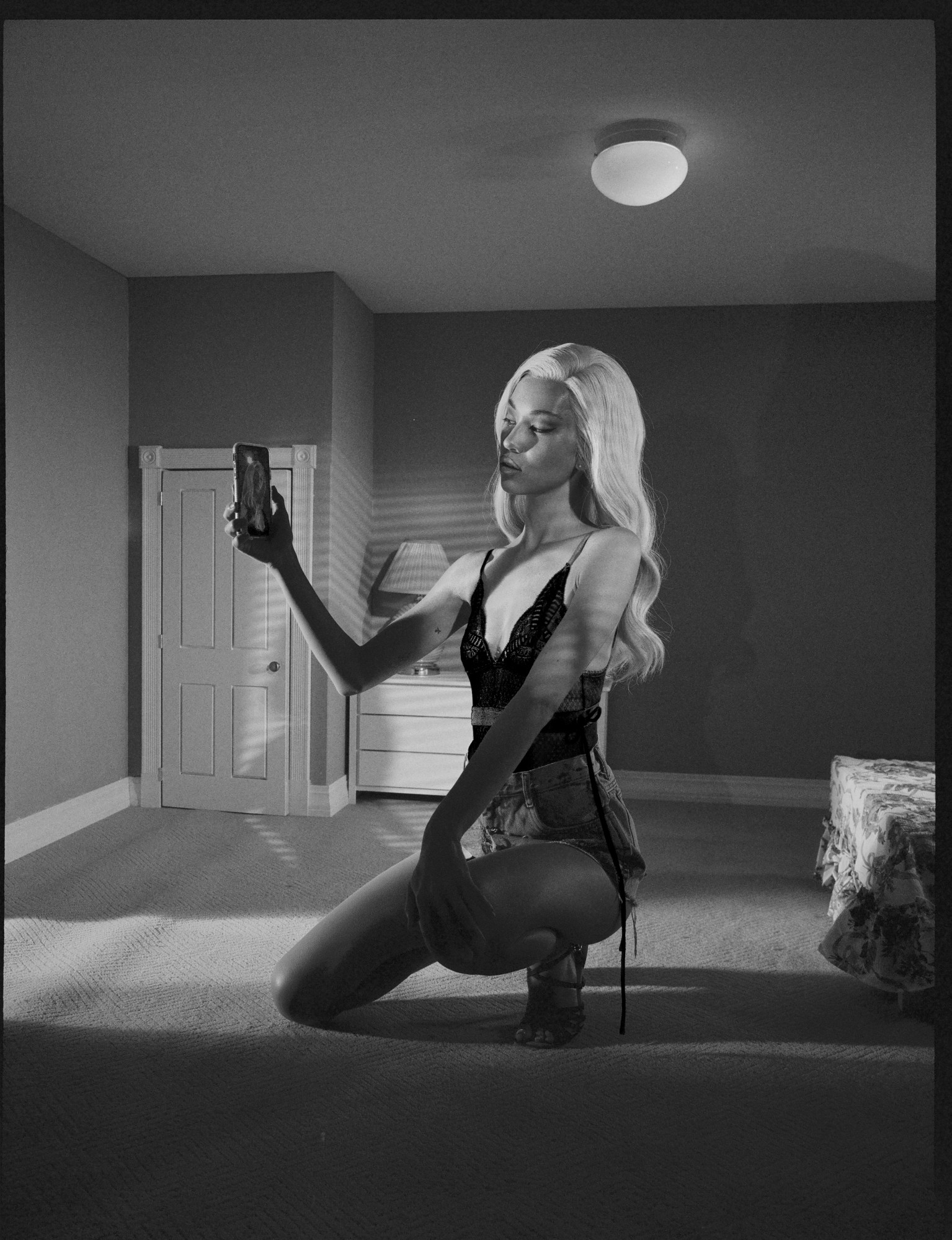
I’ve been studying the internet for a really long time now, specifically filters and how they’ve physically changed us. And then I reread Simulation and Simulacra, which is something I first read in school. Because I grew up on the internet, I’ve always had my IRL self and my URL self. It’s second nature to me. But especially through, COVID-19 we’ve seen this crazy progression where people are realising that we do live in different realities. Though we shot before the pandemic, the shoot was super inspired by that way of thinking. Even with the hair and makeup, we wanted to create these filter-like features.
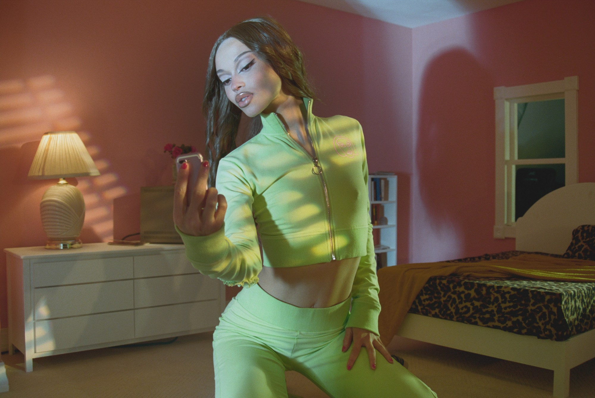
You worked with Kiko Mizuhara, Ama Elsesser and Severine Santos for that. How those people represent what I’m Sorry is about?
I was just really lucky that I got all of them at once. They’re all amazing people, and they’re great in front of the camera. I’ve been obsessed with Kiko forever, I think she’s so radical and so cool. And then Ama is someone I’ve been shooting since they were 14, they really understand who I am and what I do, so they just brought their own character to set. Severine is again someone that I’ve been shooting for a while, she’s played so many characters for me. She always comes to set so cute, fully ready to jump into whatever Bratz doll character.
And how would you describe the characters that you’ve designed this collection for?
Interesting… there are a ton of different characters, actually. But I’ve designed it for everyone, which is why the pieces are a little vague. I didn’t necessarily have specific characters in mind, but I hope that anyone can take the collection and make their own story with it.
Discover I’m Sorry on ssense.com
